Inspired by such great artists like Drew Struzan I wanted to do a different kind of a promo photo that looks more like a kind of a lobby card with a mixture of painted touch and filthy film grain look.
Step 1
First I needed some hilarious photos in front of a green screen to make the extraction in Photoshop easier.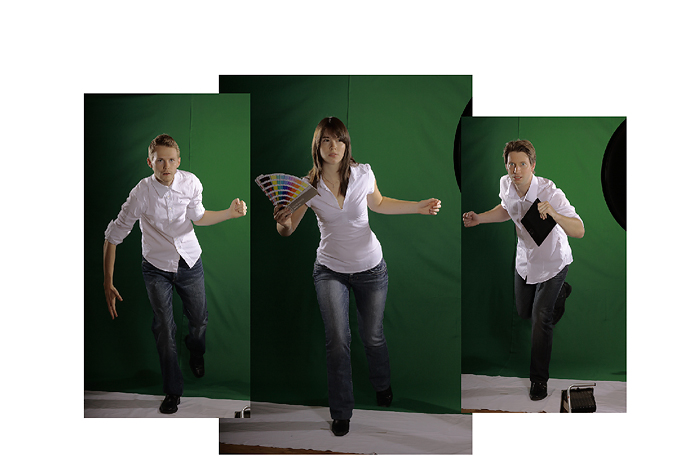
Step 2
After browsing through millions of photos I chose those body parts I would like to put together because the perfect image is mostly hard to find. So I did this “digital Frankenstein-ing” with layer masks. The models were mixed with different stock photo material, like falcons or owls. Why? ‘Cause Dinosaurs are extinct. ;)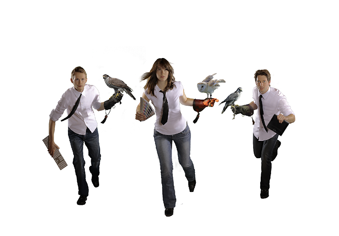
Step 3
With the combination of adjustment layers and the rectangle tool feat. Asphalt and wall textures I build a rooftop. Because I don’t have a helicopter anymore I had to buy an adequate stock photo. ;-)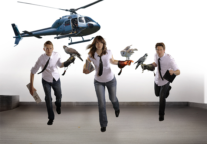
Step 4
Running dudes in front of a white layer doesn’t kick ass at all. So it’s better to place another stock photo – this time a high-rise skyline – in the background. With some self-made vanishing point lines it should fit right. I also build a quick helipad, to make it clearer that the helicopter already dropped the three amigos on the top of that building.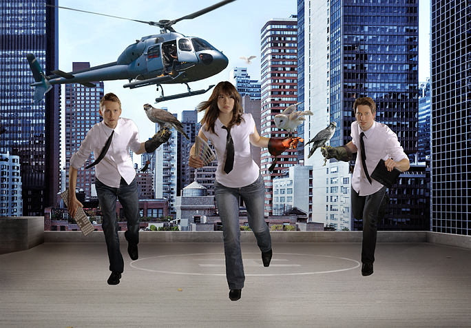
Step 5
To make it look more Rock’n’Roll and not like a cheap montage, I played around with some adjustment layers like color balance or gradient maps.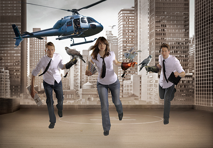
Step 6
I added a few shadows and a smooth vignette. For the contrast I gave everything a little bit more brightness.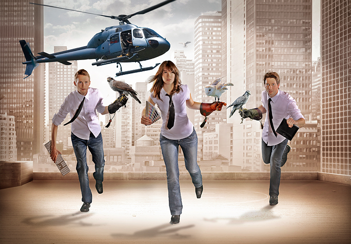
Step 7
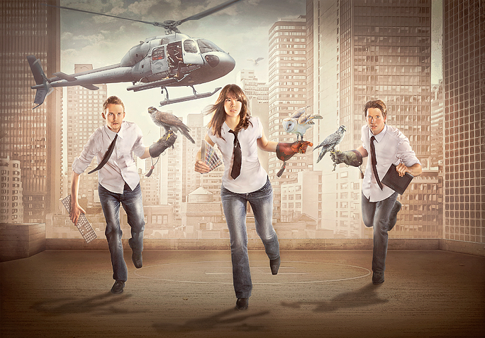
The old-school method of dodge and burn helped me a lot giving everything a constant look.I matched the colors of the helicopter optically and a couple of adjustment layers later… I couldn’t believe it, but my image looked like this. ;-)
Step 8
Finally brought it to an end with the finishing move “old movie projector lines” followed by some noise and a smooth blur to create the look of a sleazy, 70s B-movie scene. I hope you enjoyed this case study for abduzeedo.com.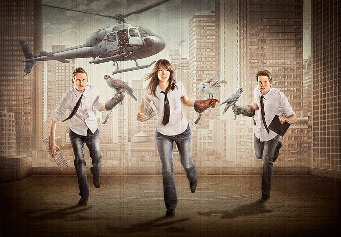


Tidak ada komentar:
Posting Komentar