Tampilkan postingan dengan label Designing. Tampilkan semua postingan
Kamis, 17 Maret 2011
Senin, 14 Maret 2011
Selasa, 01 Februari 2011
The Fossil Shaped Wash Basin arriving into Market via My Blog..
Introducing new concrete washbasin shaped as a fossil, the Ammonite washbasin from HighTech. Inspired by the archaic beauty of ammonites, this unique design showcases the organic qualities of concrete.

The washbasin can be produced in widths between 90 cm and 330 cm with a standard depth of 56 cm, and is available in several colors. It can be installed either with a table-mounted or wall-mounted tap. "Ammonites are an extinct species of cephalopods which lived in the sea about 400 million years ago. Their shells are found all over the world and they are very much sought-after by fossil-hunters, their collector’s value depending on size and the state of preservation. The fascinating shape of ammonite fossils – which resembles a rolled up helix – is the basic design element in the new HighTech washbasin. The association of water and fossil design is a clear allusion to the prehistoric inspiration for the Ammonite washbasin."

Minggu, 16 Januari 2011
25+ Funny Online Photo Editing Sites to Play and Have Creative Fun With..
There are a lot of online resources available where You can change, enhance and make funny photo editing without knowing and program like Photoshop. Maybe You want to be on magazine cover, want Your own personalized dollar or maybe just want to change Your mood? Now You can do it with just few mouse clicks and in few seconds.
I collected all the best free photo editing services, which will keep You busy for quite a while and You will receive amazing results – maybe funny, maybe silly – but You’ll get original photos and few more reasons to smile.
1. BeFunky
BeFunky Photo Effects allow everyday people to easily create photographically rich and artistic results from their digital images without the need for any technical knowledge. These “one-click” photo effect options produce desired results effortlessly and each effect comes with the option to make simple adjustments.
2.FunPhotoBox
The FunPhotoBox site is a place where you can create funny pictures from your photos. FunPhotoBox is a free photo editing online service. FunPhotoBox allows you to add special effects to your photos.
3. Imagic Photo Enhancer
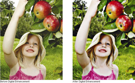
Imagic Photo Enhancer is an easy to use digital photo enhancement software that instantly transforms your pictures into rich, glowing, beautiful images. Our photo enhancer was inspired and developed to do one thing.. to make your pictures look their absolute best.. quickly, affordable, and easily.
Now you can give all your pictures a professional touch without the need for fancy, expensive studio equipment. Imagic Photo greatly improves the quality and visual appeal of your images.
4.PicArtia
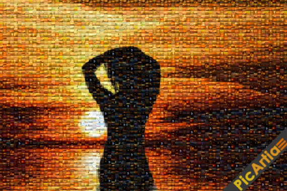
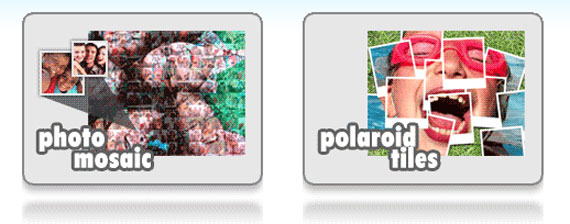
Create photo mosaic Online and Free! A powerful photo collage maker in 3 easy steps. Get your photo montage in less than 2 minutes!
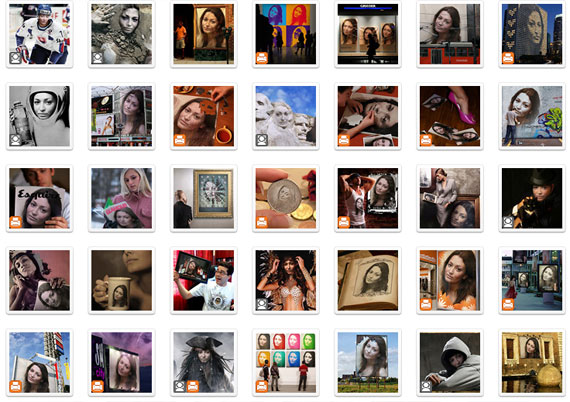
5.Photo 505
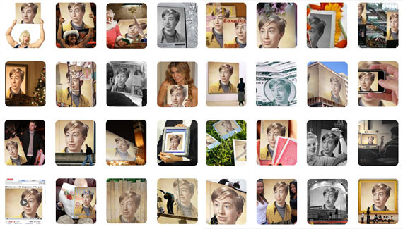
Huge collection of photo templates, which will keep You busy for quite a while.
6.Loonapix
In a few words – Loonapix is going to beautify your life. A lot more photo templates.
7.Funny Photo
Even more photo templates – just upload Your images and choose one of funny effects available!
8.Dumpr
While not all of templates are free, still there are enough to choose from.
9.WriteOnIt
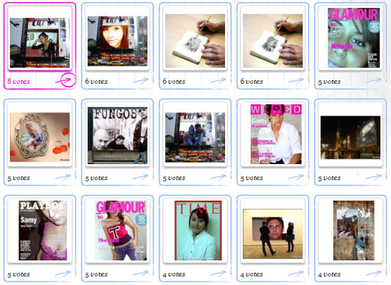
Here you can easily create your fake pictures, captions and fake magazines (Wired, Playboy, Playgirl, Glamour, Time) and other funny jokes for you and your friends.
10.MagMyPic
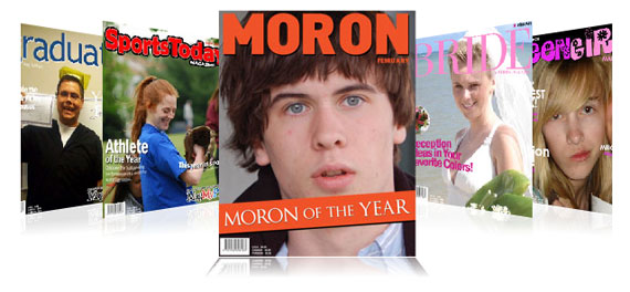
There are 30 different magazines to choose from for now. You can select any of them and make an impressive, unique, custom fake magazine with ease and Your own picture – it’s simple as that!
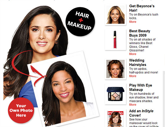
11.Hollywood Hair Virtual Makeover
Try on the hottest celebrity hair and makeup looks!
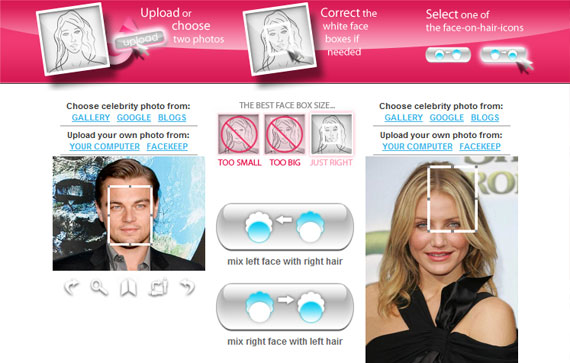
12.Hairmixer
Lovely tool and it does exatcly what it says in the image below.
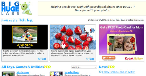
13.BigHugeLabs Flickr
Have fun with Your photos, a lot of photo editing tools available here, You don’t need any knowledge of professional photo editing programs.
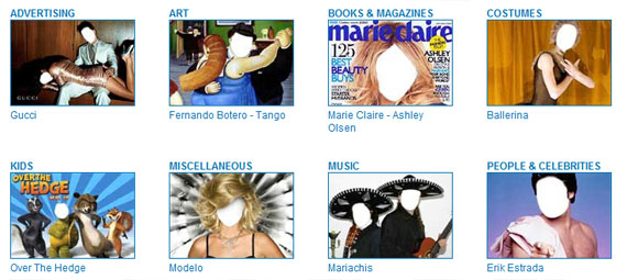
14.FaceInHole
With FACEinHOLE.com you can easily and in a matter of seconds create a totally “new look” for you and your friends. You just have to select a scenario, upload and adjust a photo (or use your webcam) and there you have it; a great FACEinHOLE that you can send to your friends, post in your blog or make available to the world.
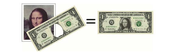
15.Personalized money
Create your own personalized money bill with Your own picther with just a click of a mouse button.
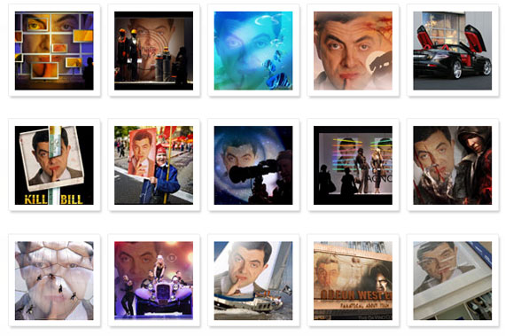
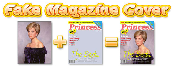
16.Fake Magazine Cover
Here you can personalize magazine covers online (no software applications to install, just use your web browser) by uploading digital photos you have on your computer.
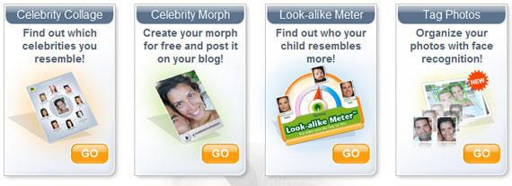
17.My Heritage Face Recognition
MyHeritage.com is one of the world’s first services to apply advanced face recognition technology to personal photos and family history; and it’s free!
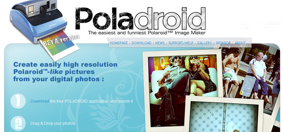
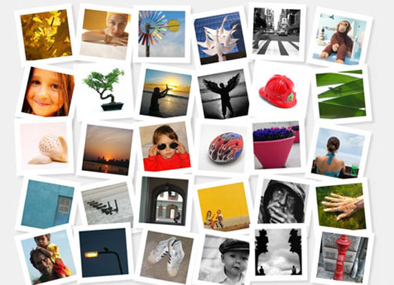
18.Poladroid – The easiest and funiest polaroid maker
Easy way how to create high resolution – polaroid like images.
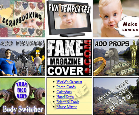
19.FotoTrix – Image Generator
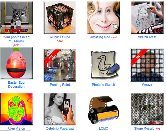
Upload a digital photo to add fun effects and novelty layouts. FotoTrix have over 2,500 templates for your digital photographs! Make it look like you had your photograph taken with a celebrity or add some goofy props to spice up your photos.
20. Picnik
Picnik makes your photos fabulous with easy to use yet powerful editing tools. Tweak to your heart’s content, then get creative with oodles of effects, fonts, shapes, and frames. It’s fast, easy, and fun.
21. JpgFun
Jpgfun is an easy-to-use free online service to edit Your photos! You can improve Your photo with different interesting and funny effects or put Your photo on a magazine cover. Mention that it is ABSOLUTELY FREE and easy as one, two, three! One more photo template resource.
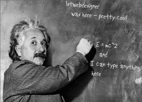
22.Dynamic Einstein picture
You can change the text on this image to whatever you like. Change the text in the form below, then click on “preview image”. The text in the image will change accordingly. You can align the text with spaces and enters.
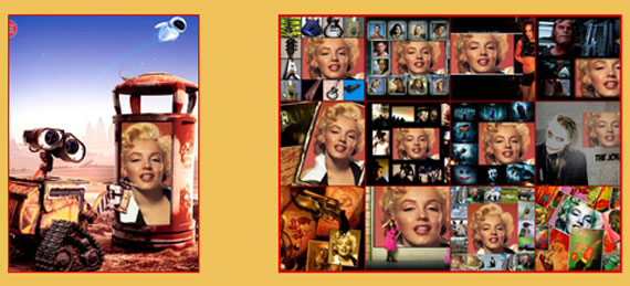
23. Photovisi
Choose from 18 photo templates and create collages from Your photos as wallpapers and more.
24. PixiSnap
Pixisnap allows you to create your own pixisnap photos in 3 easy steps: choose a mosaic type, upload your photo and customize your mosaic art.
25. Fotocrib
Fotocrib is a web based photo editing service. Fotocrib currently allows users to:
* Create montages
* Add 3D effects
* Encrypt photos
* Create rounded corners
* Convert between jpeg, png, gif, pdf and postscript formats
* Send photos to email recipients and lots more.
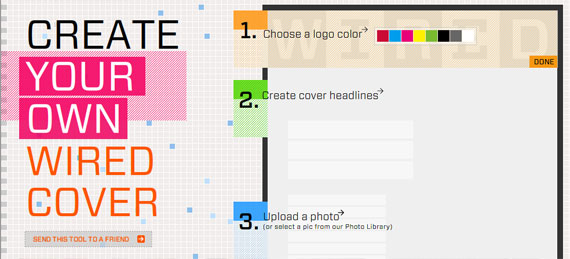
26.Create Your Own Wired Cover
Ever wanted to be on Wired magazine cover? This is Your chance! You can customize cover headlines, borders, color palette, background – fully customizable!
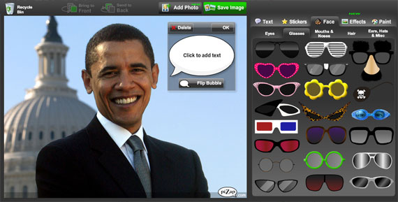
27. Pizap
Pizap is a fun free photo editor that lets people easily create wacky images with their digital pictures. PiZap was created as a tool primarily for social networking users who want to post their images to their favorite social networking sites
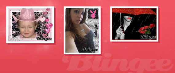
28.Blingee
Add Glitter, Graphics, and Comments to personalize your images, then share with your friends!
29.PhotoFunia
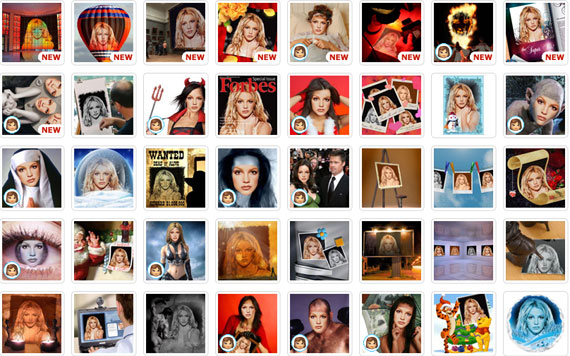
PhotoFunia is an online photo editing tool that gives you a fun filled experience. You upload any photo and just wait to see the magic. Our proprietary technology automatically identifies the face in the photo and let’s you add cool photo effects and create funny face photo montages.
PhotoFunia is free and very easy to use. Just select an effect you like from over 100 different effects, upload your photo, and PhotoFunia will handle the rest for you.
If You know more similar services – feel free to add Your link in comment so I can create even better list!
Senin, 10 Januari 2011
Tricks to Write Like Ernest Hemingway or J.B Saw Style..Even you are on Internet..

Ernest Hemingway, minimalist, good at writing. The first thing everyone will know in a skill are the basic principles and exercises which will be the foundation for the more advanced levels. Take for example the masters in martial arts, every day they practice their basic footwork, basic kicks and punches, everything basic. Why? Because mastering the fundamentals of a skill is the correct path into becoming awesome! Master the basics of writing a sentence and you’re on your way to becoming a superstar.
“Eschew obfuscation, espouse elucidation,” meaning “avoid being unclear, support being clear” as written in Wikipedia. But no matter how much you want to be clear on the things you write there will come a time when you simply can’t be clear. Why? Read on.
Problems
You know you can’t write the Hemingway style if you are experiencing the following:
1. Nothing to say

Image by: Penny Mathews
Without anything to say writing becomes slower and harder. You are forced to blabber around for the sake of producing something. Sometimes even becoming redundant. But redundancy has its good effects too, Ernest Hemingway uses it with some of his short stories and they add color to the whole story.
Now, my dear readers, the above paragraph is an effect of having “nothing to say” for this item. Notice that the fourth sentence has nothing to do with “nothing to say”. Do not imitate this very bad example. *laughs*
2. Unable to express
When trying to explain something complicated people tend to use complicated terms for the sake of expressing it. No matter how great your vocabulary is, if your readers can’t connect with the things you say you’re not effective, they will leave.
Not being able to express a thought in a word or two results to a convoluted difficulty in understanding.
3. Word count, so important

Image by: Brenton Nicholls
Writers who are paid per words written will not benefit from this article mainly because this article’s conception is to minimize the use of words as much as possible to attain the highest quality possible through minimalism. However, there is a way. If your quota is 1000 words, write 1500 and eliminate 500.
If you are used to using many qualifying words, flowery adjectives, and would want to reduce that for better quality then this article is for you.
Solutions
How to write a simple, exact, and great article the Hemingway style.
1. Use Simple Sentences

Image by: Dani Simmonds
You are writing either because you want to explain something or tell a story. The best way for people to understand what you write is to avoid using complicated sentences. The shorter the better. Use words that won’t make the reader reach for a dictionary.
Contrary to my writing tips number 2 “if there’s a word for it, use it” and tip 5 “strong words, strong memory” do not use strong and exact words if these words are hard to understand. You know, ninja-level words.
If you have seen any of Discovery Science’s shows you will never feel “left behind” even if the topic is about hyperspace and wormholes (…what?) you will understand everything that the narrator and scientists say without having to grab a dictionary. Why? Because they are well-versed in using simple sentences to convey even the most complicated topic. If the topic they are dealing with is far complex than yours, does it not make sense if your sentences are easier to simplify?
Have you read Wuthering Heights? I did and I experienced brain hemorrhage, took me quite some time to love it. The book.
2. Be Positive

Image by: Jonathan Natiuk
Instead of saying “it is hard to walk into Mordor” say “one does not simply walk into Mordor”. The word “simply” gave a lighter feeling in the sentence. No wonder Tolkien made it that way.
Instead of saying “beware of dogs” say “not safe, dogs bite”. The word beware gives everyone chills.
Now why is it important to write positive? Writing in a positive tone does not mean eliminating the use of negative words, it means making the tone lighter. This works when writing instructional articles. The lighter the tone is, the better the readers grasp the ideas presented.
3. Do not be afraid to omit things

Image by: Zsuzsanna Kilian
There are things that require no explanation, just like when I said “use words that won’t make the reader reach for a dictionary”, most of you automatically know why even if I did not explain the reason behind it. That is the beauty of simplicity. You can tell people without actually telling them. How? Below:
- Use negative words (as opposed to tip 2) to express a positive idea like “suffocating colors” denotes “please change the dark colors to lighter ones, I don’t like it.” Nobody wants anything that is suffocating, saying the word expresses dislike.
- Figures of speech to explain complicated stuffs, eliminating technicalities. Analogy is a good example.
- Sometimes you’ll just have to give hints and let the readers form the connection, also saves you the trouble of explaining things when you can’t be so direct to the point to avoid over-explaining things. An example is “early to bed and early to rise, makes a man healthy, wealthy, and wise.”
4. “Write drunk; edit sober.”

Write drunk; edit sober? Just don’t take it literally, you can write great without being drunk, yet.
Write everything related to your topic and leave it for a while, edit later. This is important because you are then giving yourself time to think. This is usually what I do before submitting my articles. After a day of not seeing my article I’ll begin re-reading it and find things that are not supposed to be there, things missing, modifying, and the likes.
5. Integrate with your style
You already have your own style of writing and I’m not suggesting that you abandon it, instead you should integrate it with these tips as you see fit. These tips should be applied when deemed necessary, depending on the audience. For instructions and tips like this article it is best to write simple. But I’m not saying that I have written this thing well, in fact I’m still on the process of making my writing “simple” with a personal touch.
Reasons to write simple
As writers of the online community we only have one goal and that is to give people what we know, to give back and let the process continue. Gone were the days when precious information was kept from the public, when textbooks were only for the high class. Many would agree with me when I say that those written information are still subject to many interpretation and decryption simply because no one understands! Those were the days when the worth of an author lies with how complicated the sentence’s structure is and on deep vocabulary. If we want to inform we need be clear in everything we want to say in order for us to be not subject to misinterpretation.
- To avoid misunderstanding
- To make information easy to recall
- Because you write to inform, not riddle people
Have you ever experienced in your school days when you have something to read for a homework or project but in the most ill of luck you can’t understand a single thing from the encyclopedia? Not fun, right?
The Role of Web Design to Bounse Back the Traffics to your Site..
One thing a blogger or an owner of a website needs to take into consideration of is its bounce rate. This is very important for it tells you on how many visitors are “bouncing” away on your site. A bounce rate determines the success or failure of a website.
Wikipedia defines bounce rate as:
A term used in web site traffic analysis. It essentially represents the percentage of initial visitors to a site who “bounce” away to a different site, rather than continue on to other pages within the same site.
Image by: ddablogimages
With this definition, we may say that the lower the bounce rate of your website is, the better. For this means that visitors are exploring more through your website’s content.
Reasons on Having High Bounce Rate
These are the common reasons why a website may have a high bounce rate:
1. Loading and Error Issues
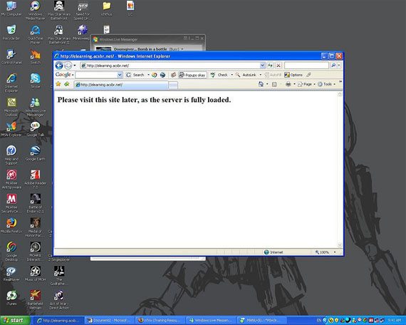
Viewers are impatient when it comes in loading a website. If it takes too long to load, users tend to just close the window or find another site related on what they are looking for.
Image by: Doomgiver…
Few Reasons That Can Slow The Loading Performance of your Website:
- Too much Flash effects.
- Huge sizes of images.
- Videos that automatically buffers.
- More requests submitted on the server.
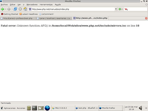
Have you experienced where you went to a site and all you see is a code instead of the content that was supposed to be shown on the screen? Of course you will feel bad about it, so you just close it and find another website.
Image by: pneff
2. Poor Web Content
Another element viewers are looking for on a website is a good content. Good and enticing content gives your viewers a drive to read more and explore your site from one page to another.
Here are some characteristics a web content must have:
- Well-Informed
Viewers are good at recognizing if a website offers a well-informed content, for they are trying to find the most relevant and quality content related on what they are looking for. Put all the relevant information that is needed by all kinds of viewers. Also, always start from the most significant information. Your text is one way of promoting your site, so your better put relevant information on your content.
- Well-Written
Grammar is very important to consider in writing an effective web content. When viewers see that your content is in good grammar, it gives them an impression that you are knowledgeable. A content that is well-written tend to bring viewers back again and again on the site. Also, it must be constructed well to give a professional look on your content.
- Brief and Precise
Your viewers are impatient to read a lot, and they are always excited to have the information they want and go on. Make sure your content is brief, maybe at least 300 words and 600 at most. Also, you should balance your content to have a brief yet well-informed content.
It should also be precise. Your site’s content must give a clear explanation on what you want to convey.
- Interesting and Entertaining
Even contents must be interesting to the eyes of your viewers and must give an entertainment. In this way, your viewers will have that excitement to read and explore on what your website offers. This also lessen the boredom they would feel even they are purely reading a text.
- Original and Unique
Originality and uniqueness matter in everything.
Originality makes your content, as well as, your website to stand out from the rest of other related websites as yours. You can get ideas from others but never copy the same content.
Also, viewers does not want to read a content that is the similar with the most. They always want something new. Always try to put a twist on what idea you have in mind to make it unique.
- Relevant and Attractive Headings
Headings are very important, because these are the first phrase your viewers will read. It should be relevant, where it directly describes your topic and if possible sums up everything you write. It should be attractive and drives curiosity on your viewers.
3. Poor Web Design
There are a lot of ways where you can decrease the amount of your bounce rate. But before anything else, start from the thing where you have all the control on what to choose from. Start decreasing your bounce rate by designing your website properly.
The design of a website is a great factor where you can decrease your website’s bounce rate. I have here the different components of a website and some tips on each to help you in getting a lower amount of bounce rate:
Domain Name
Image by: piestobis
A domain name is a combination of letters, symbols or numbers that labels an entity on the Internet. It should be specific, unique and captivating. Remember that your domain name must reflect on what you are advertising for.
- It should be brief. One or two words with five to eight letters could be enough for your domain. Viewers does not want to type a long URL, this annoy them so much.
- It should be easy to remember. Your domain name is your trademark that reminds your viewers that this name has this kind of website.
- It should not be complicated. Do not make it too complicated to pronounce and understand, so your viewers will easily remember your address.
Web Interface
A website with a boring design makes viewers look like this:
Image by: Chelsea
I know you don’t want your viewers to feel bored when viewing your site. Each viewers are expecting an attractive web design to make them feel excited to explore.
Usability is also one factor viewers are expecting on a website. A site with a user-friendly interface and navigation is a thumbs up on your viewers. This gives them comfort in browsing your website.
Creativity should also include on your component when we are talking about web interface. A beautiful background can attract viewers to explore your website, just make sure that your background is related to what you are promoting for. Also, never use more than one background on each page. This gives a thought to your users that when a background changes, they are stepping on another website.
Image by: Donna *deestea*
Colors are also one way of bringing your viewers to go on your web page onto the other. Capture their attention by using attractive colors that is relevant on what you promote. Never use bright colors, this can irritate their eyes. Also, choose a color combination that could reflect your business or personality.
Header
The first things your viewers may notice on your site is the header. Today, many websites have artistic or creative headers. In this way, you catch your viewers’ enjoyment and able to explore your website. So if your website does not have a nice header, they just tend to leave your website.
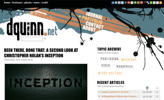
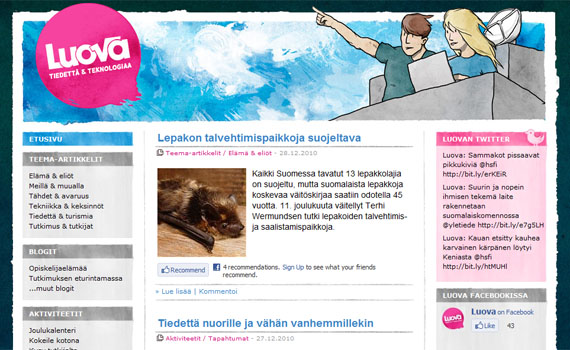
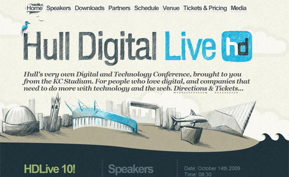
Take a look at these websites that have attractive headers:
Navigation
Navigation is very important on your website and for your viewers, this is their way on browsing the rest of your pages. So, if your navigation is not well-designed your viewers will just “bounce” away on other site.
A navigation should be:
- Noticeable. As what I have mentioned awhile ago, navigation is your viewers’ way to explore your website. Making them easily noticed gives your viewers the urge and curiosity to “bounce” on one page to another. The color of your buttons must contrast your background’s color, so it can be easily noticed.
- Easy to understand. Navigation must be easy to understand by your viewers. The moment they see it, instantly they should know on how the navigation works.
- Attractive. One component of a website that could capture viewers’ attention is with your navigation. Make your buttons attractive by putting a hover and a release effect. Putting sound effects may attract too.
Here are some examples of websites with well-designed navigation:
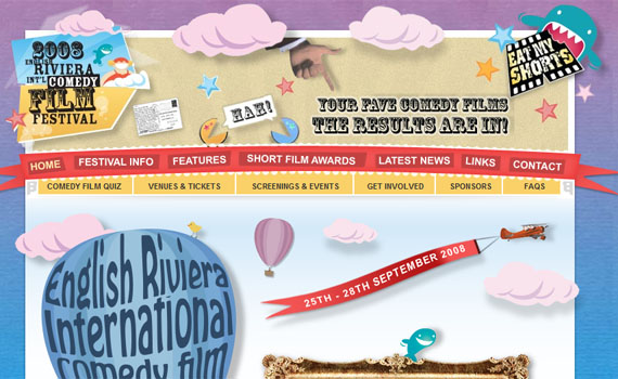
The web design itself is creatively designed. With the navigations, they are put into contrast colors to make them noticeable.
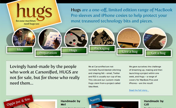
This is a good concept where links are separated by using different images and circles. In this way, viewers already have an idea on what to expect when they click a button. A well-designed navigation indeed.
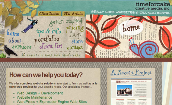
I find the navigations so unique to put it as a list and the font used are very attractive.
Typography
Typography plays a big role in conveying a message on your site. You can use typography when you want to focus on something. Here are some tips when it comes to choosing your fonts:
- Readable
If your viewers find it hard for them to read your text, they would just close the window or find another website. Make sure you fonts are in a size where it can be read properly. Most designers use 12px for the body text and H2 for the header.
- Appropriate
Be appropriate. For instance, if you are creating a website for a company it would be better if you
- Creative
Did you know that you can be creative evener with the fonts you are using? Yes you can. For instance, if you want to emphasize something you can put your fonts in bold letters. If you want to put more life on your site, use lively font colors. Just make sure it still look readable and professional.
Here are some websites with a good typography:
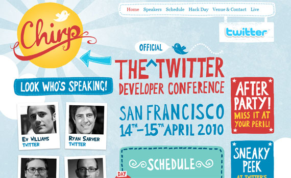
The fonts are creatively done. I like how the designer use typography to make the website look attractive.
The fonts are very readable and clean. Make sure you put your font colors in contrast to the color of your background.
Even there are several fonts used on this site, I still find it very clean and well-designed.
Media
Putting media is a great way in attracting viewers. When they got attracted, they tend to explore more of your site.
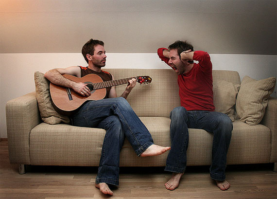
- Audio
Image by: Northwest Folklife
Music is relaxing, but not appropriate for a website. It is not good to put a music on a website. First, it adds to the loading. Second, it can annoy your viewers. There is an appropriate place for music, but it is not for a website.
If you want, you may use sound effects but do not put too much. It will make the website look unprofessional.
- Images
Image by: ArtsySF ©
Images are great way in attracting viewers. Research says that viewers are more into viewing images than reading.
-
- Put images but be sure they are related on your content.
- Do not put images that is too large in size.
- Pure texts can be boring, as well as pure images. Combining the two can make your website look good.
If you are promoting a product, you can post a picture of that product. This is a good way of informing your viewers on what your product looks like.
- Videos
Image by: Rhor
It is okay to put videos, just make sure that they are related. Also, do not put it in an automatically played setting. This makes the website load slowly.
Balancing media and text is equal to a perfect web content.
Here are also some of the components you must have and must not have on a website to reduce your bounce rate’s amount.
Image by: Snæþór Halldórsson
These are the things viewers might consider as distraction when viewing a website:
- Automatic Pop Ups
- Scrolling Texts
- External Toolbars
- Automatic Downloads
Never put these on your website. I tell you, your viewers might get annoyed or distracted and just leave your site.
External Links
Image by: Courtney Bolton
External links are hyperlinks on your website’s page where will lead you to another website.
As the definition says, it leads on another website. This is not your purpose, your purpose is your viewers to stay on your website as long as possible. So, avoid putting too much external links on your site to avoid high bounce rate.
Interaction
Interaction between you and your viewers is a good way on letting them be back again on your site. For bloggers, interactions can be a great way to give a good amount of bounce rate on your blog.
Here are some ways to create an interaction on your site:
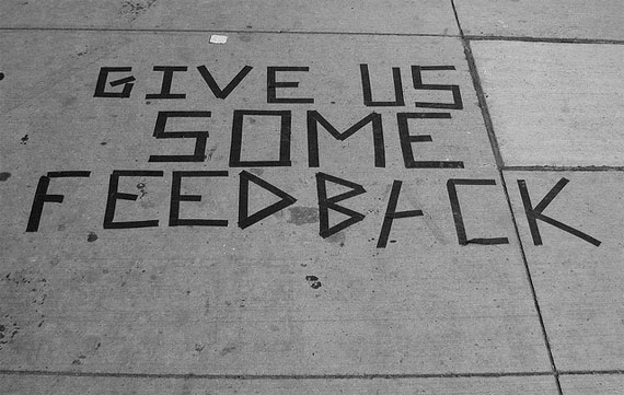
- Feedbacks
Feedbacks are good ways to know on what your viewers or clients think of what you advertise. In this way, you will know what they like and they don’t. This also gives an impression that what they say are important to you.
Image by: Jorie O’Brien
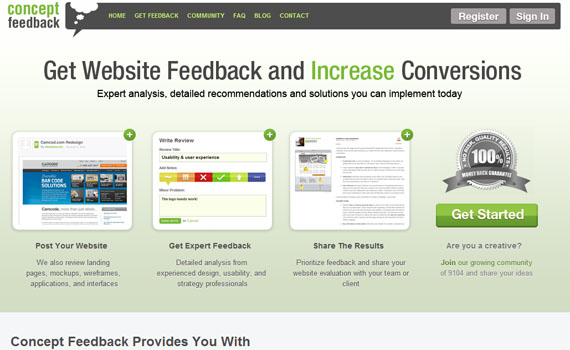
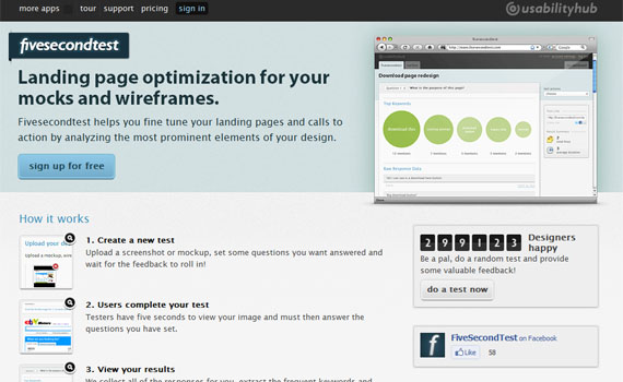
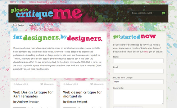
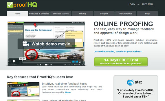
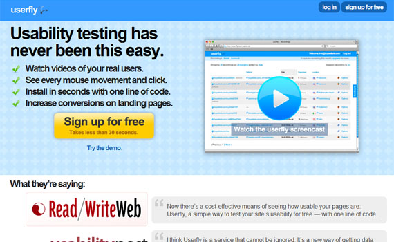
There are a lot of tools you may purchase on the web in collecting feedback on your site. Here are some of them:
- Comments
Comments build communication and relationship between you and your readers. The more interactive your site is, the faster it will become popular.
Image by: premasagar
I have here some comment system you can use on your website or blogs.
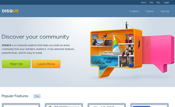
In our blog, we are using Disqus. Disqus is a platform that can help you build an active community within your website.
Features:
- Realtime comment system
- Social integration
- The Community Box
- Connected communities
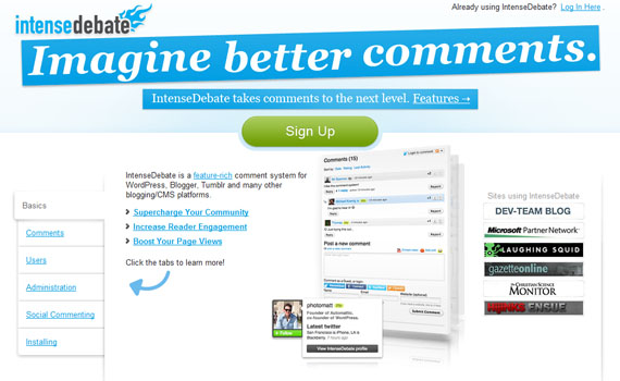
A comment system for WordPress, Blogger, Tumblr and other blogging and CMS platforms.
Some features it has:
- Commenter Profiles
- Reply-by-Email
- Comment Threading
Click here to see more of what it can offer.
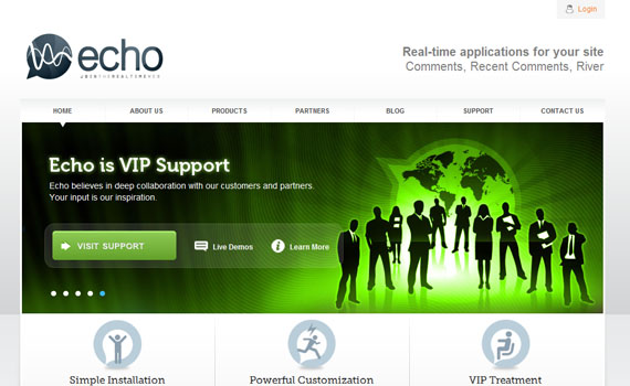
Publishers can quickly embed Echo on any site and turn their static pages into a real-time stream of Diggs, tweets, Facebook updates, comments and more.
Features:
- Increase Traffic
- Increase Engagement
- Increase Time Spent
Web design plays a big part in gathering a good bounce rate. All you have to do is to attract while advertising your own or your business. Attract while advertising. Advertise and inform.
Your Thoughts
What about you? Do you have anything to share regarding this? Feel free to share it on the Comment section.
Langganan:
Postingan (Atom)