One thing a blogger or an owner of a website needs to take into consideration of is its bounce rate. This is very important for it tells you on how many visitors are “bouncing” away on your site. A bounce rate determines the success or failure of a website.
Wikipedia defines bounce rate as:
A term used in web site traffic analysis. It essentially represents the percentage of initial visitors to a site who “bounce” away to a different site, rather than continue on to other pages within the same site.
Image by: ddablogimages

With this definition, we may say that the lower the bounce rate of your website is, the better. For this means that visitors are exploring more through your website’s content.

Reasons on Having High Bounce Rate
These are the common reasons why a website may have a high bounce rate:
1. Loading and Error Issues
Viewers are impatient when it comes in loading a website. If it takes too long to load, users tend to just close the window or find another site related on what they are looking for.
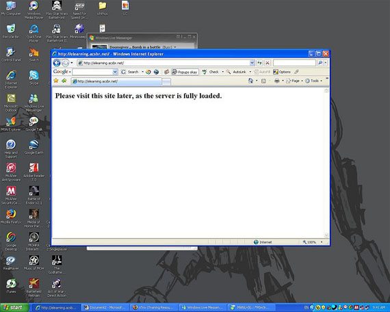
Image by: Doomgiver…
Few Reasons That Can Slow The Loading Performance of your Website:
- Too much Flash effects.
- Huge sizes of images.
- Videos that automatically buffers.
- More requests submitted on the server.
Have you experienced where you went to a site and all you see is a code instead of the content that was supposed to be shown on the screen? Of course you will feel bad about it, so you just close it and find another website.
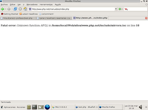
Image by: pneff
2. Poor Web Content
Another element viewers are looking for on a website is a good content. Good and enticing content gives your viewers a drive to read more and explore your site from one page to another.
Here are some characteristics a web content must have:
- Well-Informed
Viewers are good at recognizing if a website offers a well-informed content, for they are trying to find the most relevant and quality content related on what they are looking for. Put all the relevant information that is needed by all kinds of viewers. Also, always start from the most significant information. Your text is one way of promoting your site, so your better put relevant information on your content.
- Well-Written
Grammar is very important to consider in writing an effective web content. When viewers see that your content is in good grammar, it gives them an impression that you are knowledgeable. A content that is well-written tend to bring viewers back again and again on the site. Also, it must be constructed well to give a professional look on your content.
- Brief and Precise
Your viewers are impatient to read a lot, and they are always excited to have the information they want and go on. Make sure your content is brief, maybe at least 300 words and 600 at most. Also, you should balance your content to have a brief yet well-informed content.
It should also be precise. Your site’s content must give a clear explanation on what you want to convey.
- Interesting and Entertaining
Even contents must be interesting to the eyes of your viewers and must give an entertainment. In this way, your viewers will have that excitement to read and explore on what your website offers. This also lessen the boredom they would feel even they are purely reading a text.
- Original and Unique
Originality and uniqueness matter in everything.
Originality makes your content, as well as, your website to stand out from the rest of other related websites as yours. You can get ideas from others but never copy the same content.
Also, viewers does not want to read a content that is the similar with the most. They always want something new. Always try to put a twist on what idea you have in mind to make it unique.
- Relevant and Attractive Headings
Headings are very important, because these are the first phrase your viewers will read. It should be relevant, where it directly describes your topic and if possible sums up everything you write. It should be attractive and drives curiosity on your viewers.
3. Poor Web Design
There are a lot of ways where you can decrease the amount of your bounce rate. But before anything else, start from the thing where you have all the control on what to choose from. Start decreasing your bounce rate by designing your website properly.
The design of a website is a great factor where you can decrease your website’s bounce rate. I have here the different components of a website and some tips on each to help you in getting a lower amount of bounce rate:
Domain Name
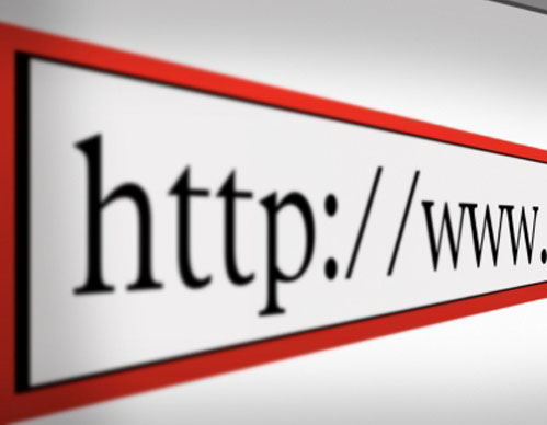
Image by: piestobis
A domain name is a combination of letters, symbols or numbers that labels an entity on the Internet. It should be specific, unique and captivating. Remember that your domain name must reflect on what you are advertising for.
- It should be brief. One or two words with five to eight letters could be enough for your domain. Viewers does not want to type a long URL, this annoy them so much.
- It should be easy to remember. Your domain name is your trademark that reminds your viewers that this name has this kind of website.
- It should not be complicated. Do not make it too complicated to pronounce and understand, so your viewers will easily remember your address.
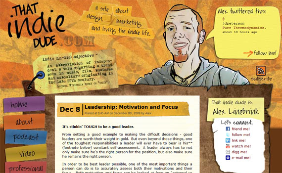
Web Interface
A website with a boring design makes viewers look like this:

Image by: Chelsea
I know you don’t want your viewers to feel bored when viewing your site. Each viewers are expecting an attractive web design to make them feel excited to explore.
Usability is also one factor viewers are expecting on a website. A site with a user-friendly interface and navigation is a thumbs up on your viewers. This gives them comfort in browsing your website.
Creativity should also include on your component when we are talking about web interface. A beautiful background can attract viewers to explore your website, just make sure that your background is related to what you are promoting for. Also, never use more than one background on each page. This gives a thought to your users that when a background changes, they are stepping on another website.

Image by: Donna *deestea*
Colors are also one way of bringing your viewers to go on your web page onto the other. Capture their attention by using attractive colors that is relevant on what you promote. Never use bright colors, this can irritate their eyes. Also, choose a color combination that could reflect your business or personality.
Header
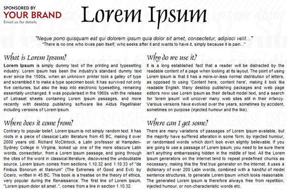
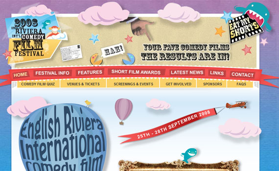
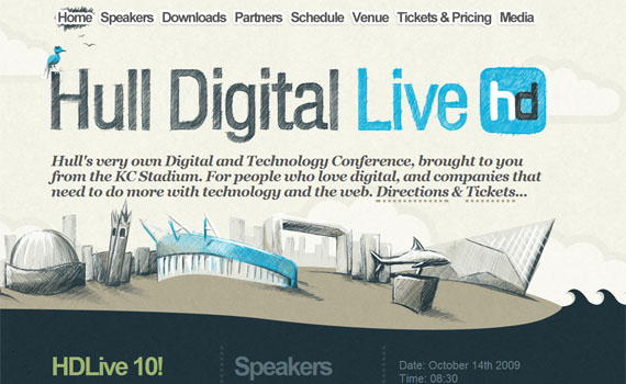
The first things your viewers may notice on your site is the header. Today, many websites have artistic or creative headers. In this way, you catch your viewers’ enjoyment and able to explore your website. So if your website does not have a nice header, they just tend to leave your website.
Take a look at these websites that have attractive headers:
Navigation
Navigation is very important on your website and for your viewers, this is their way on browsing the rest of your pages. So, if your navigation is not well-designed your viewers will just “bounce” away on other site.
A navigation should be:
- Noticeable. As what I have mentioned awhile ago, navigation is your viewers’ way to explore your website. Making them easily noticed gives your viewers the urge and curiosity to “bounce” on one page to another. The color of your buttons must contrast your background’s color, so it can be easily noticed.
- Easy to understand. Navigation must be easy to understand by your viewers. The moment they see it, instantly they should know on how the navigation works.
- Attractive. One component of a website that could capture viewers’ attention is with your navigation. Make your buttons attractive by putting a hover and a release effect. Putting sound effects may attract too.
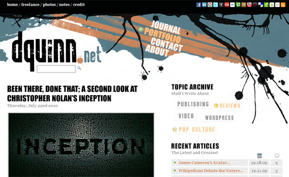
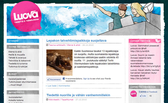
Here are some examples of websites with well-designed navigation:
The web design itself is creatively designed. With the navigations, they are put into contrast colors to make them noticeable.
This is a good concept where links are separated by using different images and circles. In this way, viewers already have an idea on what to expect when they click a button. A well-designed navigation indeed.
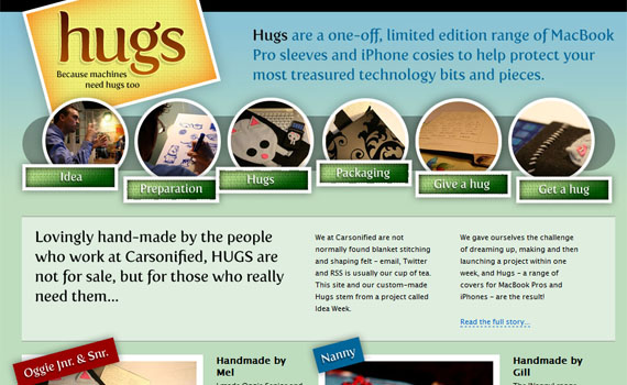
I find the navigations so unique to put it as a list and the font used are very attractive.
Typography
Typography plays a big role in conveying a message on your site. You can use typography when you want to focus on something. Here are some tips when it comes to choosing your fonts:
- Readable
If your viewers find it hard for them to read your text, they would just close the window or find another website. Make sure you fonts are in a size where it can be read properly. Most designers use 12px for the body text and H2 for the header.
- Appropriate
Be appropriate. For instance, if you are creating a website for a company it would be better if you
- Creative
Did you know that you can be creative evener with the fonts you are using? Yes you can. For instance, if you want to emphasize something you can put your fonts in bold letters. If you want to put more life on your site, use lively font colors. Just make sure it still look readable and professional.
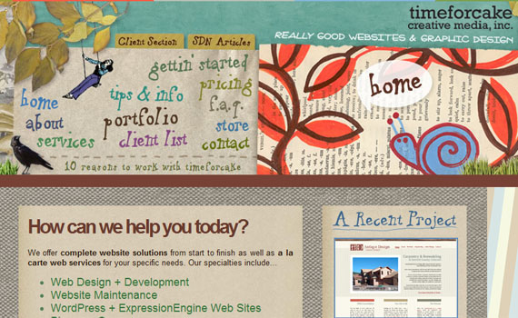
Here are some websites with a good typography:
The fonts are creatively done. I like how the designer use typography to make the website look attractive.

The fonts are very readable and clean. Make sure you put your font colors in contrast to the color of your background.
Even there are several fonts used on this site, I still find it very clean and well-designed.
Media
Putting media is a great way in attracting viewers. When they got attracted, they tend to explore more of your site.
- Audio

Image by: Northwest Folklife
Music is relaxing, but not appropriate for a website. It is not good to put a music on a website. First, it adds to the loading. Second, it can annoy your viewers. There is an appropriate place for music, but it is not for a website.
If you want, you may use sound effects but do not put too much. It will make the website look unprofessional.
- Images
Image by: ArtsySF ©
Images are great way in attracting viewers. Research says that viewers are more into viewing images than reading.
-
- Put images but be sure they are related on your content.
- Do not put images that is too large in size.
- Pure texts can be boring, as well as pure images. Combining the two can make your website look good.
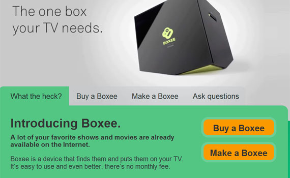
If you are promoting a product, you can post a picture of that product. This is a good way of informing your viewers on what your product looks like.
- Videos
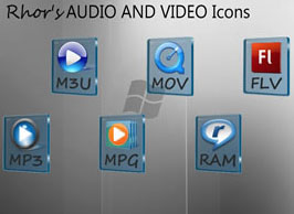
Image by: Rhor
It is okay to put videos, just make sure that they are related. Also, do not put it in an automatically played setting. This makes the website load slowly.
Balancing media and text is equal to a perfect web content.
Here are also some of the components you must have and must not have on a website to reduce your bounce rate’s amount.
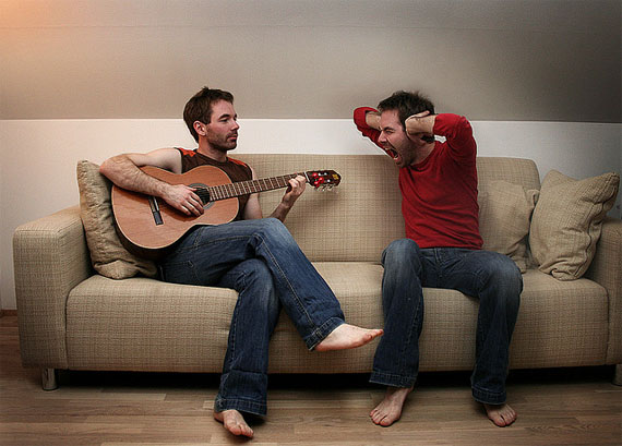
Image by: Snæþór Halldórsson
These are the things viewers might consider as distraction when viewing a website:
- Automatic Pop Ups
- Scrolling Texts
- External Toolbars
- Automatic Downloads
Never put these on your website. I tell you, your viewers might get annoyed or distracted and just leave your site.
External Links
Image by: Courtney Bolton
External links are hyperlinks on your website’s page where will lead you to another website.
As the definition says, it leads on another website. This is not your purpose, your purpose is your viewers to stay on your website as long as possible. So, avoid putting too much external links on your site to avoid high bounce rate.
Interaction
Interaction between you and your viewers is a good way on letting them be back again on your site. For bloggers, interactions can be a great way to give a good amount of bounce rate on your blog.
Here are some ways to create an interaction on your site:
- Feedbacks
Feedbacks are good ways to know on what your viewers or clients think of what you advertise. In this way, you will know what they like and they don’t. This also gives an impression that what they say are important to you.
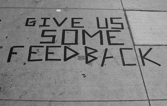
Image by: Jorie O’Brien
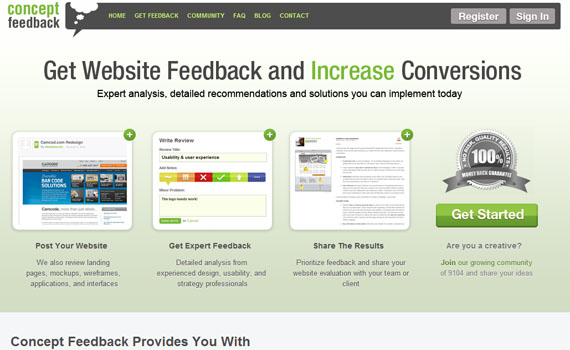
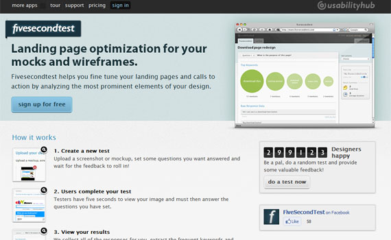
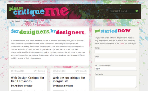
There are a lot of tools you may purchase on the web in collecting feedback on your site. Here are some of them:
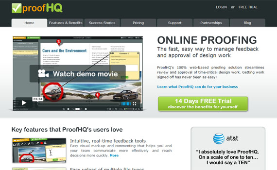
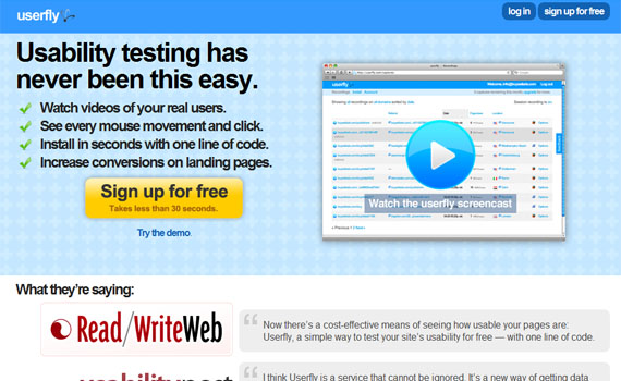
- Comments
Comments build communication and relationship between you and your readers. The more interactive your site is, the faster it will become popular.
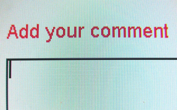
Image by: premasagar
I have here some comment system you can use on your website or blogs.
In our blog, we are using Disqus. Disqus is a platform that can help you build an active community within your website.
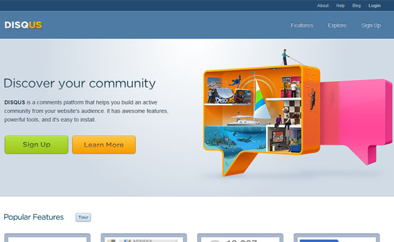
Features:
- Realtime comment system
- Social integration
- The Community Box
- Connected communities
A comment system for WordPress, Blogger, Tumblr and other blogging and CMS platforms.
Some features it has:
- Commenter Profiles
- Reply-by-Email
- Comment Threading
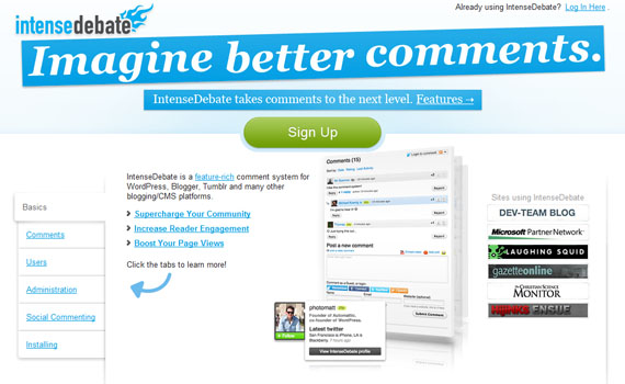
Click here to see more of what it can offer.
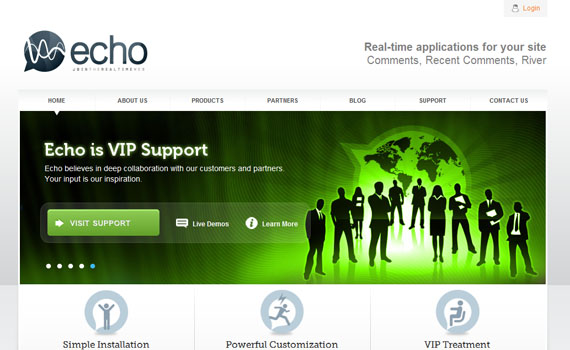
Publishers can quickly embed Echo on any site and turn their static pages into a real-time stream of Diggs, tweets, Facebook updates, comments and more.
Features:
- Increase Traffic
- Increase Engagement
- Increase Time Spent
Web design plays a big part in gathering a good bounce rate. All you have to do is to attract while advertising your own or your business. Attract while advertising. Advertise and inform.
Your Thoughts
What about you? Do you have anything to share regarding this? Feel free to share it on the Comment section.

Tidak ada komentar:
Posting Komentar