
One of the most popular tutorials we’ve published here at CreativeFan was our ‘Create a Vibrant Colorful Alcohol Product Ad‘, which covered some fun effects that you can create using liquids. We decided to revisit the concept of using liquids for a product ad, and this time show you some more effects and techniques you can use in your designs and photomanipulations to create eye-catching artworks.
In this Photoshop tutorial, you’ll learn how to create a Sobe fruit drink advertisement using some simple water stock images and a lot of easy to use techniques that will yield high quality results.
As always, we love hearing feedback and suggestions from you, so please, if you want to see a tutorial on a given effect, let us know by using the contact form or leaving a comment!
Tools used:
- Adobe Photoshop
- Various stock images
- Wacom, not required
Final Image Preview:
Step 1: Water stock selection.
To start off you will need a water stock. You can choose any stocks you like but its best if choose one that has a lot of movement. I obtained my stock from ShutterStock, but if you don’t want to go that route there are plenty of other stock sites to choose from such as Sxc, Deviantart or even Google images and Wiki Commons. The stock image I used is below.
Once you obtain your stock, if it is on a black background you will need to go ahead and invert it since we will be using a white canvas. If need be, clean up any spots that aren’t the way you want them and then we can continue on.
Step 2: Fruit manipulation
*Note that from this point on I will assume that you are using the same stock I am.*
Ok, so now that we have our water stock and we changed the blending mode to multiply we can continue on with or design. So now we need to start dropping in a few fruits. Our first stock will be a cherry located on SXC. http://www.sxc.hu/pic/l/l/lo/lockstockb/977595_29456105.jpg

Now we need to isolate out just the cherry. To do this you should use whatever your most comfortable with, I used a layer mask and the paint brush. Once the stock is isolated drop it into your canvas and place it somewhere you think looks nice!

Now we will take our hard edged eraser (size 25) and erase away a section of the cherry to give the effect that it is under water. But before doing this make a duplicate of your cherry and set it to overlay and hide it.

Now that you have erased out a section of the cherry turn your overlay layer back on and erase all of the cherry that is out of the water. This way the overlay layer is only showing were the original cherry was erased.

Once you have done that we can proceed to get our next stock image. This time we will be using a orange, which like the last image, is also located on SXC. http://www.sxc.hu/pic/l/l/lo/lockstockb/1097244_46620521.jpg

We will be using the orange on the left hand side. So once you have copied it into your canvas its time to go ahead and isolate it out.
This time I placed my orange near my cherry. I didn’t think that it needed the above process done so I left it as is. However this was largely due to the placement, if you think your orange needs to be given the underwater treatment (see above) then by all means go ahead.

Now once again, we can head over to SXC to grab another stock, this time a banana. http://www.sxc.hu/pic/l/b/br/brokenarts/229578_9291.jpg

Once you have your banana proceed to isolate it out as we have done with our prior fruits.

Since I placed my banana by a ‘lip’ in the water we will erase the banana as we did with the cherry but we will not apply a overlay layer. If you are placing yours in a area that appears as if it should have the overlay layer then by all means do so.

Next we will be using a water melon located at: http://www.sxc.hu/pic/l/u/ug/ugaldew/494856_83457949.jpg
Once you have obtained the water melon stock go ahead and isolate it out. Once that is done just drop it under your water layer and move it to one of the more transparent sections. Since our water layer is set to multiply our water melon should still be visible.

Now we need to continue this process. You will want to place down a ton of fruit so below I have a list of wonderful stock images you can use to drop into your water arrangement. So just repeat the above steps until your canvas starts to fill up and then we can continue on to the next step.
Fruit Stocks:
- http://www.sxc.hu/photo/1197407
- http://www.sxc.hu/photo/372777
- http://www.sxc.hu/photo/16742
- http://www.sxc.hu/photo/1091647
- http://www.sxc.hu/photo/1091647
- http://www.sxc.hu/photo/229996
- http://www.sxc.hu/photo/229996
- http://www.sxc.hu/photo/1091635
- http://www.sxc.hu/photo/1097401
- http://www.sxc.hu/photo/984621
- http://www.sxc.hu/photo/794728
- http://www.sxc.hu/photo/1123415
- http://www.sxc.hu/photo/991581
- http://www.sxc.hu/photo/486214
- http://www.sxc.hu/photo/386645
- http://www.sxc.hu/photo/261060
- http://www.sxc.hu/photo/1152194
- http://www.sxc.hu/photo/1091639


You can see in the above and below screen shots that I have sized my fruits randomly, this is key to create something that does not appear ‘repetitive’.


Also place a few large fruit around the canvas and apply a Gaussian blur with a radius of about 9 as I have done in the below screen shots. This will help to achieve a depth of field which will make our design more interesting in the end.


Step 3: Water saturation
Now we will be changing the colors of our water just a tad. This will help make the piece more vibrant and also help blend everything into one cohesive mesh.So to start off we will grab our brush tool and set it up as I have below.

Then we will grab a few colors (since our water is blue I used mainly green, purple, orange and blue for this) and draw all over the water. This should be done on a layer that is under the fruit layers. Any fruits that are under the water layer will just have to be colored along with it!

Now we can apply a light Gaussian blur (something around a radius of 25) and then set the opacity to something around 50%-100%, depending on how dark you want your colors. Also be sure to use an eraser and clean up any of the coloring that is not under the water!

Now we can repeat this process a few times (depending on what your looking for) and also play with the colors more.


Once you are done with your coloring we can continue on to the next step. At this point my canvas looks like the below image.

Step 4: Sketching and line work.
Now we can start our line work and sketching. Here at CreativeFan we have discussed (at nauseam) how to create the line effects used in this piece along with how I sketch (which will also be used). So if your unsure of how to create these effects, below are two links (tutorials by me!) which I suggest you read before continuing on.http://design.creativefan.com/create-a-cosmic-xbox-using-custom-brushes/
http://design.creativefan.com/create-a-shattering-3d-composition-using-sketching-techniques/
Now that you are well versed in how we create the lines that we will be using its time to get started! I used both techniques (sketching and shear tool) at the same time and suggest that you do the same. Start off by placing a few lines around some of your shapes, have some of the lines over cross the shape.


It’s also important to vary your colors, as you will see in the below screen shot I used red even though the banana is yellow. This is of course not to say that later on you don’t want to use an orange line on an orange though, it’s just food for thought, the more diverse your design is the better the end outcome will be!


It’s also nice to just add some diversity to your line work in other ways aside from color. For instance in the below screen shot I drew a drip with the standard hard brush, its not difficult to do, but it adds more diversity than just a simple line so I would suggest you experiment with this as well.

Step 4.5: line work continued and splatters introduced.
Splats as well as line work has also been beaten to death and there’s no reason to keep beating a dead horse. So if you do not have any splat/brush stroke brushes check out the below tutorial before continuing on.http://design.creativefan.com/combining-custom-brushes-for-wild-effects-in-photoshop/
Now while continuing our sketching and line work we can also start to throw down some splats. Like the line work this is were we can bring in new colors and make our design more exciting to the viewer. I started off by creating a new layer, just for splats, under the sketch/line layer. Once you have created a new layer to cater to your splats, just start dropping some splats on your fruits and water areas. Be sure that you don’t hide anything when doing this step. We don’t want to take anything away from our design ever, just add to it. I started off by splattering the water melon rein (with green), throwing some blue on top of my banana and apply a small brush to the orange.

Now continue to draw lines and use your shear lines but also drop a splat in or two along the way. I added in a few low opacity lines and then applied a white splat or two.

Next just keep doing it. You can also apply a few low opacity splats on the water to give it more color/texture if you want as I have done in the below screen shots.


Once you feel that you have dropped in enough line work and splats we can continue on the next step of the tutorial.
Step 5: Product placement and closing.
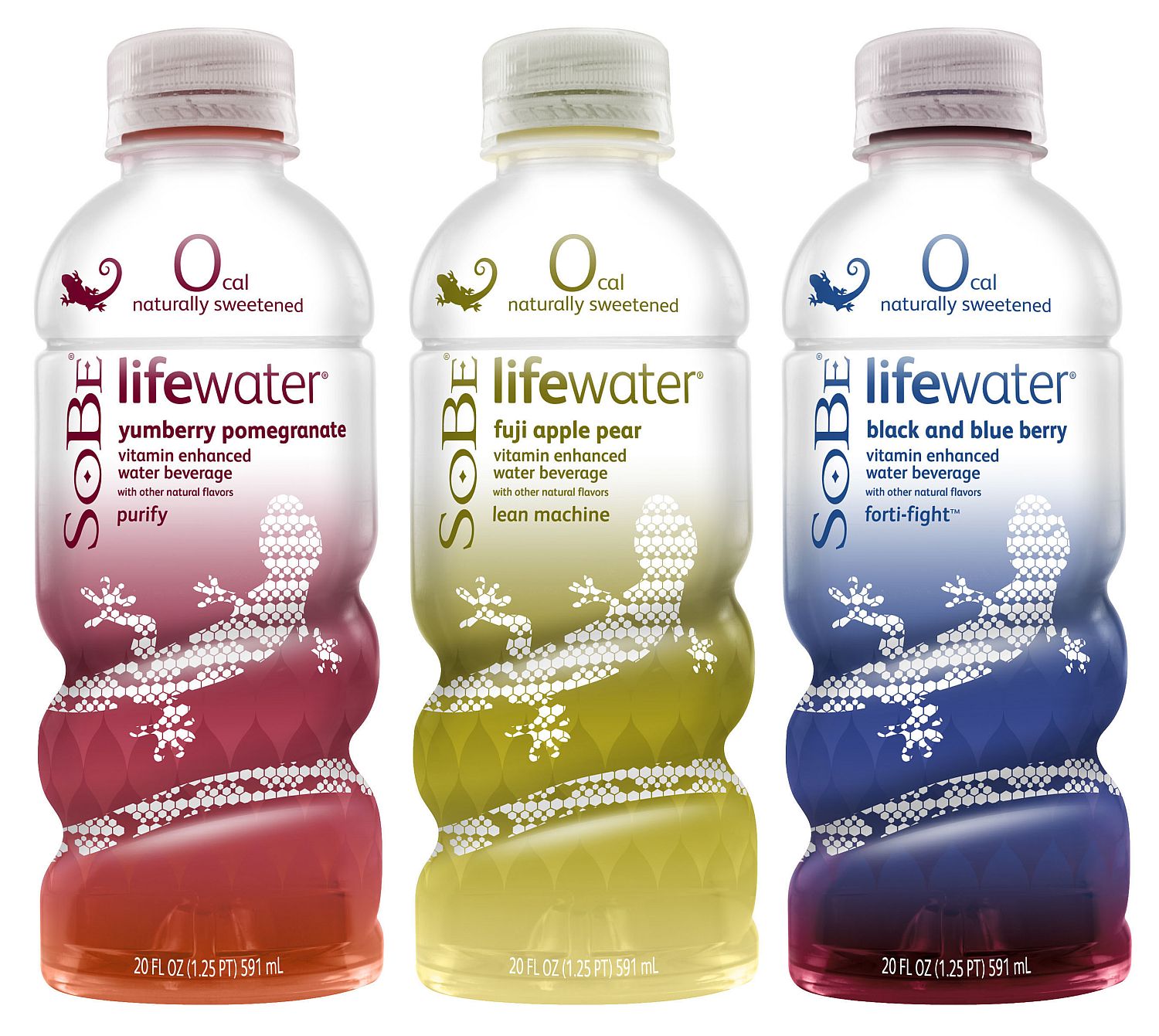
Now that our design is close to its completion we can start considering product placement. So since we have been working with fruity water I thought it would be a good idea to use a water/juice product to advertise. So we will be using a stock image of Sobe’s Life Water. The image is located here :http://popsop.ru/wp-content/uploads/pepsico_sobe_life_water.jpg

You can use any of the three bottles you like or even use your hue and saturation editor to create your own color scheme; however I went with the blue/purple bottle as seen below.

Once you have chosen your bottle (and edited it, if you like) its time to isolate it out. Once you have isolated the bottle you need to put it dead smack in the middle of your wave. This way our product (the Sobe bottle) will be in the dead center of our manipulation.

Next we need to duplicate the bottle and set it as overlay; this will help the bottle pop out more and also help it appear not as flat as it once did.

Now we can start incorporating our bottle into the design. To do this start off by painting a drip (preferably with a small hard eraser, I use a 3 px) from one of your fruits. Have the drip splash onto the side of the bottle. If your having difficulties creating the drip you can also just use your splat brushes or a combination of the two!

Next throw done some shear lines (preferably thin ones) around your bottle and your done!


Once you have applied the last lines around the bottle we are finished. Of course it doesn’t have to be done yet, you could continue adding in other elements such as 3D shapes, but you don’t have to. I hope you enjoyed reading my tutorial and have come up with a design you like or some tips/inspiration for you to use in your next upcoming design endeavors! If you have any questions don’t hesitate to ask!

Tidak ada komentar:
Posting Komentar