20 Design Features That Will Make Your Blog Stand Out From The Crowd!
43 Comments Written by Debashish
Hello Everyone, 
Make Your Blog Stand Out From The Crowd!
Today we have a review of some of the additional design features you may wish to consider adding to your blog in order to make it visually more appealing and also to make for a better overall user experience.I get a lot of emails about design – it appears most people can install a nice wordpress blog – especially when using the easy install feature that is available on the Cpanel at Hostgator.com and adding themes such as those available at Woothemes.com
However it appears a good number of you would like to Jazz up your Blogs – make them more striking and impacting. This post is for those people. For each feature we have suggested, we have also included a screen-shot of that feature in action on some of our favorite blogs.
Just one word of warning here — we are presenting you with 20 different features to consider, but this does not mean you should actually use all 20 features. I am a huge fan of customizing your blog and making it as individual to you as possible (bearing in mind literally 100’s or even 1000’s of people can be using the same Base Theme) – but as with most things in life, everything in moderation
And one final thought on design and customization – always ask yourself:
And if you are running your Blog with the goal of making money then ask:Does this Design Feature actually improve the User Experience?
Will This Plugin, this Design Feature Help Me Make More Money?If the answer to either of these questions is NO, then really you should not be doing it.
OH and as with all businesses, TEST, TEST, TEST
Every-time you add any new feature to your Blog you need to check how that new feature effects (improves) your conversions, wither that be sign-ups to a newsletter, affiliate commissions or sales of your products.
Enjoy the post – be inspired!
Best Wishes
Michael
PS: I am also aware a number of my readers, outsource all Blog Design work to their own tame Techie – go and impress them by suggesting they incorporate some of the features blow in the next redesign.
+++++++++++++++++++++++++++++++++++++++++++++++++++++++++++++++++++++++++++
20 Ways To Make Your Blog Stand Out From The Crowd!
#1 Attractive Website Navigation
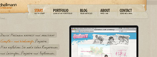
Having a noticeable website navigation that looks really really good can make your users explore your blog more.* * * * *
#2 Splash Header
In Freelance Switch’s header, they mention the most important parts of their blog and use it as a kind of splash area to make sure people go in the directions they want them to. Here at IncomeDiary we do the same sort of thing on our homepage, we mention our most important content and give brief intros to the most important pages on the site.* * * * *
#3 Have A Fantastic Footer
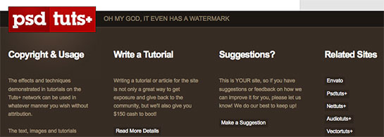
Your probably thinking whats the point, no one looks at the bottom of my site. But its surprising how many people actually do. That’s why having a decent ending to your blog is a nice touch.* * * * *
#4 Next & Previous Posts Feature
Once you read a blog, you are often wondering where to go next, if you enjoyed the post, you definitely want more. With WebDesignerWall, they have a simple customization that sends people to the previous or next post, a great addition every blogger should consider to make their blogs stickier.* * * * *
#5 Use a Popular, Breaking & Featured Widget
The sidebar can very often become cluttered up with un-useful widgets and text. That’s why merging some of it into one widget can be the solution. Having a widget that features Popular, Breaking and Featured posts can be really handy, and encourage user interaction.* * * * *
#6 Feature Your Best Post Within A Slider
Having a best post slider on your homepage with nice big splash images can really be a good way to greet your visitors. This way, they can see the best content, and catch up on what they have missed out on since they last visited your blog.* * * * *
#7 Create a Custom Heading Using Typography
Using a custom font and colours that make headings stand out can work wonders on your blog.* * * * *
#8 About The Author
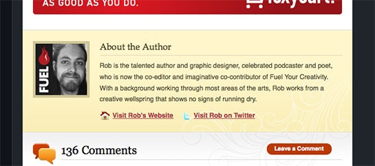
When someones finished reading a post, its nice to display a small Author bio. Nothing too long, but its better that just having “Posted by Rob”. A small avatar can make the bio look good too!* * * * *
#9 Add a Breaking News Feature
Breaking news is a really cool idea that gives content urgency and importance. This could work for any type of blog that offers up to date content.* * * * *
#10 Add a Popular Posts Feature Within Your Content
When listing your forever growing archive of blog posts, its nice to display something that “breaks” the list up. Having a popular posts bar is a perfect idea to break up content. And it can gain you more traffic too!* * * * *
#11 Author Comments
Admin comments should stand out because you have something important to say that people should take note of, UxBooth have done a great job at customizing theirs!* * * * *
#12 RSS And Twitter Count
Displaying your Twitter and RSS count can be handy, especially if its big. You can display this anywhere on your site, and design something nice and subtle, or big and bulky that shows your count off. Personal touches like this can make a good blog great.* * * * *
#13 Use a Collage as a Background
Using a collage style background can really make your website stand out. Many websites do it, but only some do it well. You don’t want an insane collage that distracts readers from the content.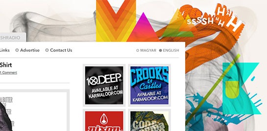
The Collage Background That Mash Kulture Uses
* * * * *
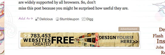
#14 In Content Adverts (That Fit The Site Design)
If you want to keep your advertisers, why not make their ads stand out more?* * * * *
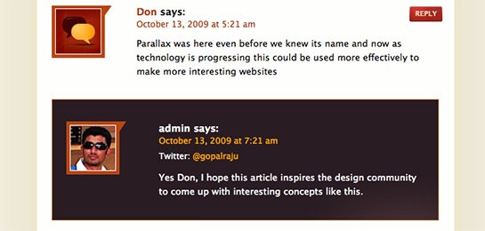
#15 Comment Style
Having a good comment style that looks good, appealing and fits your design can really make your users comments stand out that little bit extra.* * * * *
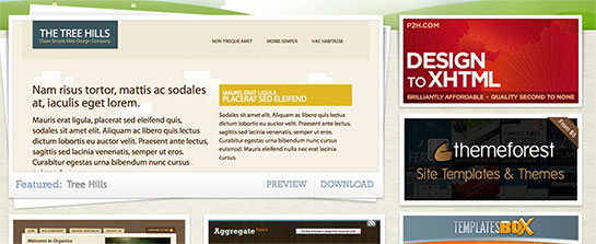
#16 Sidebar Adverts
If you accept advertising then the Sidebar is a great place to put them and if you have the traffic you can earn you a nice sum of money – but please make them fit in with your design. Don’t make them look like an afterthought!* * * * *
#17 Top Search Bar
I hate it when I’m on a really great website, and I go to search for something and I can’t find the search-bar. Having a big search-bar that doesn’t take peoples eyes away from the main design, but is easy to find is a real winner, and can take your blog from being good to great.* * * * *
#18 Favicon
Using a distinctive favicon is important. I know its only 16px x 16px, but those 256 pixels are valuable real estate, so you want to design your favicon with thought.* * * * *
#19 Quotes In Blog Posts
Everyone quotes things when writing on a blog. Styling your quotes differently from the rest of the content is a key. This makes interviews look ten times better!* * * * *







Tidak ada komentar:
Posting Komentar