When it comes to displaying featured content, designs and products there seem to be a few trends that designers follow.
Today I take a look at just what makes these techniques so effective, and analyze some inspiring examples:
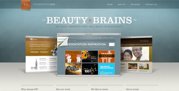
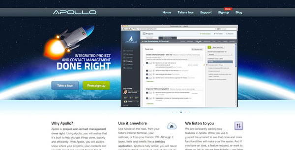
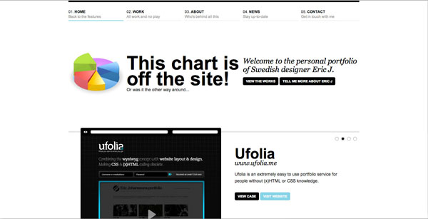
Feature Displays Within Browser Screengrab
A common way to display featured content is within a browser window screenshot. This browser window within a browser window approach is great for making content stand out a familiar way. By positioning content within a browser like area visitors can instantly make a ‘web-connection’ with the screengrab. For example, if a web app image is displayed in this format, the visitor will instantly make the connection between the app and the internet due to the internet browser framing the image.Foundation Six
Bogo Themes

Apollo HQ
Wez Maynard

Eric J
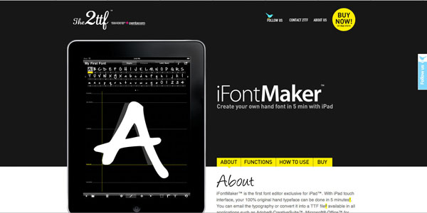
Feature Displays Within Monitor or Mobile Device
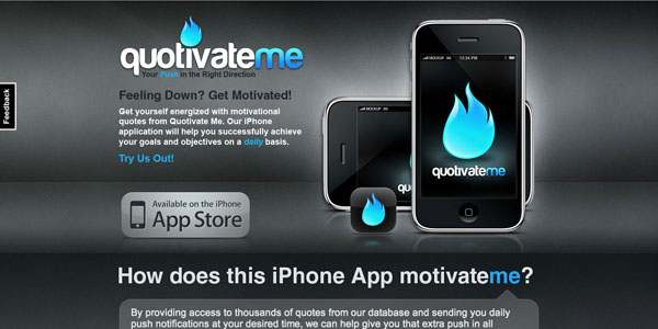
A very common trend for displaying featured content is to display it within a computer monitor or mobile device screen.There are several reasons for this technique. Firstly, the sleek design and professionalism associated with the device is then associated with what is being displayed. Many sites use an Apple monitor to showcase their content, simply because Apple has very well designed products. Using products in this way also makes a technological connection for the viewer. If the user sees content displayed on a mobile device they assume that the product/content is relevant to the mobile industry, if they see it displayed on a computer monitor they assume it is computer or internet related.
Perhaps most importantly is the concept of ‘framing’. We are used to looking at content within some kind of frame (usually within the frame of an internet browser, which itself is framed by our computer monitors). By further framing content, designers can maintain this convention and make content easier to view/browse.
Baney Design

Front 72

FarsiTel

iFontMaker

Pomodoro

Perfect Layout

Safe Haven

Quotivate Me
Bombardier Studio

Precise Design

Other
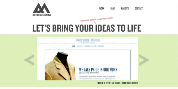
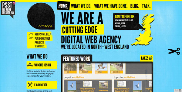
There are of course other ways to display featured content and products. Generally, designers will highlight a featured area through use of contrast and framing. That is to say, the content will be framed by a color that contrasts the surrounding background. Alternatively lighting and glow effects can be used to make a featured area stand out from it’s background.You can see in the examples below that all these sites use some kind of framing device (even if the frame is white space):
Chimera Themes

Maple Studios

McCombs Creative
Armitage Online
It’s Pronounced Frits

WebTeam

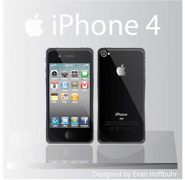
Want to Create Your Own Featured Area?
Check out these great vectors if you would like to create your own featured content/product area:Free iPhone 4 Vector
Blackberry Vector
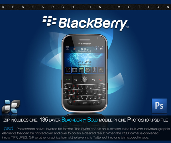
Mobile PSD

Apple Display PSD

Safari Browser Window PSD


Tidak ada komentar:
Posting Komentar