9 Things You Can’t Forget When Designing a Blog

Designing a blog can be quite a daunting task, to be sure. To-do lists alone could fill pages if you were to include all the minor details that accompany the project. Which is why most designers shy away from logging that in-depth of a laundry list of items, indispensable and not so much, to get done by the launch date of the blog. Which is also why some of these little things that would make the latter pages of the list, more often than not, get overlooked. Never fear, that is why we are here!
It is an easy thing to do when so much is on your plate, to let one or two of the smaller details silently slip through the cracks, remaining hidden in the dark crevasses in the backs of our minds. And though this checklist may not be as long as I exaggerated such a comprehensive to-do list would be, this is a list of nine very important details that many blog designers overlook. These are often thought of as so minor that it makes little to no difference in the overall design of your blog. However, these features can serve to top things off, design wise, and act as some simple finishing touches that step up your blog’s presentation, and thereby, its presence.1. Favicon
How important can a tiny 16×16 pixel square be? Well, I guess the true answer to that, would be relatively based on how important your branding is to you. Favicons not only take your branding a step further in solidifying it, but they also make for easily recognizable bookmarks for your readers. And any steps that you can take to improve your reader’s experience is always a worthwhile time investment that will pay off in the end. It may be one small step for you, but it will be one giant leap for your blog.Resources
It’s very simple to add a favicon to your website.Step 1 – Create the favicon and name it favicon.ico. Below are a couple of resources to help you.
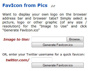
Quickly create favicons from images or your Twitter icon.
A tutorial on how to create a favicon in Photoshop and save it as an .ico file.
Step 2 – Upload favicon.ico to your root directory
Step 3 – Add the following line of code between the head tags of your header file.
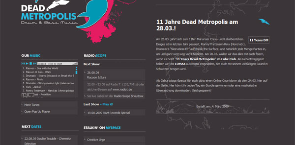
Inspiration
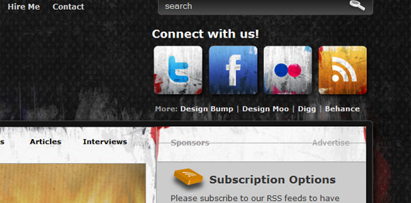
2. Subtle use of gradients, textures, shadows & single pixel lines
…Oh my! That is a bit of a list in and of itself, but it is better seen as a number of available options at the blog designer’s disposal to enhance their work. These small details give a design depth and keep things from looking flat and boring. You want your design to be pleasing to the eye, to appeal to your readers and entice new ones to check out your site. If the site looks dull and drab, then more times than not, people may judge the content and bloggers to be the same. Make the right first impression through your design with these subtle inclusions, and you will not be sorry that you took the extra time.Resources
Loads of great tips on those subtle visuals that will polish your design.
Some great tips on the proper use of gradients and some common problems new designers have.
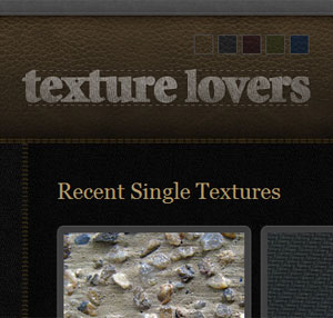
A large collection of textures from around the web that are free for commercial use.
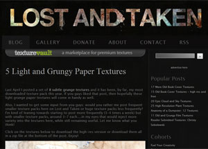
A blog dedicated to providing high quality free textures to the design community.
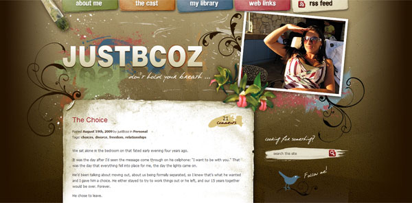
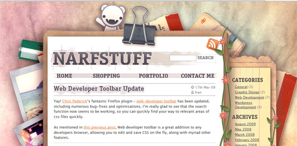
Inspiration
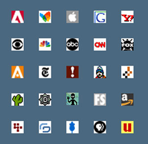
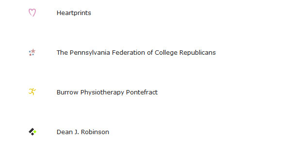
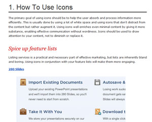
3. Icons
Coming in third on the list (though to be fair, they are not listed in any kind of order of importance, because they are all important), focuses on you finding or making the right set of icons to fluidly fit into your design. There are literally thousands of icon sets that have been graciously given to the community, so give this search the time it needs to be thorough. Or again, create a set of custom icons to complement your theme. You want these elements to mix seamlessly with your site, so as to not detract from your flow and design. Also make sure to use link icons to let people know what kind of link they are following. Again, this is just a matter of courtesy to your readers.Resources
A tutorial that teaches you how to add icons to the links on your site.
A great and in depth tutorial on how you can use icons to enhance your web designs.
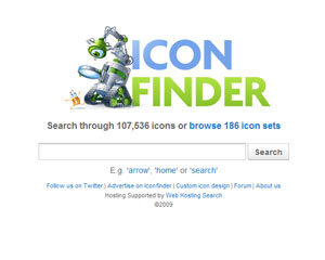
An icon search engine including over 100k icons and 186 icon sets.
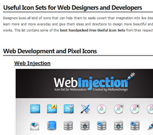
A varied collection of both free and premium icon sets.
Inspiration
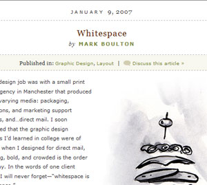
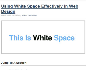
4. Whitespace
This is one I have had to struggle with myself, but you can learn from my shortcomings without succumbing to them yourself. Do not fall into the same trap I fell into, feeling that just because you have empty space it has to be filled with something, anything…it didn’t matter if it served the design or not, the whitespace had to go. Through growing as a designer, and strict bi-weekly aversion therapy sessions, I was able to break free from my bad design stranglehold and see the light. Keeping whitespace makes your blog look clean and not overly cluttered, not to mention it really aids in making the content stand out.Resources
A List Apart’s look at the importance of using whitespace in web design.
A how to on effectively using white space complete with some excellent examples.
Inspiration
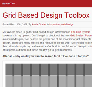
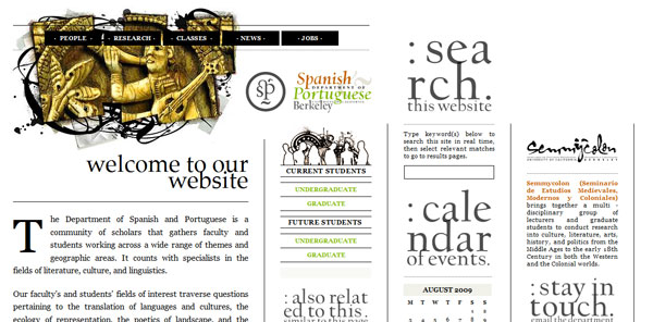
5. Alignment
I understand that out of the box thinking which often leads to a lot of innovative design techniques, so I do not want to cramp anyone’s style, or more so their alignment, with this next topic. Alignment can be very important for your site, simply because of the symmetrical feel and flow it can provide to your design. It is a scientifically argued point, that people respond favorably to symmetry and through use of a grid, you can ensure that your elements are all in line, so to speak, and are visually stimulating to a majority of the masses who will be interacting with your blog. By all means, buck the system if you want, but my advice would be to use a grid for initially laying out your blog design then, if necessary, break the grid.Resources
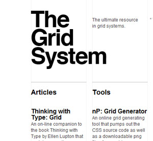
The ultimate resource in grid systems.
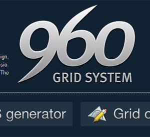
The official site of the 960 grid system. Downloadtemplates and the CSS framework here.
Pretty much any link you could think of on grid based designs.
Inspiration

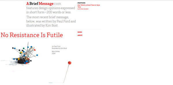
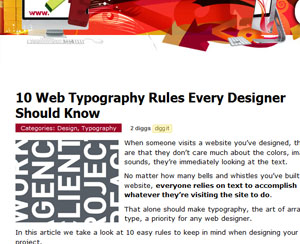
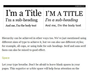
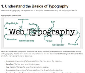
6. Typography
What is a blog without words? Other than a non-descriptive gallery with no context, protext, or any kind of text. Kidding, but seriously, making sure that the typography you have chosen for your blog is eye catching, is definitely one to consider, that some designers overlook. Like with most media, your headlines have to stand out and grab reader’s attention to draw them in. A blog is no different. You may think that what it says is all you need worry with, but you would be wrong. Making sure that the fonts used are clear and readable are beyond a must, they are…something that is beyond a must. If either your headlines or your body type are not clear, people are not going to stick around long trying to decipher your typography.Resources
The title says it all!
I Love Typography’s guide discussing contrast, size, hierarchy and space.
A must read article for anyone who wants to improve their web typography.
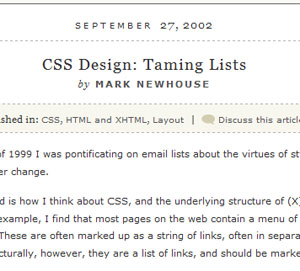
Inspiration
7. Emphasis
This is another area where I know better than I perform, but I am working on it, and that is placing emphasis throughout the posts and site to make the blog a bit more user friendly as well. With so much going on in your posts and your blog, it is easy for a reader to become overwhelmed, or simply not have the time to fully concentrate, and so the user merely skims them both looking for something to catch their eye. Make sure that you take this into consideration and bold important information for users to make it stand out for them. Also, be sure to have your links highlighted in a complimentary color to make sure they do not get overlooked by the busy reader, as well. Once again, it is always beneficial to your blog to take the extra steps that improve the users overall experience, and this is one of them.Resources
How to Make Things Stand Out
A look at all the different elements you can use to add emphasis to your design.
An article specifically focusing on how to add emphasis to your typography.
Inspiration
8. Styling Lists & Blockquotes
One of the main focuses of your blog will be the posts you put up, so make sure you do not undercut your site by under-styling your content. You want to demonstrate pride in your work as you present it to your audience, and one way to easily achieve this is through your style-sheet. Having well styled lists and blockquotes can do a lot to not only enhance the look of your posts, but if you have guest authors it opens up the format for their posts a bit. Having a limited style-sheet may effectively tie the hands of your guest writers who do not like having their posts presentation seeming bland and unsophisticated. So they opt to leave out elements that would normally give the post a bit more presentational punch and pizazz.Resources
A tutorial that teaches you how to style lists in pretty much any way you can imagine.
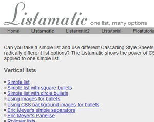
Listamatic shows the power of CSS when applied to one simple list. A great resource if you quickly need to figure out how to do a particlular list style.
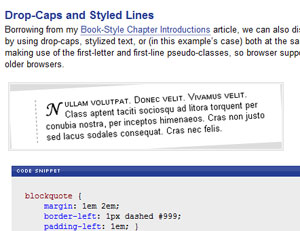
Six different ways to style blockquotes including how-tos for each.
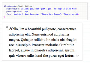
How to style blockquotes using background images.
Inspiration
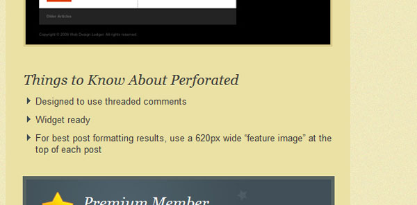
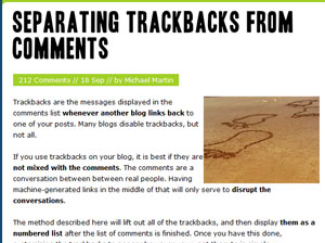
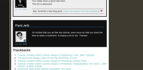
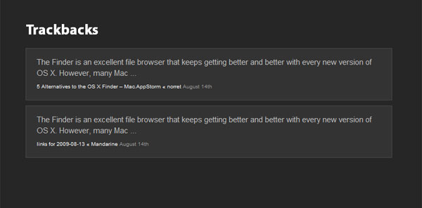
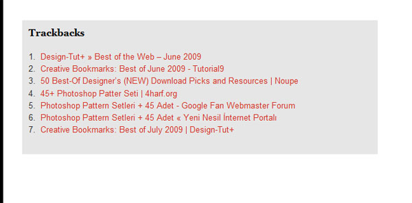
9. Separate Comments from Trackbacks
The final design detail that tends to get underestimated or under-valued that I want to talk about here, is the separation of comments from the article’s trackbacks. While it is understandable for you to want to not only recognize those who link to your work, but also to keep those links in the post for prominence and relevance, you have to keep in mind that it can be frustrating for a reader to have to sift through trackbacks mixed in with comments. Taking the time to distill the two elements apart from each other on your blog will help with the flow of readability, and once more show a dedication to the user friendliness of your site. As I said, it is nice to want to include these links kindly extended to your work, but that is generally not what the readers who comb through your comments are looking to read.Resources
An extremely simple how-to.
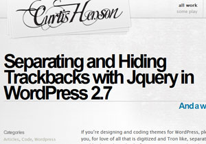
Useful if you want to either separate or hide trackbacks.

Tidak ada komentar:
Posting Komentar