
In this tutorial, I’ll show you how to create some energetic lines you can use to create more lively digital creations. Effects such as this are great for enhancing abstract compositions!
What We’re Making
A preview of the effect we’re going to create in this tutorial can be seen in the back of this graphic:
The purpose of this tutorial is not to actually recreate this exact graphic, but rather show you how to add similar lines into your own compositions. For this reason, I’m not going to explain how to design this specific background, but you are free to download the background here if you’d like to follow using our example.
Step 1 – Start with a Flare
Create a new Layer.First, we’ll create a large, bright flare where our lines will sprawl out of. Using a large, soft brush (0% hardness, 100-200px, or greater for large documents), and a white foreground color, dab a bit somewhere in your document as a starting point for your lines.
Set this layer to Overlay. If need be, duplicate this layer several times to get a more intense effect. Here is the flare after 3 duplicate layers:

Step 2 – Adding Some White Lines
Create a new layer above your flare. Still using a white foreground color, set your brush size to 1-2px, and your brush hardness to 100%.Plan out a path for your lines. Decide which direction you want your lines to flow, how many sets (directions) you want your lines to flow in, and how you want your lines to interact with any subjects you may have in your composition. I want to have 3 groups of lines, two shooting upward out of my flare, and one coming out the bottom as if the flare fuses those groups together.
Now, making quick, smooth strokes (a Graphics Tablet really can help), draw your groups of lines into your new layer (Video Below). With a mouse, you need to be sure to make fast flicks to create a smooth looking line. Alternatively, you can create dozens of paths with the pen tool, and then stroke those paths with a 1-2px white brush. This approach will almost alway look better, but is more time consuming.

Here’s a quick demonstration video:
Step 3 – Adding More Lines
Continue to build upon your lines with additional colors as you see fit. Try to choose colors which compliment the other colors in your image, or are similar to the colors used in your graphic. Yellow is a nice complimentary color for blue, so I’ll add some extra yellow lines.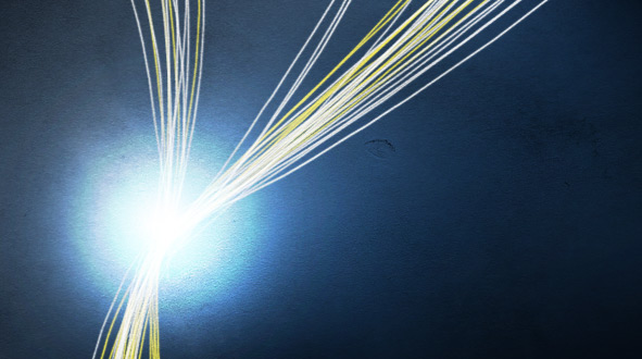
Step 4 – Scribbles
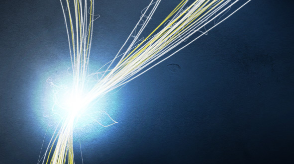
Create a new Layer.Using a 1px, 100% hard, white brush, draw in some scribbles that closely follow your line work completed in steps 2 and 3. Add some extra scribbles that shoot out further than the rest near your flare, as if it is filled with electrical energy (you’ve gotta love the terms I’m using to describe such things in this article by now, but really, thinking of ways to compare your linework to real world examples can help you put your ideas to paper).
Step 5 – Add Depth with a Shadow
Duplicate the layer of white lines, and move the layer underneath your flare layers. Apply a Gaussian Blur with a radius of 5-10px. Change the color from White to Black by going to Image > Adjustments > Invert.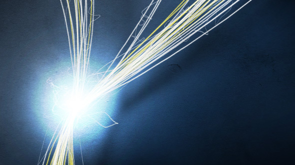
Using a shadow is a great way to create an illusion of depth in a graphic. After applying your shadow, the lines and flare should appear to pop forward a bit from the canvas.
Step 6 – Adding a Vibrant Blur
While holding Ctrl, select every line layer and flare layer you’ve created so far. Once every layer is selected in your layers palette, right click one of the selected layers, and choose to Duplicate layers (or Layer > Duplicate Layers).You should now see a group of layers above your layers you just duplicated (all still selected). Merge these layers (Ctrl + E, or Layer > Merge Layers).
Set this new layer to Overlay. Apply a Guassian Blur with a radius of 10-20px.
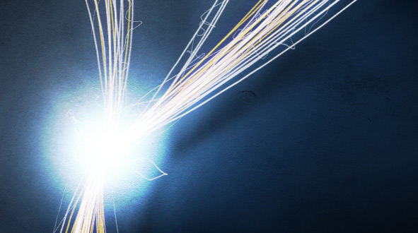
This will simply five your lines a more ambient light feel, as if they are actually glowing a bit.
Step 7 – Adding Sparks
On a new layer, using a 1px, hard, white brush, paint in some small sparks (just quick dabs of paint), which increase in number as they approach closer to the flare and lines.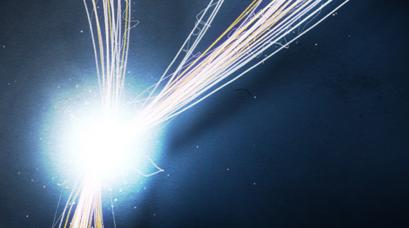
Wrapping Things Up
That’s really all there is too creating this sort of effect. The real creativity is not in the effect itself, but how you tie it into your design work. You can use the lines to wrap around objects in your compositions (would require some extra work with the eraser or masking), to direct attention to different parts of an image, or even use the lines to frame something.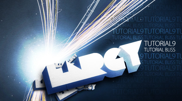
As usual, you can grab the PSD that shows how we created our graphic shown in this tutorial if you’re having any trouble with the effect on your own!

Tidak ada komentar:
Posting Komentar