
Selecting the Right Chart Type for your Data
The world today has way too much data, but very little information. In this tutorial I’ll show you how to convert your data into powerful information by selecting the right charts for expressing them.
Unless you are a data-analyst or a statistician, you will probably be using two commonly used types of data analysis: Comparison and Composition.Comparison of data is the most common and easy to understand type of data analysis. And that makes it the perfect starting point. So let us dive in.
Comparison of data
Consider the following cases:- You want to compare the Quarterly Revenues of a product company over a period of 4 years.
- You want to compare the total visitors of ten competing websites for the month of May.
- You want to visualize the population trends of a country over a period of 170 years.
1) Comparing Quarterly Sales over 4 years
We make a note of the following points:- The Revenue (in dollars) will be shown along one axis.
- The time (quarter number) will be plotted along another axis.
- There are four categories: Q1, Q2, Q3 and Q4.
- Each category will have 4 columns for years 2006 through 2009.
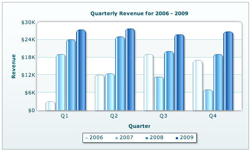
In each set of columns we have used a progressively darker shade of the same color; blue in this case. The progression of shades makes the sequence (2006, 2007, 2008, 2009) apparent. Using shades of a single basic color shows that all of them belong to the same data type.
2) Comparison of total visitors to 10 competing websites
We make notes again:- The names (URLs, which are pretty long) of websites appear on one axis.
- The number of visitors appear on another axis.
- The number of categories is 10 (the number of websites).
- A bar chart is suitable when the number of categories is higher than 8 and lower than 15.
- Bar charts give you more space for long text (since the screens are wider than they are high)
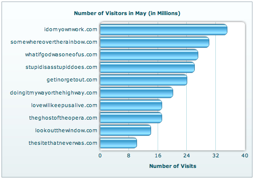
The data sets have been arranged in descending order. This makes comprehension of data much easier as your eyes follow a decreasing pattern. With the pattern, they can connect shape to value much quicker.
3) Population trend of a country over a period of 10 years.
Notes, yet again:- Time (years) will be plotted along the X- axis (people are used to seeing time on X-axis. Physics guys nod your heads here).
- The Total Population will be plotted along the Y-axis.
- The number of categories/data points is very high (much more than 20).
- The number of data points is very high and a column or bar chart will look pretty cluttered.
- Our aim for this chart is not to show the maximum or the minimum population. We are trying to show the trend, that is the rate of change of population (steepness of the line) rather than the population itself. A line chart is best suited for showing trend-based visualization.
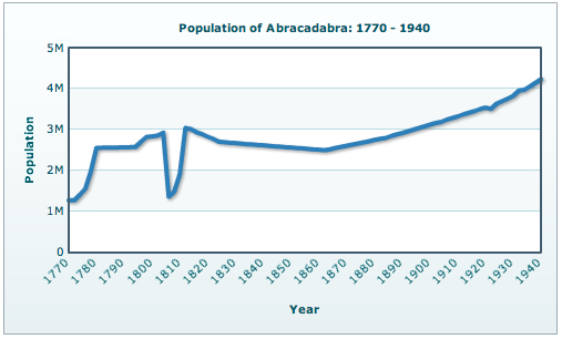
Abracadabra is a good fictitious name to use when you can’t think of anything better.
So far, we have talked about data visualization for comparison of data. Next, we come to charts that depict composition of data.Composition of data
Consider the following cases:- You want to plot the break-up of traffic sources to your website.
- You want to plot the break-up of the visitors to your site by the duration they stayed on your site, in turn broken down on a day-wise basis.
1) Break-up of the visitors to your site based on traffic source
- There will be 4 categories: Direct Traffic, Search Engines, Referring Sites and Others
- We will plot the values in %, as we are interested in a comparative study more than the exact values.
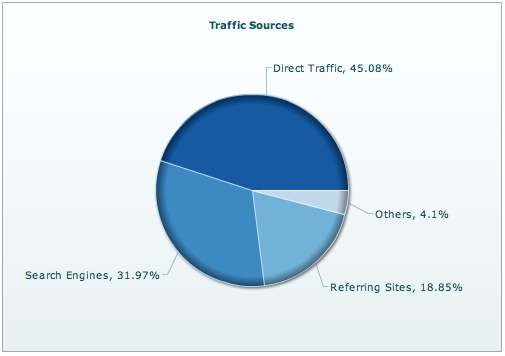
The use of pie charts is pretty debatable. So do NOT use a pie chart:
The pie and the doughnut chart are inter-changeable, and the choice mostly depends on your (or your client’s) taste.- If you have more than 6 categories, unless there is this one clear winner that you want to focus on.
- If two or more categories have almost the same values.
- To sum up a couple or more categories and then compare them to another sum.
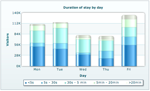
2) Break-up of the visitors to your site depending on the duration of stay
- The number of visitors will be broken down as per the time they spend on the website.
- We also need to compare the above statistics depending on the day of the week. So the number of visitors by duration will in turn be broken down by the day of the week
- The total number of visitors to the site on every day also has to be displayed.
- It can show the break-up of visits by duration and show the whole using the same data plot.
- The number of categories is small – five, or seven if you want to consider weekends as well.
So we have talked about Comparison and Composition of data. There is also another type of data analysis that combines the merits and functionality of both Comparison and Composition into one.
Distribution of data
Consider the following cases:- You want to plot the variation of relative humidity with temperature.
- You want to plot the variation of rainfall with temperature.
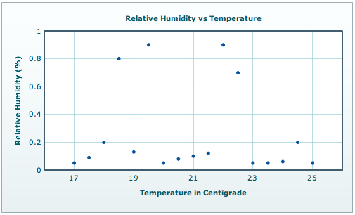
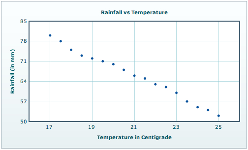
- There are a large number of discrete data points.
- There are two variables that are inter-dependent.
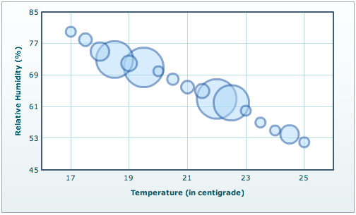
- If there are two or more sets of data (multi-series scatter) and you want to show similarity in their variations with respect to a single parameter. The common parameter is usually plotted along the horizontal axis.
The End. Or is it?
It is pretty difficult to have a guideline for all types of charts that soak in all kinds of data. For that a book will not be enough, let alone a tutorial. However, I have tried to cover the basic data representations and how to classify them as one of the three types viz, Comparison, Composition and Distribution.The best way to select the right chart for your data is to ask yourself what you intend to analyze. Is it finding out a pattern? Is it seeing the break-up of one-complete-whole-something? Once you have your answer, your data analysis can be categorized into one of the 3 methods we just discussed. Then go ahead and plot the chart you think is the most suitable (with the help of the pointers given in the tutorial). If you are able to analyze whatever data you set out to, there you have it. If you could not, try out the other charting variations possible in that category. Sooner or later, you will strike gold.
Even though time consuming to start with, it is a very methodical approach. Once you master the art of selecting the right chart, it will serve you forever, placing powerful actionable information in your hands.
This post was written with the help of @hatfullofrain

Tidak ada komentar:
Posting Komentar