
Illustrator is great for creating sharp clean graphics. I used to rely on Photoshop for creating simple seamless textures for typography, web, and illustration projects. Since the updates to the Appearance panel in CS4 and the updated crisp graphics for web in CS5, I create these textures solely in Illustrator and actually, it’s really easy!
Tutorial Details
- Program : Adobe Illustrator CS5 (You should be able to create this tutorial in CS4 but some of the tutorial images might look different.)
- Difficulty: Beginner /Intermediate
- Topics Covered: Appearance Panel, Effects, Pattern Fills, Graphic Styles
- Estimated Completion Time: 15-20 minutes each
Adding Texture in Illustrator
If you have been working with illustrator for a while, you probably know that you can easily drop in a texture image, set it to multiply, and you are good to go. One of the great things about using the techniques in this tutorial is you can easily create a seamless texture without having to mask out a texture or make sure it will fit your artwork properly. Moreover, we are going to be using to Appearance panel so we can easily make a graphic style, making it easy to apply the effects to other text and vector objects.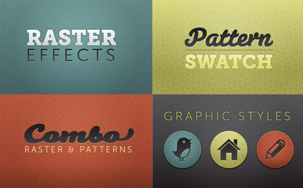
I know some of you are saying that using raster effects in Illustrator is cheating because its not vector art and you should just use Photoshop. You really can do whatever you want. I just have found creating these type of effects in Illustrator a lot easier and quicker. Probably one of the best reason to use Illustrator for these type of effects is the scalability of vectors even with raster effects applied. Unless you expand the effects, you can adjust your artwork without worrying about creating pixelated artwork.
Raster Effects
If you are familiar with some of the texture effects and filters in Photoshop, you will feel right at home with this technique. For these effects, I keep the Document Raster Effects Settings at 300 ppi. You can change this resolution by going Effect > Document Raster Effect Settings.Step 1
Create a new document and create a rectangle with the Rectangle tool (M).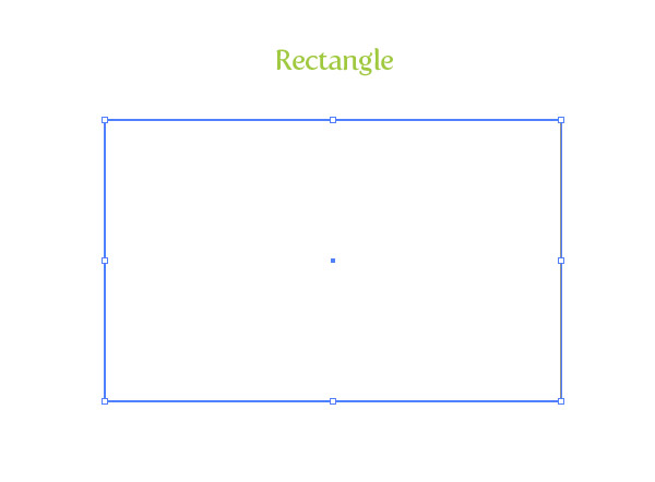
Step 2
Take off the stroke and fill the rectangle with a linear gradient. Change the first color stop in the gradient to a greenish blue color, change the second color stop to a darker greenish blue color, and change the Angle to -90.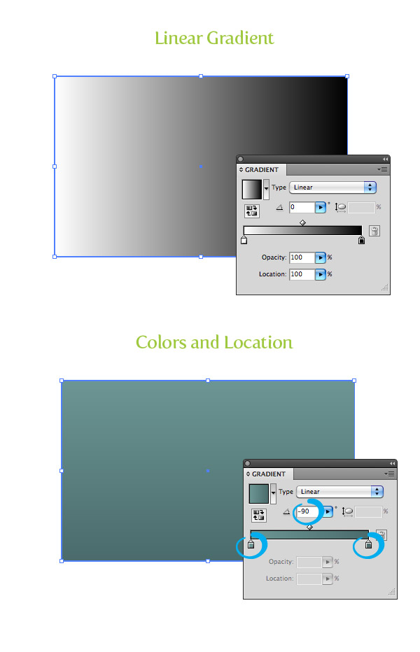
Step 3
From the pop-up menu of the Appearance panel, choose Add New Fill. Choose the topmost fill from the Appearance panel list and change the fill to a gray color.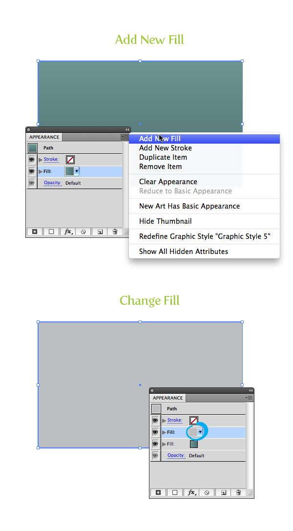
Step 4
With the new gray fill selected in the Appearance panel, go Effect > Texture > Grain. In the Grain dialog, change the Intensity to 90, the Contrast to 50, and the Grain Type to Sprinkles. From the Appearance panel, press the arrow to the left of the title and from the sub-list, click on the Opacity link and change the Blending Mode to Multiply.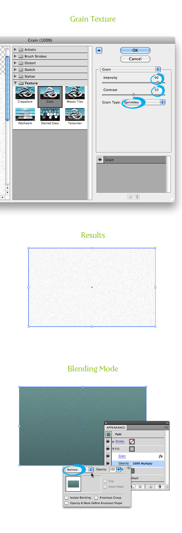
Step 5
From the pop-up menu of the Appearance panel, add another New Fill like before. Make sure you have the top most fill selected, change the new fill to a radial gradient and fill both color stops with white. Change the opacity of the first white color stop to 40 and the second to 0. From the sub-menu of the new radial gradient, click Opacity, and change the Blending mode to Overlay.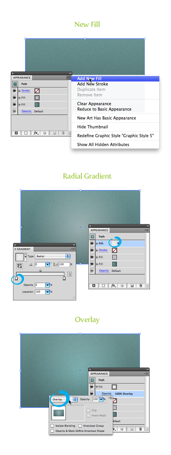
Step 6
That does it for the background texture, but we can add similar textures to text with the Appearance panel. Moreover, we will keep the text still editable! Start with typing out some text with the Type tool (T). I used the the font for Museo Slab 900 for the “Raster” text. Next, take off any stroke and fill from the text.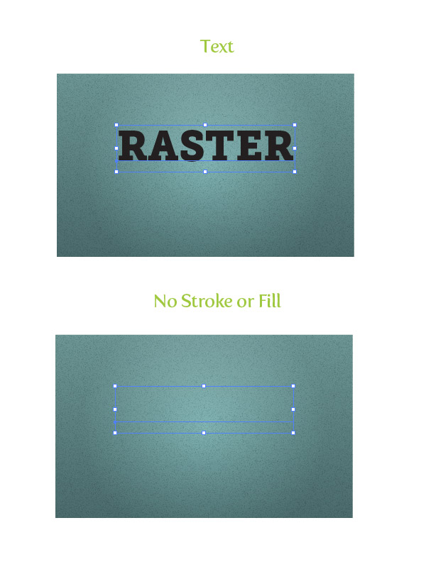
Step 7
Choose Add New Fill from the pop-menu of the Appearance panel and fill it with a linear gradient. Change the first color stop to white, the second to a light gray, and change the Angle to -90.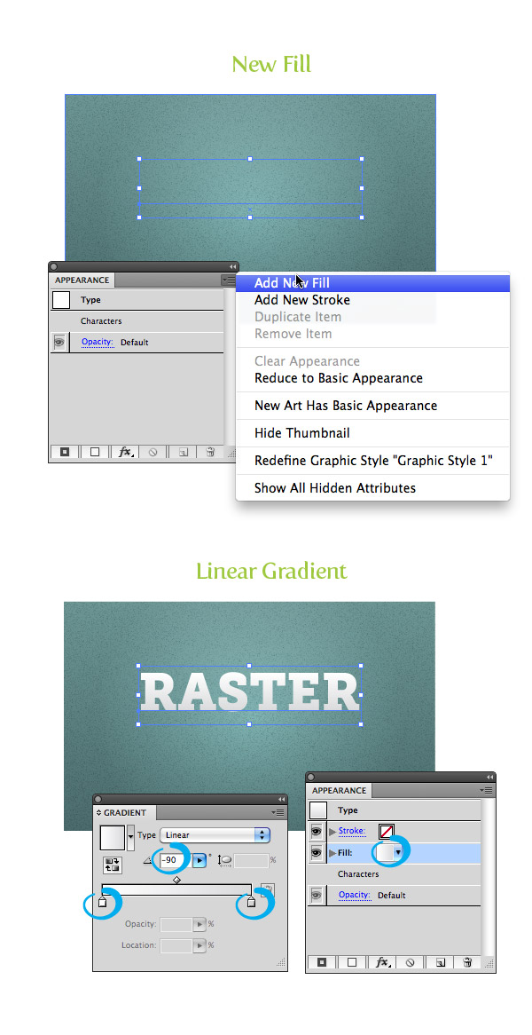
Step 8
Create another new fill from the Appearance panel and fill it with a gray color. With the new gray fill item selected in the Appearance panel, go Effects > Texture > Texturizer. In the Texturizer dialog, change the texture to Burlap, the Scaling to 200, the Relief to 50, and the Light to Top. Change the fill’s Blending Mode to Multiply and set the Opacity to 5.
Step 9
Select the bottom linear gradient in the Appearance panel and go Effect > Stylize > Drop Shadow. In the Drop Shadow dialog, change the Opacity to 60, the X and Y Offset to 0 and the Blur to 1. All done with this treatment!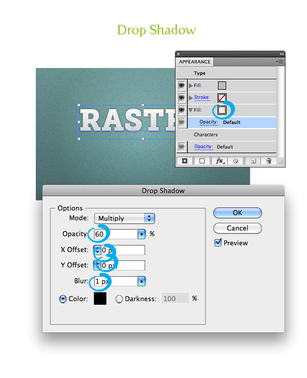
Step 10
For the “Effects” text, I used Museo Sans 300 (I’m kinda obsessed with the Museo Family). With this treatment, take off any stroke and fill, create a new fill from the Appearance panel, change it to a linear gradient, change the first color stop of the gradient black, change the second color stop a gray color, and change the Angle to -90. Create another new fill, make sure you are editing the last fill list item in the Appearance panel, change the fill to a lighter color than your background, and go Effect > Distort & Transform > Transform. In the Transform Effect dialog, change the Vertical Move to 1. That does it for the raster texture example!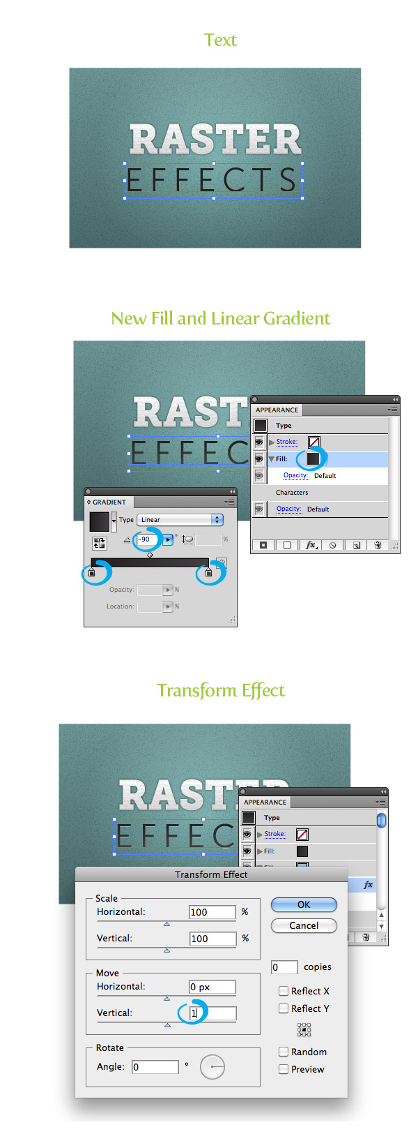
Playing Around
It’s fun to play around with different texture to get to create different results. Below is taken from the Vectips tutorial Create An Editable Stitched Label Type Treatment with some basic textures added.
Pattern Fills
Creating this technique is pretty similar to the raster effects technique. Really, these textures are just seamless pattern fills that come stock with Illustrator, but they can create some pretty interesting results.Step 1
The initial steps are almost exactly the same as the previous raster example. Create a rectangle, take off any stroke, fill it with a linear gradient, use greenish yellow colored color stops, and change the angle to -90.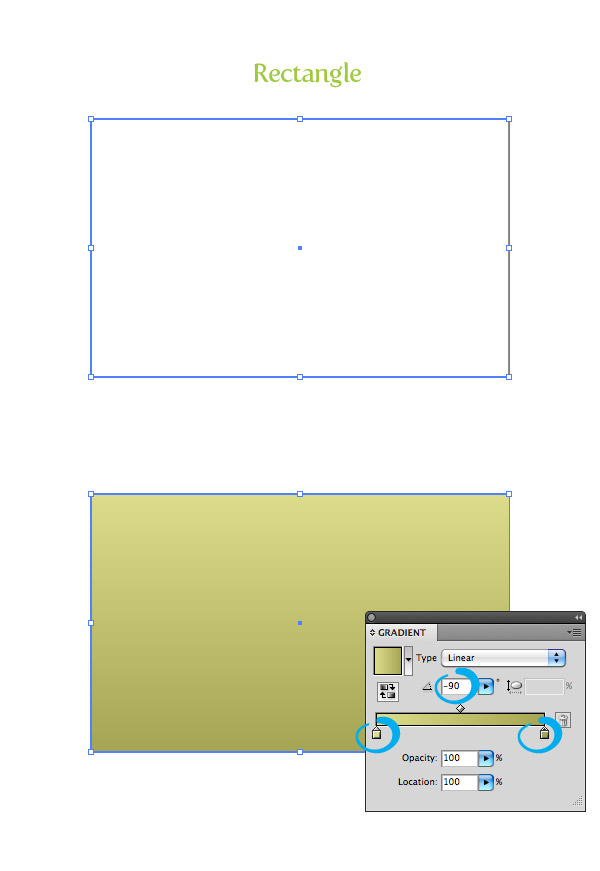
Step 2
Instead of using an effect for the next step we are going to use some of Illustrator’s stock pattern swatches. From the Swatches panel, press the Swatch Library Menu button at the bottom left side of the panel and choose Patterns > Basic Graphics > Basic Graphics_Textures. With the rectangle selected, choose a new fill from the Appearance panel, select the topmost fill, and fill it with the Bird Feet swatch from the library we just opened. An easy way to see the name of the swatches in a library is to choose Large List View from the pop-up menu of the swatch panel. After you have filled the new fill with the Bird Feet swatch, change the Blending mode to Overlay.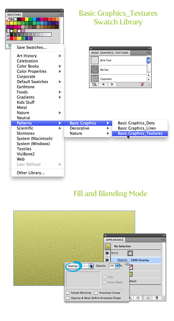
Step 3
To finish off the background, create a new fill and fill it with the same white radial gradient from Step 5 of the Raster technique. That’s it for the pattern fill technique! Pretty easy, right?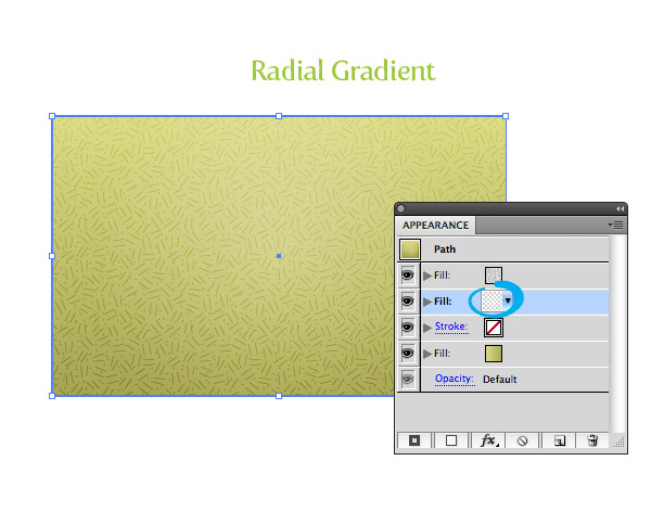
Step 4
The text treatment is pretty similar to the rater image. For the “Pattern” text I did the same as step 10 from the raster image. I used Susa Heavy for the font and in the Appearance panel, I filled it with a dark gray linear gradient, added a new fill, offset the new fill, and changed the offset fill to a lighter background color.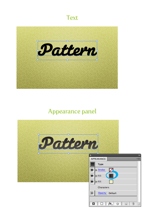
Step 5
Below the “Pattern” text is just a couple simple paths. With the Line Segment tool (/), create a path that is the length of the text. Change the stroke to 1 pt and change the stroke color to a gray color. Create another path directly below the first, and change the stroke color to a light background color.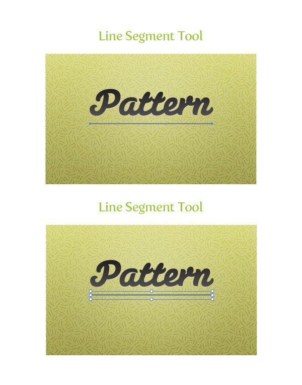
Step 6
For the “Swatch” text, I used Museo Slab 900. First take off any stroke and fill and from the Appearance panel add a new fill. Change the new fill to a linear gradient with the first color stop white, the second a darker yellow color, and change the Angle to -90. With the new fill selected in the Appearance panel, go Effects > Stylize > Drop Shadow. In the Drop Shadow dialog, change the Opacity to 50, X and Y Offset to 0, and the Blur to .5 px.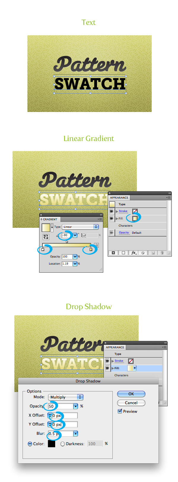
Step 7
Create a new fill from the Appearance panel, fill it with a linear gradient, change the first color stop to a light yellow color, change the second to the same darker yellow color in the previous step, and set the Angle to -90. With the new fill selected in the Appearance panel, go Effects > Path > Offset Path. In the Offset Oath dialog, change the Offset to -1 px. That’s all!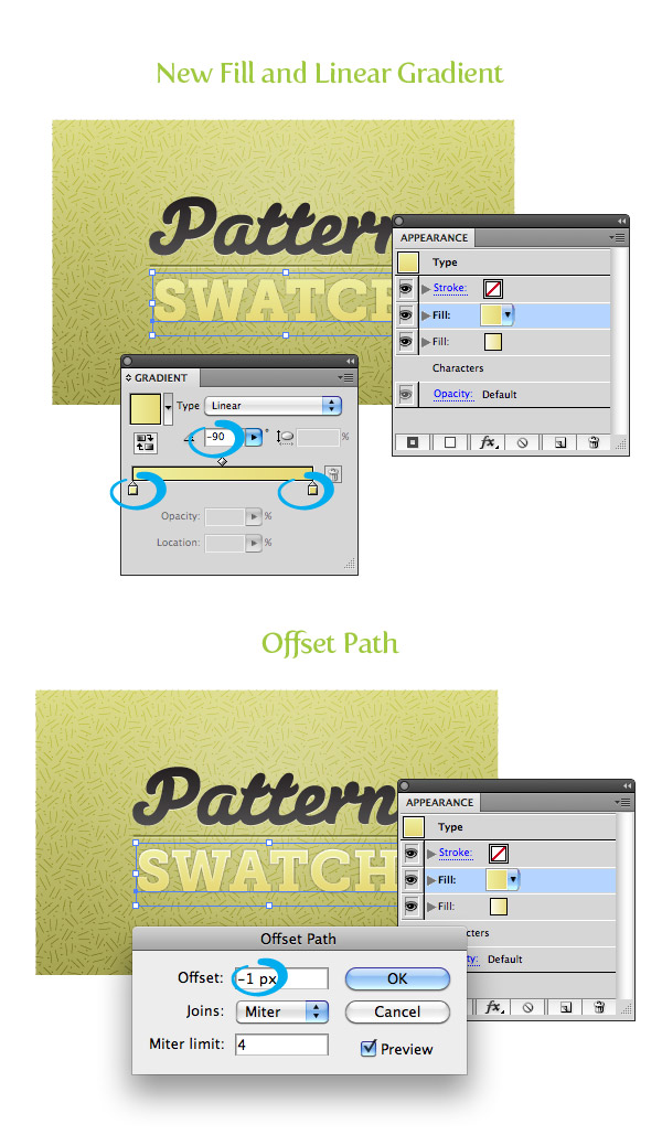
Playing Around
These are really fun to play with. Take your background texture that you just made, find the Bird Fill item, and change it with any of the Basic Graphics_Textures swatches and see what you come up with! Also try combining a couple of different pattern fills on the same background.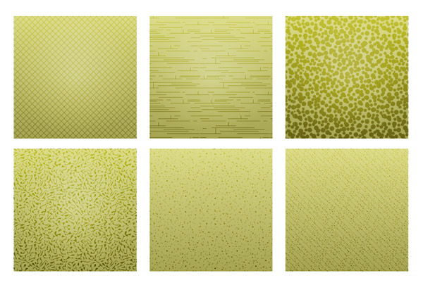
Combining Raster Effects and Pattern Fills
This technique is probably my favorite. It’s fun to explore and play around with all the different results. Basically we are combining both the raster and pattern fill techniques. This is pretty similar, so if you had no trouble with the previous techniques, you will have no problem with these!Step 1
I’m not going to go into too much detail because you have already done these initial step in the first two sample. Basically, create a rectangle, fill with a red linear gradient, create a Sprinkle grain pattern, and create a radial white gradient.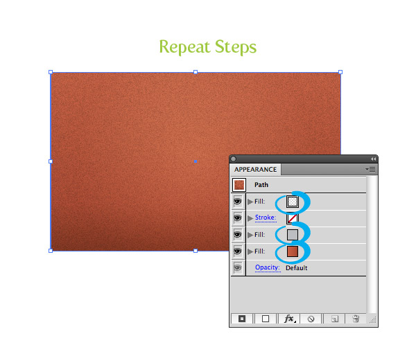
Step 2
Add another fill in the Appearance panel and choose the “Diamond” pattern fill from the Basic Graphic_Textures. Set the Blending Mode of the new pattern fill to Overlay and change the Opacity to 50.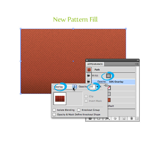
Step 3
For the “Combo” type, I used RadioTime for the font and used the same gray gradient and offset from the previous examples. The secondary text is simply Museo Sans 300 with a yellow fill.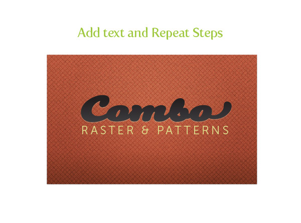
Playing Around
Like before, this is good time to play around and see what different texture treatment you can come up with!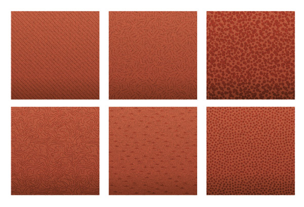
Creating Graphic Styles
So now that we have all these wonderful textures created, we can apply the effect to other artwork and text. Instead of creating the effect every time, we can just create a Graphic Style.Step 1
To create a graphic style, simply select you texture and press the New Graphic Style Button in the Graphic Style panel. Seriously, it’s that easy. Now select some text or another object and click you new style in the Graphic Styles panel and your all set! You can even create graphic styles for each of the text treatments we created.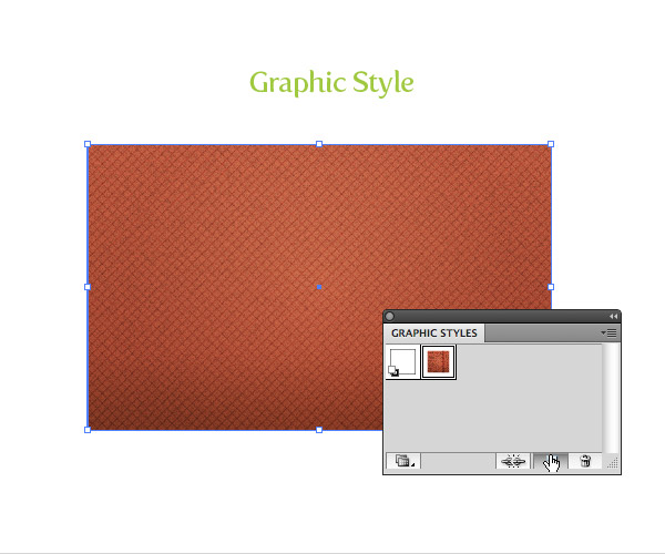
Step 2
I sometimes adjust the texture in the Appearance panel to include other elements. In buttons examples below, I added an offset fill of 1 px and added a drop shadow to the fill. The background texture is just a Graphic Pen fill (Effect > Sketch > Graphic Pen) and the icons have the same treatment as my text is some of the texture examples.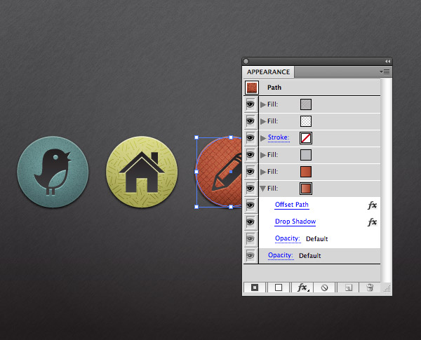
Playing Around
Now just play and experiment with the graphic styles on other text, UI, and vector objects.

Tidak ada komentar:
Posting Komentar