Design a Advetisements of a Diamond Brand in Photoshop©

In this tutorial you will learn a few techniques that might be very useful for you and give you some great ideas when you start creating an advertisement. Before you go on and start the tutorial I would like to thank the photographers for their amazing stock images and for giving e permission to use the images:
Materials Needed
- Katanaz-Stock male
- Katanaz-Stock female1
- Katanaz-Stock female2
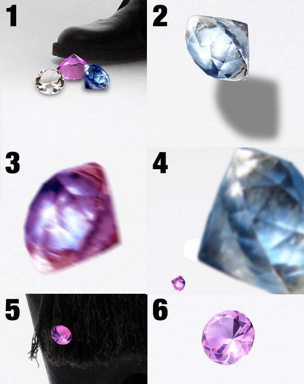
- Stock Art Resources Gem1
- Stock Art Resources Gem2
- Stock Art Resources Gem3
- Stock Art Resources Gem4
- Stock Art Resources Gem5
- Stock Art Resources Gem6
- Demon-Daisy-Stock Gem7
- kire198 nebula
- sxc 1
- sxc 2
- sxc 3
- sxc 4
- sxc 5
Getting Started
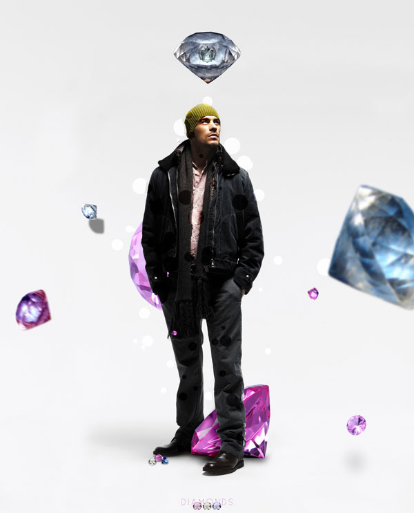
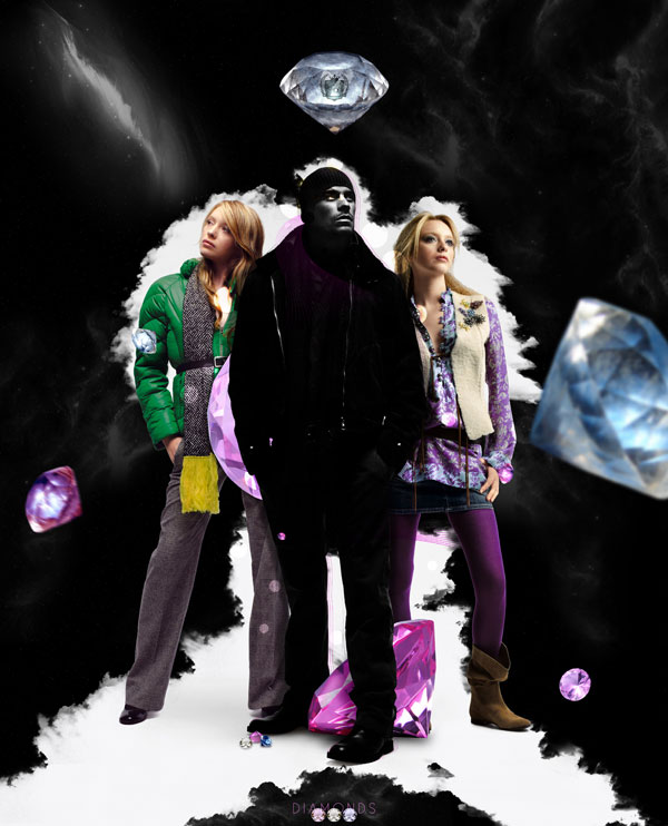
Before you start creating a piece it is very important that you fist make some sketches or maybe jot down some ideas, some elements that you have in mind and would like to use in you composition. It is true that the final result may not be the same and may not have the exact shape as you first imagined it but that is the point, you must evolve and expand your idea. This is something that happens to me all the time I start a project.Final Image Preview
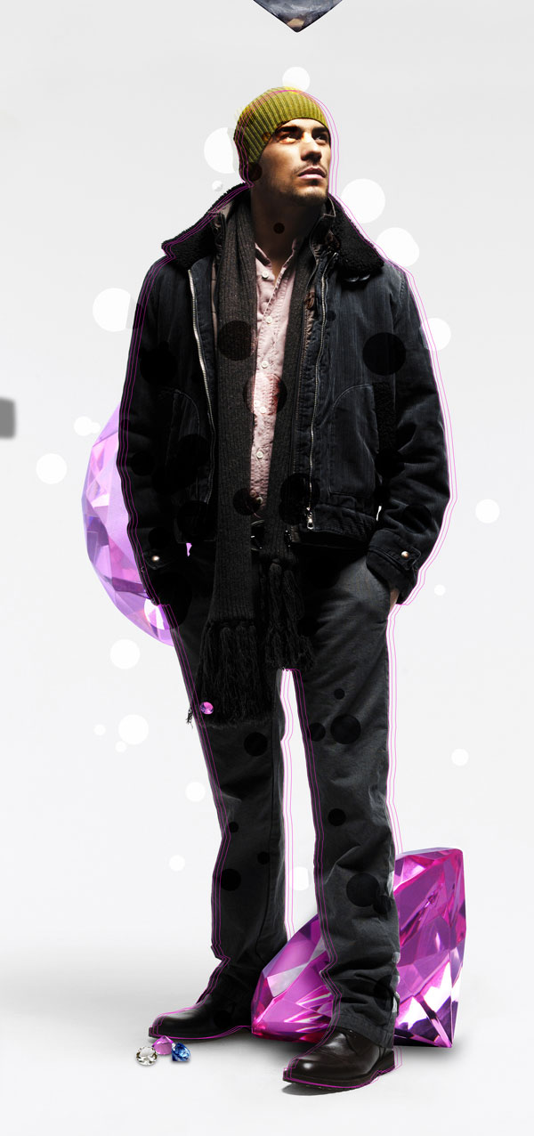
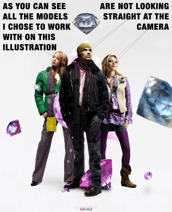
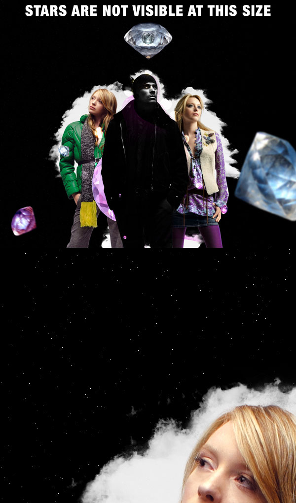
Before you start take a look at the final image you will be creating.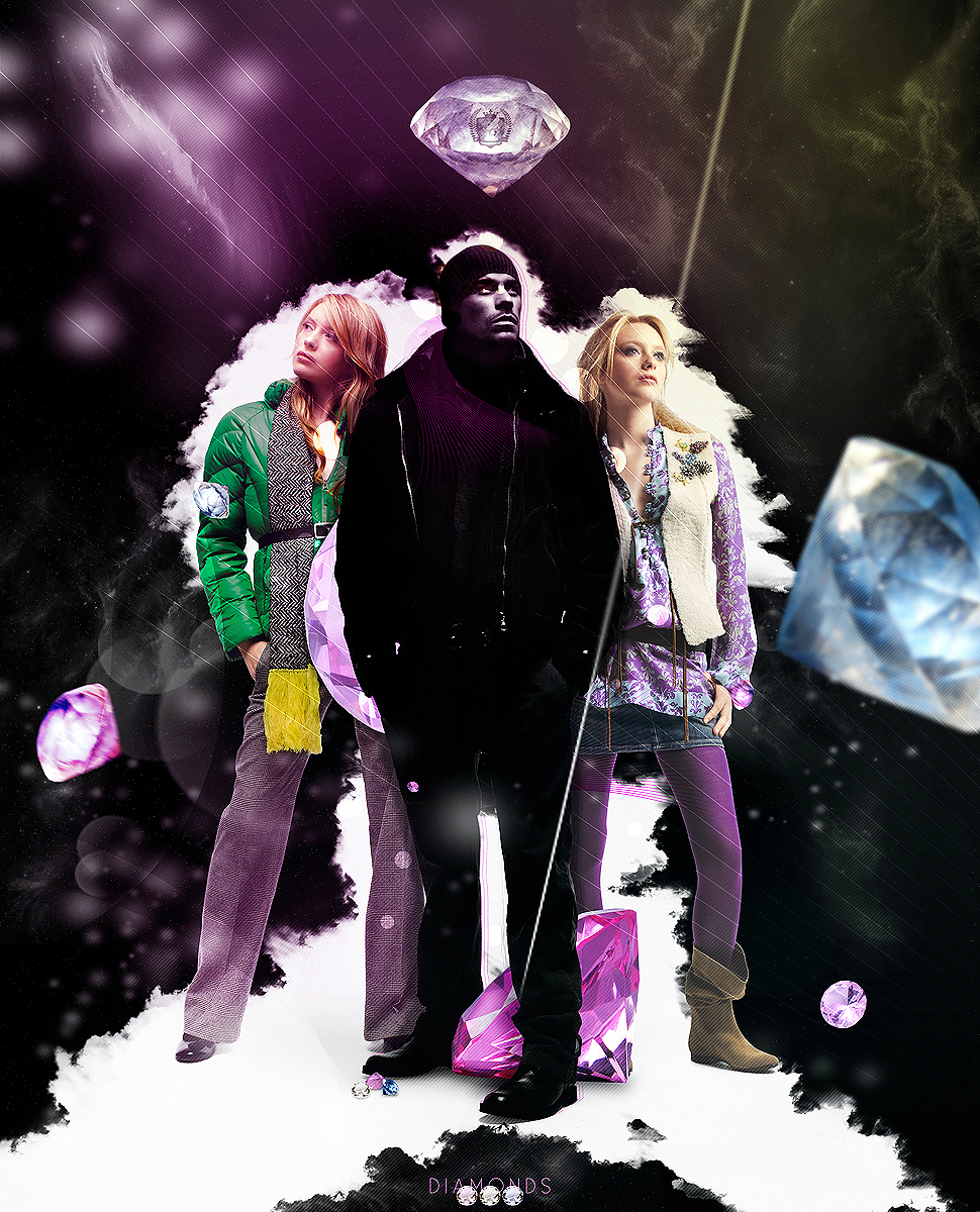
Step 1
First of all you need to start a new document. The size I chose is a very big one as I want this printed later on. Then import the male stock to your document and resize it as you wish. As you can see in the image there is a lot of white that you need to cover with the same grey behind the model.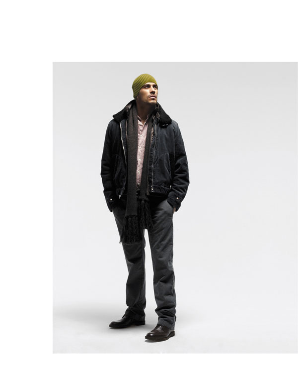
Step 2
Using the Clone Stamp Tool (S) expand the grey so that it looks like the image below. Also play around with the Levels settings a bit so that you make the model more detailed and a bit darker.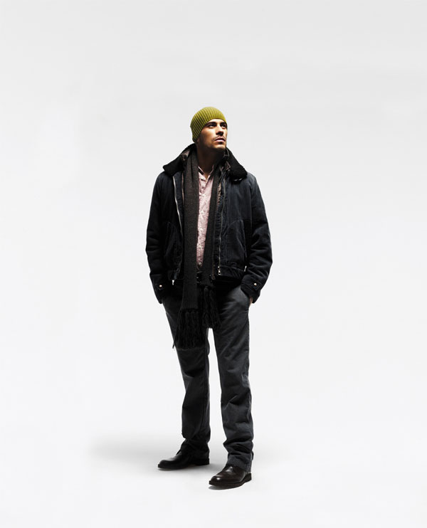
Step 3
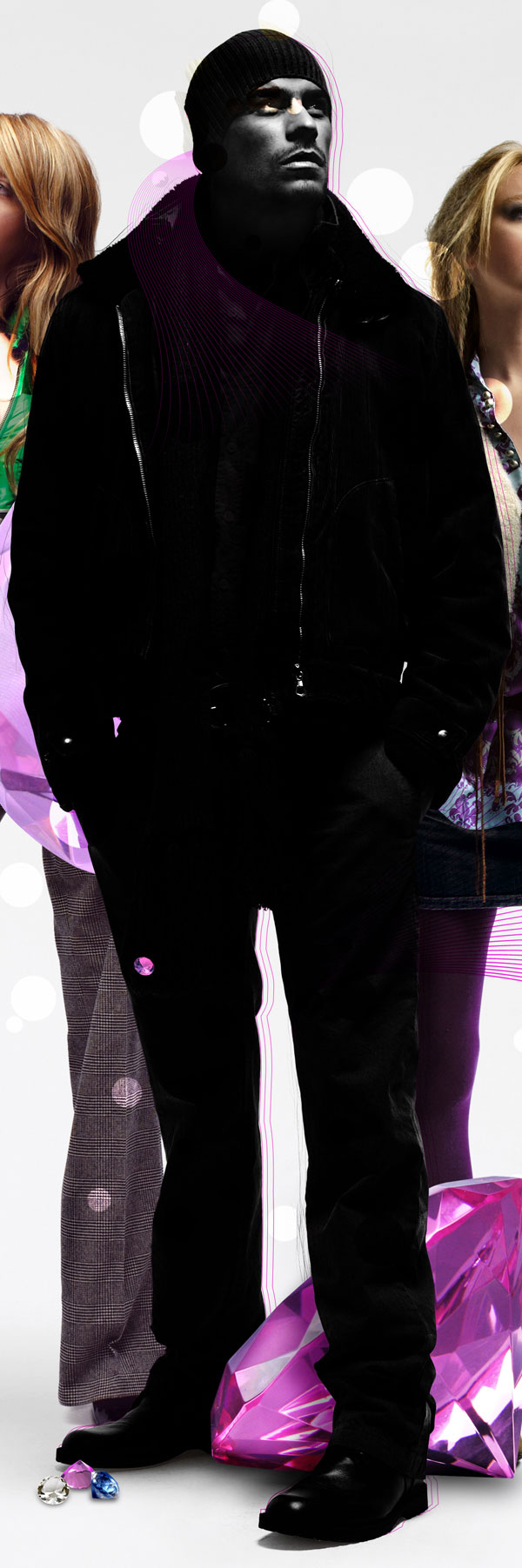
Next I will start adding some elements on the composition. Using the Brush Tool (B) with the below settings, draw some white circles.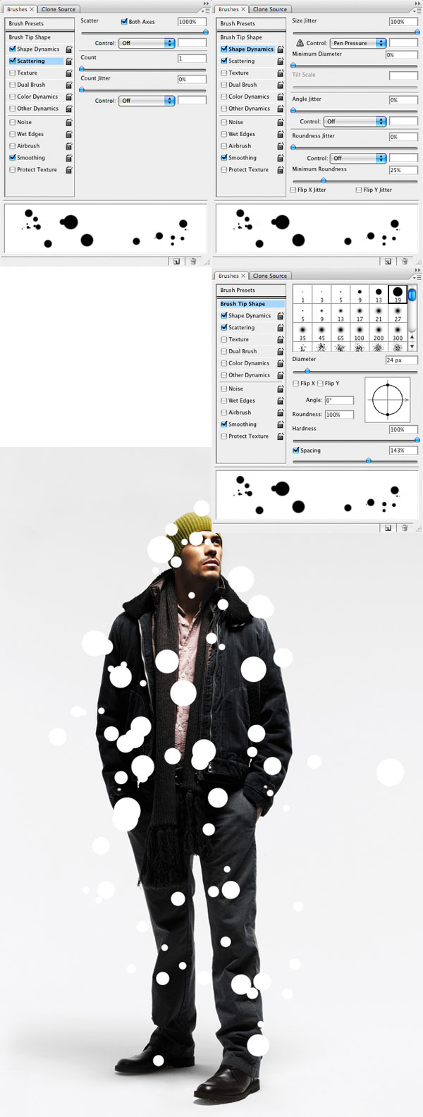
Step 4
Command + Click on the circles layer, using this selection go to the original model layer and press Command + J. Move the new layer left a few times and set the layer to Overlay.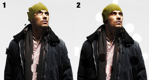
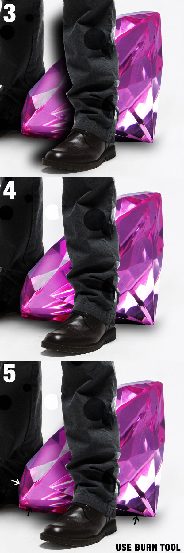
Step 5
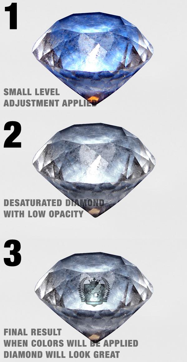
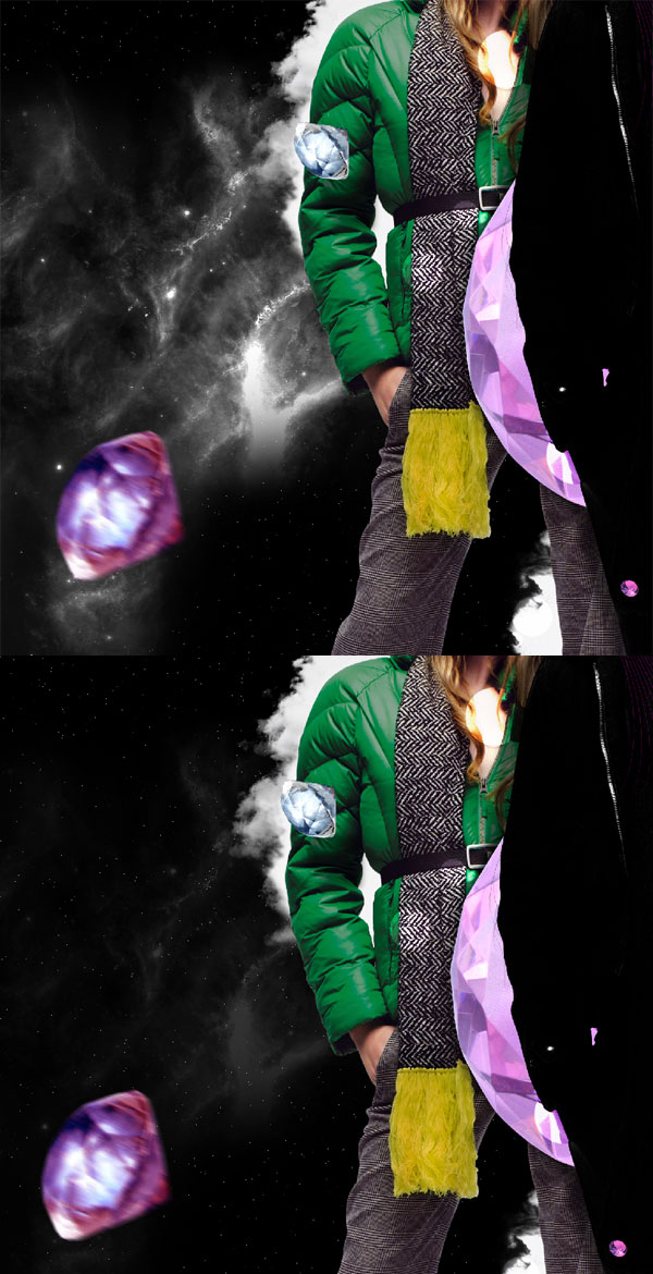
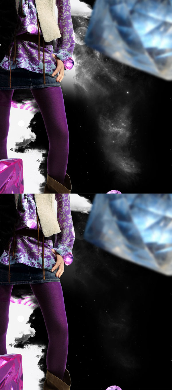
Next step is to import the diamonds into the composition. You can start arranging them but you must keep in mind that you will surly change their order when you add more elements. The first images shows you how I arranged my diamonds.1. Working on the top diamond: First of all crop the diamond and import it into the document then duplicate the diamond and desaturate it. Set the desaturated layer to 70%. Then I used my logo to make it look like it is frozen into that diamond.
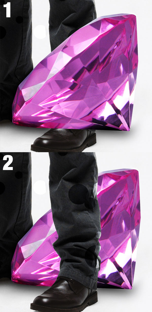
2. The lower diamond between the legs need some shadow and masks applied to it. First of all mask the diamond using the Pen Tool (P). Then create a new layer on top of that and using a sot black brush draw a shadow like below and set the layer to Overlay and Opacity 75%. Duplicate the same layer, set it back to normal but change the Opacity to 45%.
The other diamonds just need some shadows below them and apply motion blur and blur to 3 of them.
Step 6
Using the Pen Tool (P) create a shape around the model. Next you need to lower the Fill to 0% and add a #f424cf stroke of 1 pixel to the shape. Duplicate the shape 2 more times and place them above the model layer. Move the layers into a group and set the group to Multiply.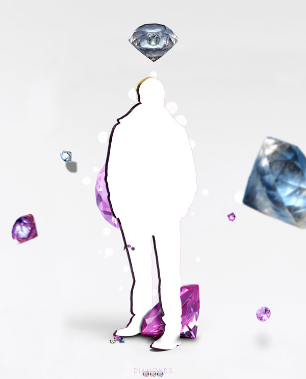
Step 7
Next using these 2 brush files found on PSDTUTS you need to place 2 of them beside the model.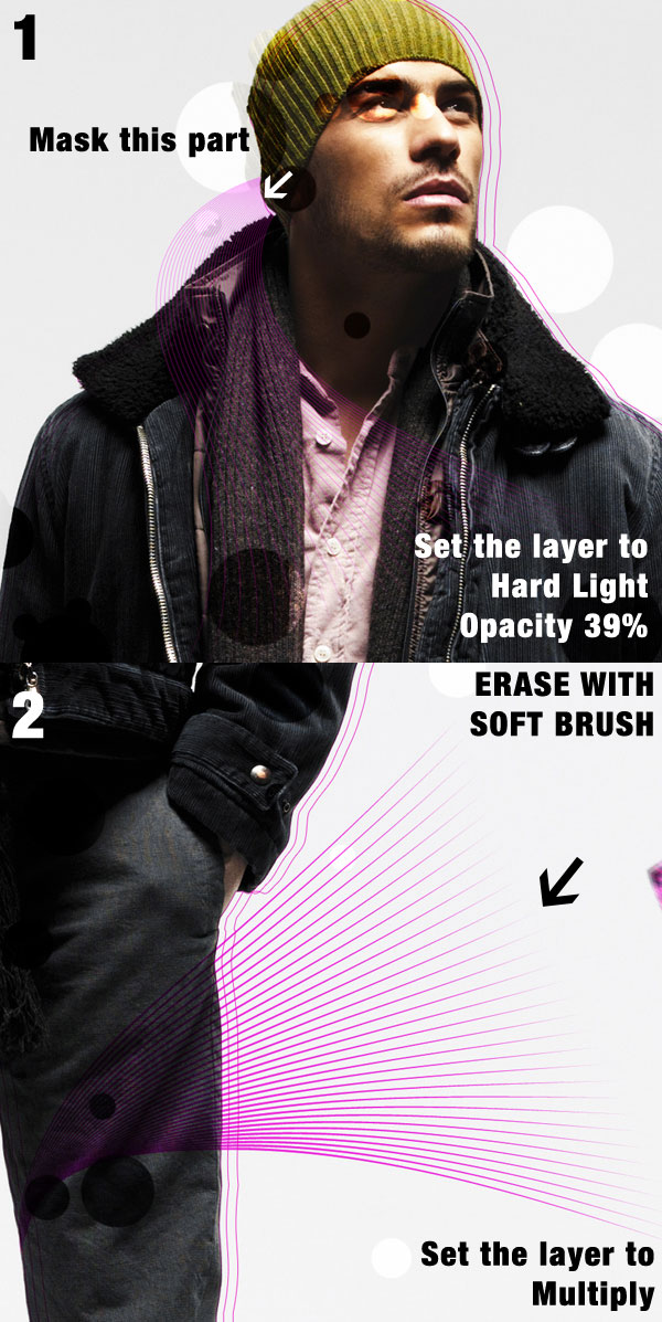
Step 8
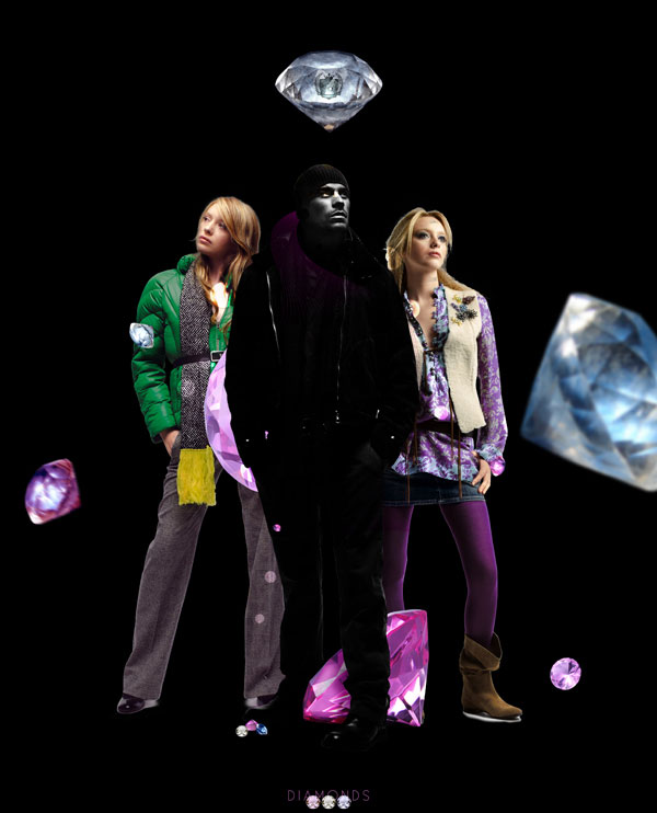
When I first created this illustration I reached this point and realized there is something missing. The elements donÕt get along with the rest of the illustration so I imported 2 more female models.The difference between these 2 models and the first one is that you need to crop these 2 using the Pen Tool and import them in the document, also you need to place them behind the male model layer.
Step 9
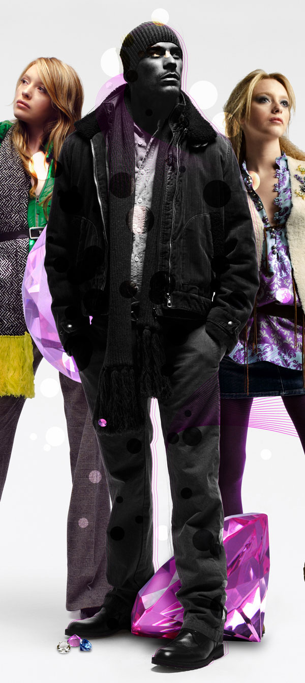
In this step we will make the male model transform into a shadow of some sort. The idea behind this illustration I have made is that “Girls Want Diamonds Not Boys”. This is what we are trying to illustrate here. We have the diamonds very visible but we have to make the boy invisible somehow.Duplicate the male model layer and desaturate it. Then create a new layer above that and then using a soft black brush, add some more dark. Remember that the brush Opacity needs to be lowered.
Step 10
Duplicate the white and black male model 2 times and place the new layers above the recent layer then set them to Multiply. Set one of them to 43% Opacity.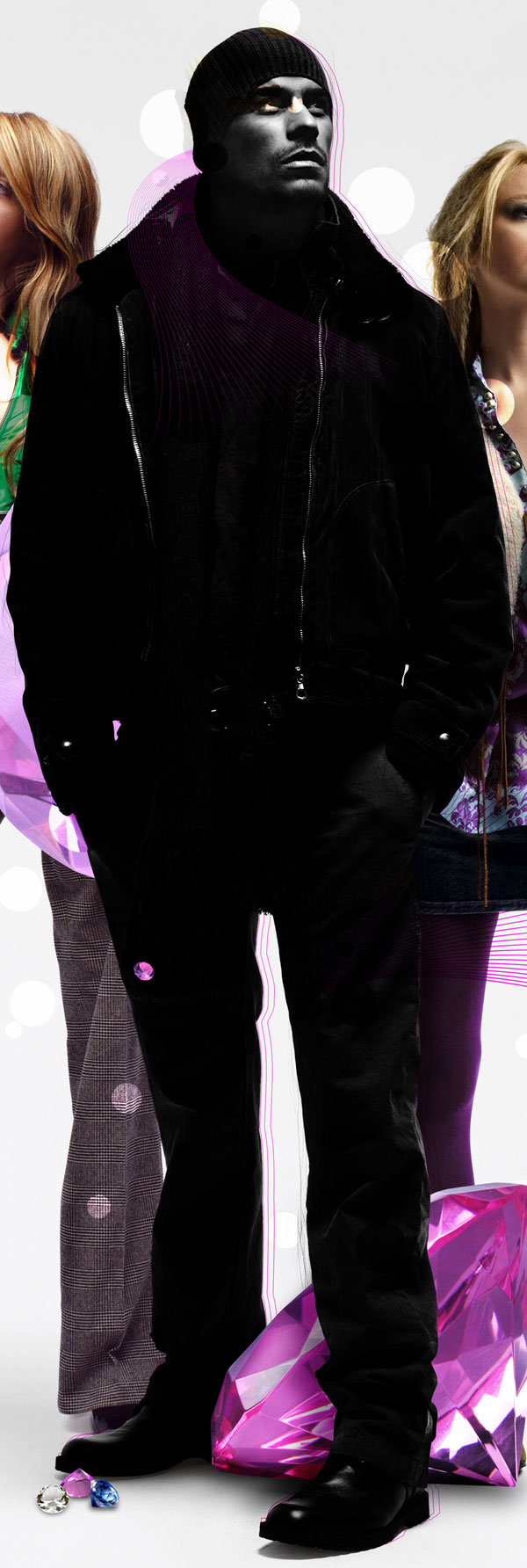
Step 11
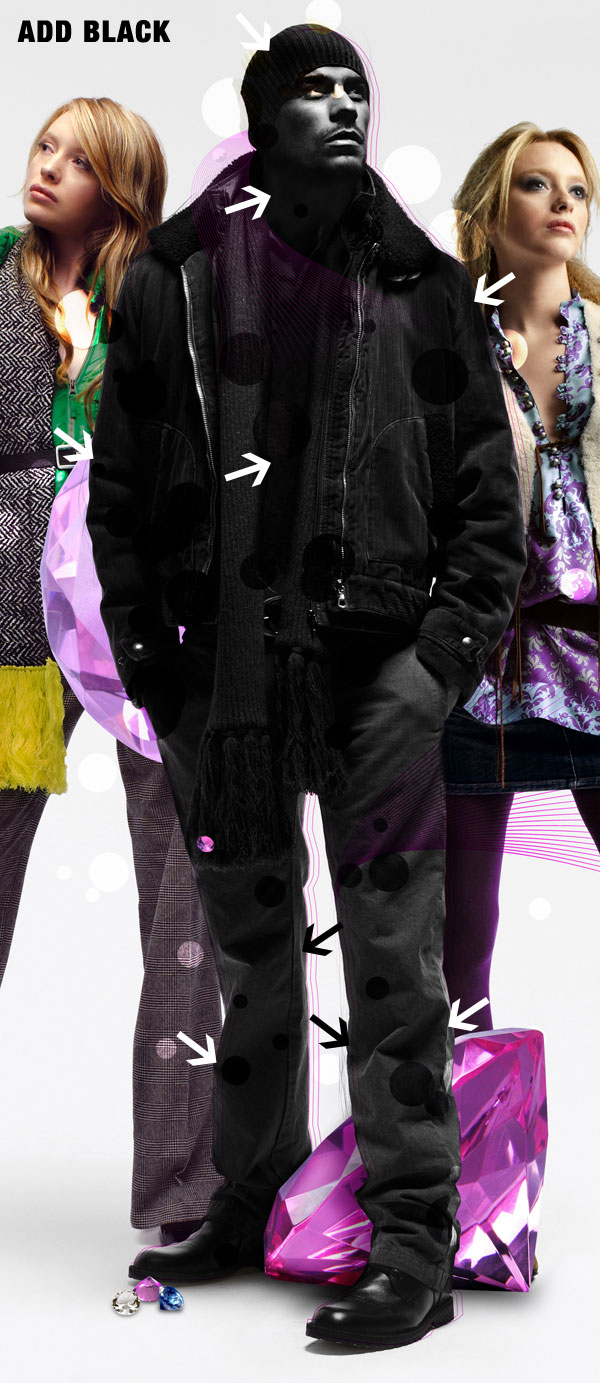
At this point the contrast between the male and background is too high so you need to do something with that. This is the step where you start creating the space background.First of all create a new layer and place it below all the other layers.
Step 12
Next, create a mask for this layer and using some black cloud brushes that you can find here DeviantArt, you need to start letting in some of the previews background that I also liked very much. This is a really great effect and the result will look very good, like a crack in the space.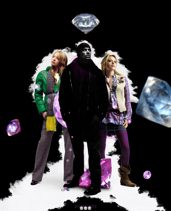
Step 13
Next you need to create the stars and nebulas.First create a new layer above the black one and fill it with black then go to Filter > Render > Noise. Then go to Adjustments > Levels, drag the left slider until stars start disappearing and stop when you are satisfied with the result. In the end mask the start so that they will be visible only on the dark background you created.
Step 14
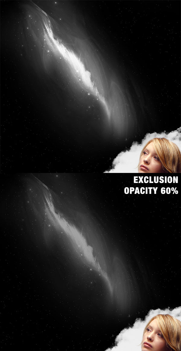
Import the nebulas created by kire198. What you will do next is to use 2 of those nebulas, desaturate them and place them in position. Then with a soft eraser you need to erase the edges. Set the layer to Exclusion and 20% Opacity.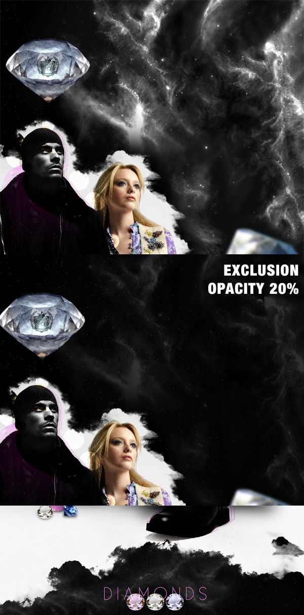
Step 15
In this step you need to add some elements that I called “Extras”. These are a few blurred white circles and a blurred line. Simple to create but they are very useful.
Step 16
Add more white dots like in step 15 but this time use the Eraser Tool (E) and Overlay setting and place them in the lower left corner. Because you set these white circles to overlay, they will make the nebula more visible and that is exactly what you wanted.
Step 17
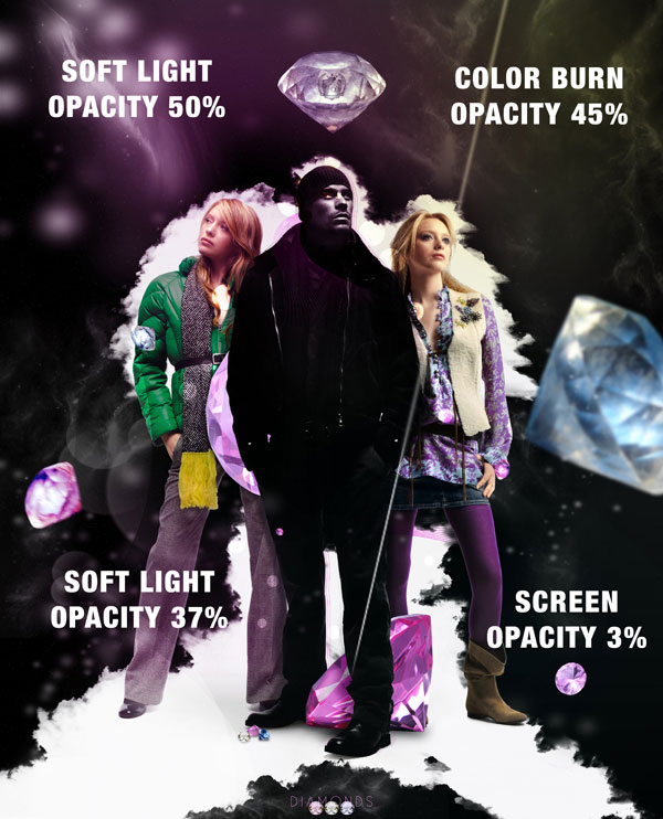
Create a new group and call it colors. In this group you will create 4 layers and each layer will have a color. You will need to place all these colors using the Gradient Tool (G) then set each layer to Screen, Color Burn and Soft Light. Follow the images for reference.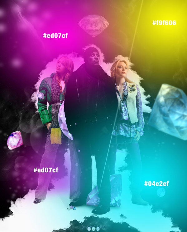
Step 18
One more element I will add over all the layers and mask in some places is another line swirl like you added in step 7. This time make it white and set it to Overlay and Opacity 62%.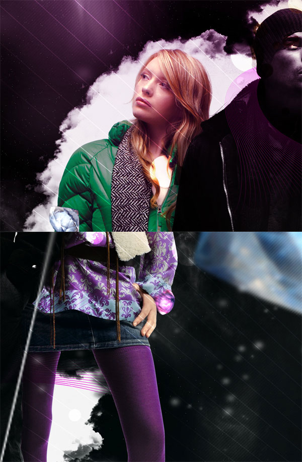
Conclusion
In the end it is good to save the image as a JPG then add some more details to the image by changing some settings with the Curves. Hope you learned some new techniques and had fun while doing so. You can view the final image below or view a larger version here.
Tidak ada komentar:
Posting Komentar