
Before Getting Started
This tutorial aims to be a guide for those starting on print design, we will cover several important subjects, such as: document settings, dimensions, layout, bleed and margins, working with color, adding typography and even printing the piece.I’ll divide it in two parts, this first one is about creating the background for the menu sheets and adding a couple of additional graphics using Adobe Photoshop, which will be imported later on into InDesign to finish the product. The second part is about adding the text elements in Adobe InDesign, mock-up a ready to print booklet style document and actually print it.
We will work within an imaginary scenario where a client "X" provide us a couple of pictures and a Word document with the coffee shop’s text and our job is to make it look nice for print.
Let’s get it started, the assets for this tutorial are:
Setting Up the Document
Remember, pen and paper first! Draft what you want to achieve and how you want to make it. Below there’s a quick draft that I did, which will be the starting point of the design. There will be two pages, front and back.On the front page we will have the cover and back cover layout, and on the back page we will have the actual menu text. The design will be folded as a booklet. We will use violet and black colors for the background and mostly white text. The paper size may be variable, I’m thinking of a "double – letter" size, which means that each page will be an actual Letter size. It’s common to print the menus on big sizes, but depends on you. Once you have the idea of what you want to achieve, it’s time to move forward.

Step 1
We will create a single Photoshop document to mock up the backgrounds, create the image with the company name and add the cup of coffee.Let’s start this adventure, open Photoshop and then go to File > New. First of all you need to decide which size of paper you want to use, this may vary depending on the client’s budget. This time we will start with a standard Letter Size of 8,5 x 11 inches. It’s very important to set up the resolution at this point, the minimal Print Resolution that works (in my experience) is 300 pixels/inch. And this time I’ll start working directly with CMYK Color Mode.
The cover and back cover of the booklet will be a unique piece of paper that will be folded after print. In order to make the background look nice and fluid (without undesired cutoffs), we will design it in a single document, which means duplicate the document width to convert it into a "Double Letter" piece of paper.
Duplicate the width size of the Letter paper to 17 inches (8,5 x 2). Once you double-check everything is correctly set up, hit OK.

Step 2
Now we’ve got the printable canvas, but we need to increase the design area a little bit with a security Bleed. Show the Ruler (Command + R) and add four Guides (click over the rule and drag) around the document borders, then go to Image > Canvas Size and increase the document size 1/8 inch at top, bottom, left and right. The quickest way of doing this is to add 1/4 inch (1/8 x 2) which means 0,25 inch to the canvas width and height as shown in the image below. Ensure the anchor point is located at the center and hit OK, you should have your canvas increased by 1/8 inch on all the borders.Finally, add a Guide exactly to the horizontal center to divide the document into two columns. Use the rule to draw two more guides 1/8 inches to the left and right of the middle guide, to create something like a middle bleed area.

Designing the Background
Step 3
Let’s start with the actual graphic design. First of all we will create a Gradient Fill Layer, go to Layer > New Fill Layer > Gradient and set the following values to the gradient colors: Violet (C:80, M:100, Y:30, and K:25), and Black (C:70, M:70, Y:70, and K:95) which is a common version of rich black and works really good. If you want to know more about using black in print design, take a look at this link: The Ultimate Guide to Designing with Black. Be sure to set the Angle to 90 degrees.
Step 4
Now add some effects to the to the background. Create a new layer above the gradient background, set the Front color to: C:80 M:70 Y:60 K:80 and the Background color as White. Now go to Filter > Render > Clouds. Change the cloud layer’s Blending Mode to Overlay.Then, go to Filter > Blur > Motion Blur, set the Angle to 90 degrees and Distance to 999 px. Finally adjust the Levels (Command + L) as shown at the bottom of the image below to finish the effect.

Step 5
Using the Pen Tool, draw a shape similar to the one shown in the image below. Fill the path with this color: C:10, M:15, Y:0, and K:0. To keep the layers organized I’m using Layer Groups, first create a folder named "Curves Right" and put all the curves of the right side of the canvas there.After drawing the curve, go to Layer > Layer Mask > Hide All and fill it with a Horizontal Gradient (White to Black) making visible just a part of the left side of the curve. Finally change the curve Layer Opacity to 25% and set its Blending Mode to Color Dodge.

Step 6
Duplicate the Curve as many times as you want (hold the Alt key and Drag) and use the Transformation Tools to distort each duplicated curve in order to get something like the image below. You can add as many curves as you want. Try changing the opacity value on each one to obtain a nice effect.Then select the "Curves Right" group and drag it to the right side of the canvas. Then duplicate the entire group (you can hold the Alt key and drag) and go to Edit > Transform > Flip Horizontal to reflect the curves, then select the new Group that you can name "Curves Left" and drag it to the left side of the canvas.

Step 7
Create a new layer above the "Curves." Use the Ellipse Tool (U) to draw a pink (C:5 M:55 Y:0 K:0) circle (hold the Shift key to make it perfect). Then go to Filter > Blur > Gaussian Blur you’ll be asked to Rasterize the Shape, do it; set the Radius to 50px and hit OK. Next, change the circle’s Blending Mode too and the Opacity to 25%, then place it somewhere over any of the curves.Duplicate this layer as many times as you want, changing the Opacity value and resizing each copy a little bit. Try to get something like the bottom of the image below. Once you’ve finished, put all the layers into a folder named something like "Light Spheres."

Step 8
For this step you’ll need to open the Stars Brushes set. In a new layer paint some White (C:0, M:0, Y:0, and K:0 ) stars in random places, then add an Outer Glow Layer Style using the Screen Blend Mode, with a Size of 70px and this color: C:15, M:55, Y:0, K:0. Finally set the "Stars" layer Opacity to 70%.
Adding the Name
Step 9
The following step is adding the logo, of course this cannot be named logo, since an actual logotype is a more complicated graphic design piece, so I’ll call it just "company name." Use some guides to divide the left portion of the document in two, both vertical and horizontal. Then use the Type Tool (T) to type the word "VIOLET" in all caps and in White. I’m using the commercial font Avant Garde, but feel free to use any substitute (Futura, Century Gothic, etc). Use the Character values shown below. Then select the letter "O" and change its color to: C:10, M:85, Y:0, and K:0.Finally, as an additional effect, add to the Text Layer a Gradient Overlay Layer Style (Gray to White) and set the Blend Mode to Linear Burn, Opacity to 75%, and Angle to 90 degrees.

Step 10
Now we will add a reflect effect to the text layer, for this duplicate the text layer, rasterize it (a quick way of doing it is creating a blank layer below it, then select both the copied layer and the blank layer and press Command + E to merge them) and then go to Edit > Transform > Flip Vertical. Place the copy just below the text. Finally, add a Layer Mask > Hide all to the copy and fill it with the Gradient Tool (Black to White).
Step 11
As a final touch, create a new Layer above the "Violet" text layer and use the Stars Brush set to paint some white stars on it. Change the Layer’s Opacity to 85%.
Step 12
Let’s type the word "coffee" in the lower right corner of the word "Violet." For this word you can use any script typeface (I’m using Edwardian Script). Now add a Gradient Overlay Layer Style using these colors: C:10, M:85, Y:0, K:0 and C:15, M:55, Y:5, K:0. Finally, put all the layers related to the company name in a Layers Group named "Logo."
Layer Comps
Step 13
Now we’ll set two Layer Comps in order to save two different versions of the design in two separate files using an Automated Script.First show the Layer Comps panel, go to Windows > Layer Comps. Ensure the "Logo" folder is visible and on the Layer Comps panel click on the tiny New icon at the bottom, rename the new layer comp to "Cover." Then hide the "Logo" folder, and create a new Layer Comp naming it "Inner" this time. You can toggle the visibility of the layer comps to double-check everything is OK.

Step 14
Go to File > Scripts > Layer Comps to files. In the dialog, set the File Type as PSD, browse where you want to store the new files, name the resultant files with some descriptive prefix like "Violet," and leave all the other settings by default. When you hit on Run, Photoshop will automatically create a new file for each Layer Comp. The name of the new document will include the name of the Layer Comp.
Additional Graphic, a Cup of Coffee
Step 15
Open the cup of coffee image in Photoshop, double-click on the "Background" Layer to make it editable. Then use the Pen Tool in Paths mode, draw around the cup’s silhouette, once you’re finished with the path drawing, click on Exclude Overlapping Path Areas in the Options bar and draw a path inside the cup’s handler. Once you’ve got the paths drawn, go to Layer > Vector Mask > Current Path to convert the path to a vector layer mask extracting the cup from its background.
Step 16
You can drag and drop the coffee cup from its original document to our working document. Once you place it on the design, rasterize the layer if you want too, Option (Right) click on the Layer and select Rasterize Layer; name the resultant layer "coffee cup."Then, using the same technique as in Step 10, add a reflection to the cup, but this time using a big, soft, black Brush (B) paint a little bit over the layer mask to soften the angular shades, as shown.

Step 17
As a little additional detail we will add a shadow to the cup. Use the Ellipse Tool to draw a rich black ellipse between the "coffee cup" and "coffee cup copy" layers. Then go to Filter > Blur > Gaussian Blur, set the Radius to 35 and hit OK.
Step 18
To keep the violet ambient add a Photo Filter Adjustment Layer above the cup, ensure the Clipping Mask option on the Adjustments Panel is selected and set this color to C:40, M:80, Y:0, K:0 and Density to 25%. Now put all the coffee cup related Layers into a Layer Group named "Coffee cup."
Step 19
Now we will add a little bit of Smoke to the coffee cup. Open the Smoke image from the assets and double-click on the "Background" Layer to make it editable. Hit Command + I to invert the colors of the image. On the Hue / Saturation adjustment window (Command + U) set the Hue value to -92 to make the smoke more violet.Let’s extract the smoke from its background. In the Channels Panel (Window > Channels) duplicate the Red channel, hit Command + A and Command + C to save the copy to the clipboard, then delete the duplicated channel, click on the RGB channel again to leave the image with its default colors.
In the Layers Panel select the smoke layer and go to Layer > Layer Mask > Hide All, on the Layer Mask miniature, always on Layers Panel, Alt-click on the mask to show it, then Paste the clipboard on the visible Layer Mask. Then click on the actual layer miniature to see how it looks.

Step 20
Drag the smoke layer to our main document. Then rasterize it and name it "Smoke." Place it just above the cup of coffee. Add a Layer Mask to this layer and fill it with a White to Black gradient to hide the bottom of the smoke column. Use a soft black brush to paint over the layer mask to hide the top of the smoke column.Finally, duplicate the "Smoke" layer, place the copy above the original layer and go to Filter > Blur > Gaussian Blur, then set the radius to 35%. This will add a nice glow to the smoke layer.

Step 21
Now, in order to increase the visual impact of the coffee cup, add some lights and stars, just like we did on the background at the steps 7 and 8. Finally, put all the layers related to the coffee cup, including the smoke, the lights and stars, into a new Layer Group named "Coffee."
Exporting the Additional Graphics
Step 22
Revising, we have two important layer groups for this step: "Coffee" and "Logo." Both will be additional graphics that we will import later on into the InDesign document, so we need to export each one as a different file. Let’s start with the "Logo" group, duplicate it (drag the group over to the New button at the bottom of the Layers Panel), select the "Logo copy" group and press Command + E to rasterize it. Do exactly the same with the "Coffee" Group.
Step 23
Select the "Logo copy" layer, then Option (Right) – Click on it and select Duplicate Layer, on the popup dialog, write a name for it and select Destination of New. This will create a copy of the logo layer in a document with the same width and height as the original. Use the Crop Tool to cut all the blank space on the copy, then save the document with some descriptive name like: "Logo.psd." Repeat the process with the "Coffee copy" layer.
Resultant Files
Step 24
That’s it with Photoshop, at this point you should have the following important elements to use them on the next part of this tutorial: two PSD files with the backgrounds, one for the cover and another for the internal pages. A PSD file including the Logo with a transparent background, and another document including the coffee cup with transparent background as well.Now we are ready to create a printable document in InDesign and add the information provided by the client.

Conclusion
At this point we have a good looking background for our menu. Now jump to Part 2 of this tutorial over on Vectortuts+ where we’ll learn more about print design.Final Product What You'll Be Creating

What You Should Get Now
In the Part 1 of this tutorial series, I showed you how to design a background for both the cover and internal pages, besides two additional graphics that we will use later. Before starting with this part of the tutorial you should have all the following PSD files on hand. Psd Premium members can find those files in the source folder of the Premium download.
Setting up the Document
Step 1
Let’s get it started, open Adobe InDesign, go to File > New > Document. Click on the More Options button to show all the options. First set the document Intent to Print, then set the Number of Pages to 4 and Start Page #1, check on the Facing Pages option, this is very important when you’re designing a booklet; set the Page Size as Letter, which is exactly 8,5 x 11 inches, and select the Portrait orientation. On the Margins set 0,25 inches (1/4) on all the fields (click on the chain icon). And set the Bleed value to 0,125inches (1/8) to all the fields. Booth Margins and Bleed values are variable depending on the requirements of your print shop, the values shown are my personal standards which work pretty good with these kind of pieces.After hitting OK, you’ll have a Letter sized document with four facing pages, with a security margin of 1/4 inch and a printer cut-off bleed of 1/8 inch.
Master Pages
Step 2
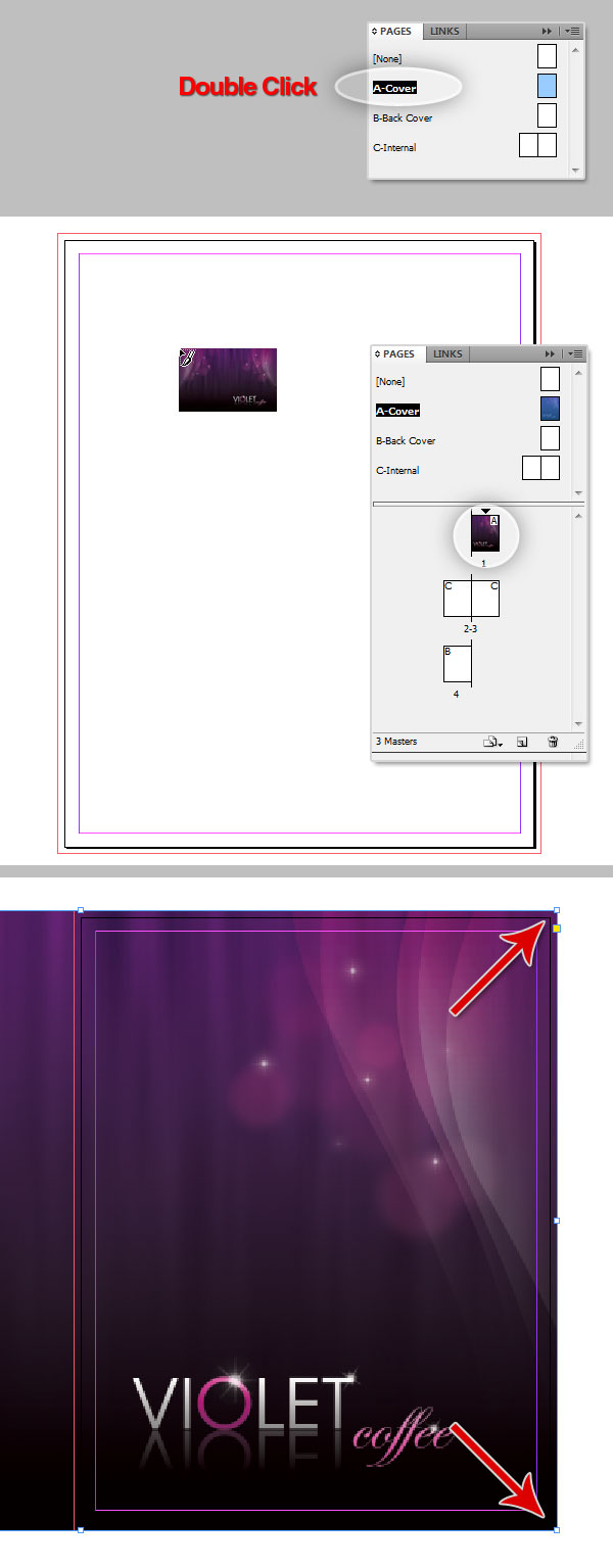
A master page is something like a "template" of basic layout that can be used over and over again on many pages of your document, and allows an quick, easy way to change multiple characteristics. In this particular case we will create three master pages: one for the front cover, one for the back cover, and the last one for the internal pages.First of all you need to show the Pages Panel by going to Window > Pages (F12). By default InDesign creates a blank master page labeled "[None]" and a secondary Master Page with two pages named "B-Master."
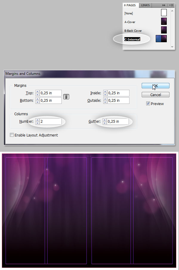
We will create our very own, Option/Right – Click on the B-Master and click over New Master, Set the Prefix to "A," Name of Cover, Based on [None] and Number of Pages at 1, hit OK and the A-Cover master page will appear in the top row on the Pages Panel. Repeat the process to add the "B-Back Cover" page and for the last Master Page named "C-Internal" just change the Number of Pages to 2.
You should have something very similar to the bottom of the image below.
Step 3
The following step is to apply the Master Pages to the actual Pages in the document. On the Pages Panel, in the lower row there’s a mini layout of the document’s pages. Select the first page with a Click, then Option/Right – Click over it to show the options menu, select "Apply Master to Pages" option, a dialog window will shows up select Apply Master: "A-Cover" (Because the first page is the cover) To Pages: 1. Repeat the same process with the Page 4, but applying the "B-Back Cover" instead. Finally Select both Pages 2 and 3 (Shift-click) and Apply Master: "C-Internal" To Pages: 2, 3.If you did everything right, a tiny letter in the upper-left corner of each page will show the prefix of its respective Master Page.
Add the Backgrounds to Master Pages
Step 4
Now it’s time to import the background elements. Double-click on the "A-Cover" master page, the page will show up in full view. Then go to File > Place… (Command D). Browse your file system until you find the "violet_0000_cover" PSD file, select it and click on Open.Now the cursor will include a miniature of the imported image, click somewhere over the master page to place it into the design. If you did everything good with the document sizing, the background’s height should be exactly the same as the master page’s height, so the only thing you need to do is place it matching the right border of the background with the master page right border.
Step 5
Repeat the previous step but this time working on the "B-Back Cover" master page, with the difference that you need to match the background left border with the page’s left border.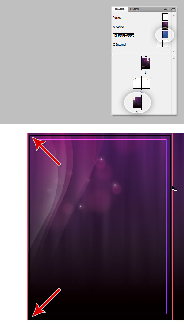
Step 6
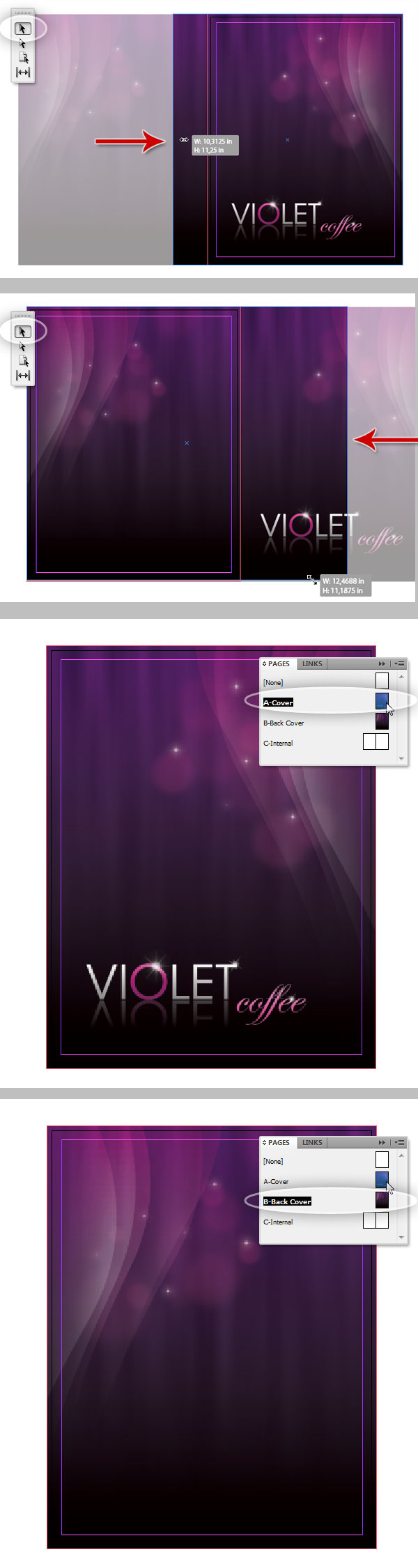
My favorite characteristic of InDesign is that you can resize the dimensions of the containing box without modifying its content nor the aspect ratio. We will reduce the background’s width in order to match it with the page’s width, for this double-click on the "A-Cover" masterpage, then in the Toolbar, grab the Selection Tool (V) and click over the background to select it to show the transformation handlers, click on the middle left handle and drag it until make it match with the page’s left border.Do the same with the "B-Back Cover," but resizing the width matching the page’s right. This process will allow you to have a better visual of the document when editing and since we designed the background in Photoshop with the "double-letter" custom size, there should not be any displacing when we print the piece, but we will cover it later.
Step 7
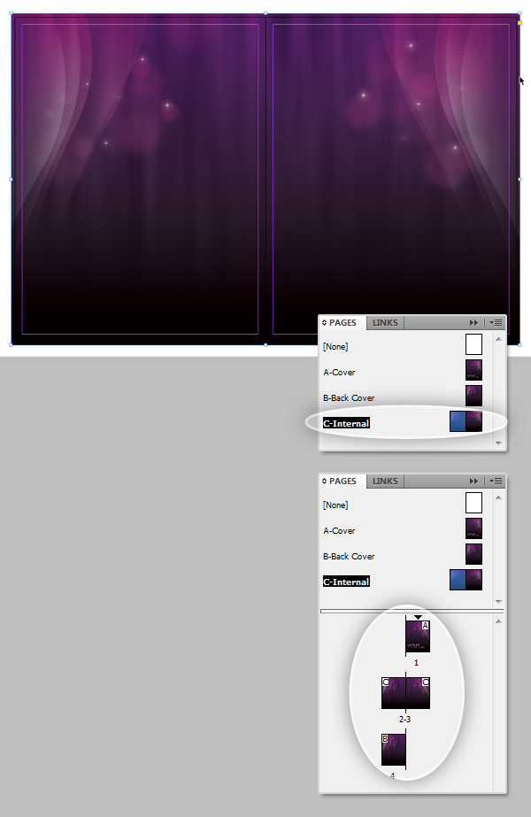
Finally add the "C-Internal" background. Double-click on the Master Page miniature and place (Command + D) the "violet_0000_inner" PSD file, since the background is already designed for a double page layout you will only need to match the borders.Those are our master pages, you should have something like the bottom of the image below. If you need to add more pages to your design, there will be no reason to insert the background over and over again, just apply a master to the respective page. It makes edits easiest, because you can always modify the background or replace it only once to modify the entire document look, or maybe create a different background style and have many backgrounds in a single document.
Step 8
Next we will add some visual aids for the columns, depending on your design you can set a layout with several columns per page, in this case we will divide the internal pages into two columns, remember this visual aid (Columns, bleeds, guides) will not be printed on the final piece.Double-click on the "C-Internal" Master Page to edit it, go to Layout > Margins and Columns… in the dialog you’ll be able to modify the Margins and Column values. Since we set up the Margins already, let’s add the columns. Set the Number at 2 and the Gutter (space between columns) to 0.25 (1/4) inches. And that’s it, now you have a two column layout for the internal pages. In case you need some pages with a different layout with more or less columns, just create another Master Page.
Adding Back Cover Text
Now we will need to open the client’s Word Document, you can download it here. Basically, its a bunch of text without any order, it’s our job to mock up it in the best possible way.Step 9
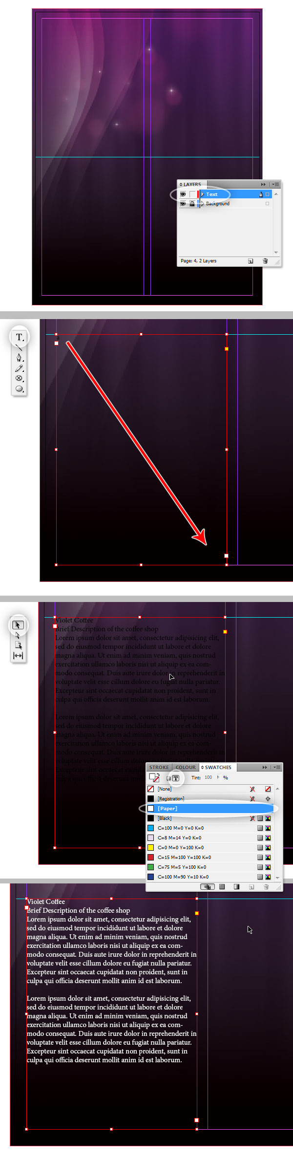
We will start with the back cover because it’s the simplest. First of all double-click on the page you’re editing, in this case Page 4. Show the Rulers (Command + R) and draw a horizontal guide and place it in the middle of the page.Show the Layers Panel (Window > Layers). There you’ll see a layer that contains the background elements, rename it to "Background," then create a New Layer named "Text" and select it. You can block the "Background" layer by clicking on the tiny square next to the layer name to avoid undesired editions, but it’s not necessary.
Select the Type Tool (T) and draw a box from the center guide starting on the left column, left border to the bottom of the left column right border, once you have the box, open the word document and copy the "Company Information" text.
Back on InDesign, click somewhere inside the text box and paste the clipboard text. Then in the Toolbar, grab the Selection Tool and click over the text box, show the Swatches Panel (which we will use several times in this tutorial) by going to Widows > Color > Swatches (F5). Now click on the "Paper" color, which will make the text white, and it’s easiest to see.
How to Create a Color Swatch
This intermediate step is about creating a color swatch, I’ll explain it once because we will need to create several swatches in this tutorial. In the Swatches Panel, click on any existing swatch, then Click on the New button at the bottom of the panel and the selected swatch will be duplicated at the bottom of the swatches list. Double-click on the duplicated swatch, and in the Swatch Options window set the Color Mode to CMYK, and set the desired values, ensure the Name With Color Value check box is selected and hit OK.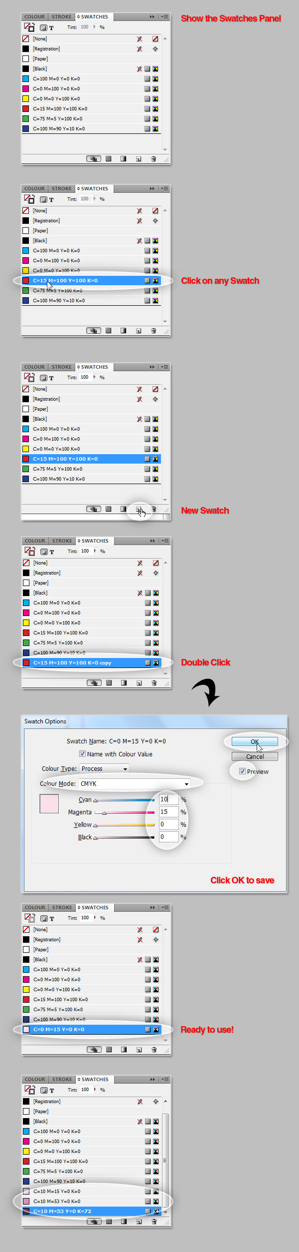
Creating a Character Style
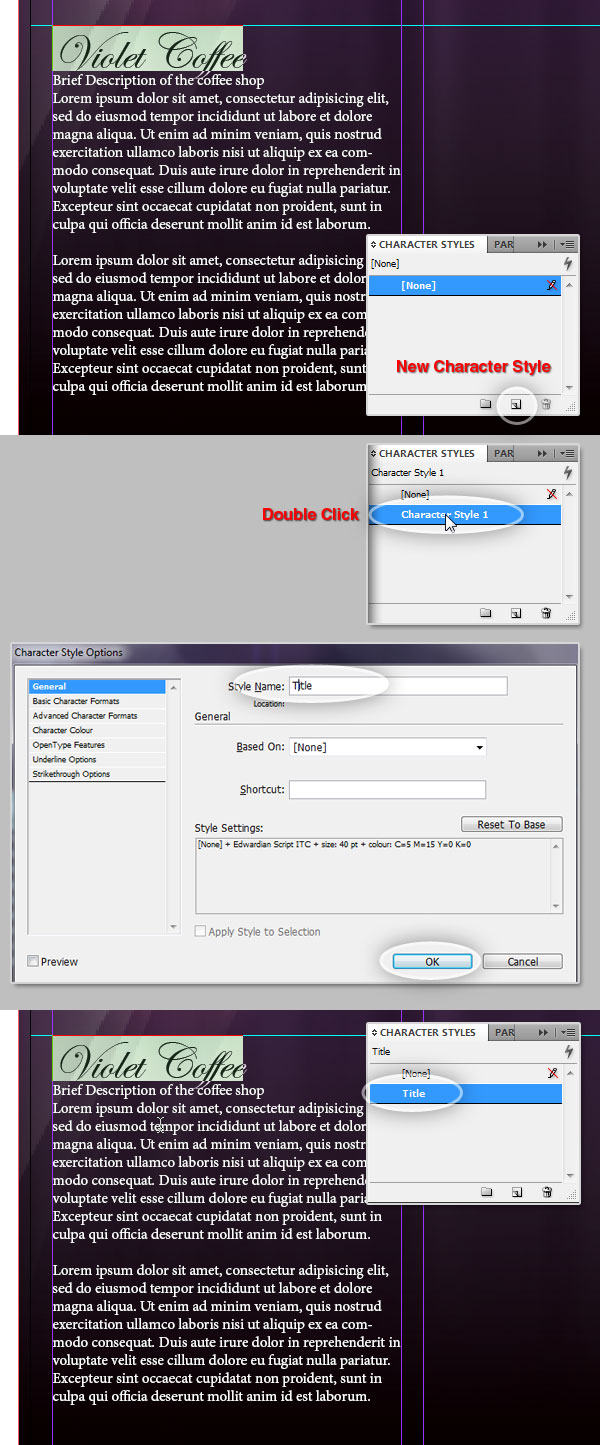
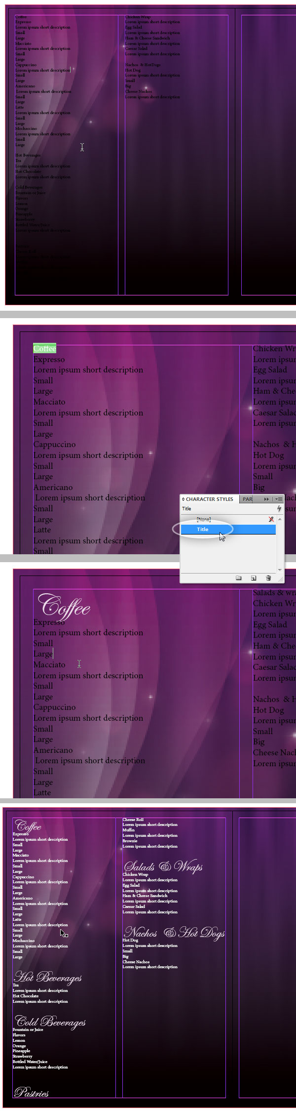
Step 10
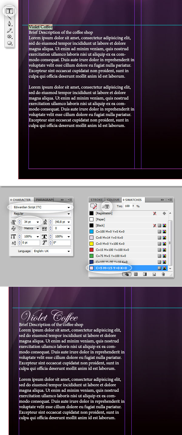
First you’ll need to show the Character Panel (Window > Type and Tables > Character) and ensure you have the Swatches Panel visible as well. Select the Type Tool (T) and select the words "Violet Coffee."Then in the Character Panel, change the font face to "Edwardian Script" (you can use any other font in case you don’t have it) and size around 34. Then in the Swatches Panel, create a new Swatch with this color: C:5, M:15, Y:0, K:0. Now click on the tiny "T" icon on the top of the panel to apply the color to the font face and finally click on the Swatch. You should have something like the bottom of the image below.
Step 11
Since we will use the Character Style a lot in this tutorial, we will save it in the Character Styles panel. Show the panel by going to Window > Styles > Character Styles. In the panel you’ll notice there’s a row labeled "[None]," which is the shortcut to remove all the styles on the selected characters.Now, to create our custom Character Style. Using the Type Tool select the text we just modified, then in the Character Styles Panel click on the tiny New icon on the bottom. A new row will appear named "Character Style #," double-click on it and a dialog with several options will be open. You can actually create the style directly there instead doing it as we did before, but the result is the same. In the dialog we will only change the style name to: "Title." Now, without repeating the process of the previous step, we can apply the style to any word in our design.
Creating a Paragraph Style
Step 12
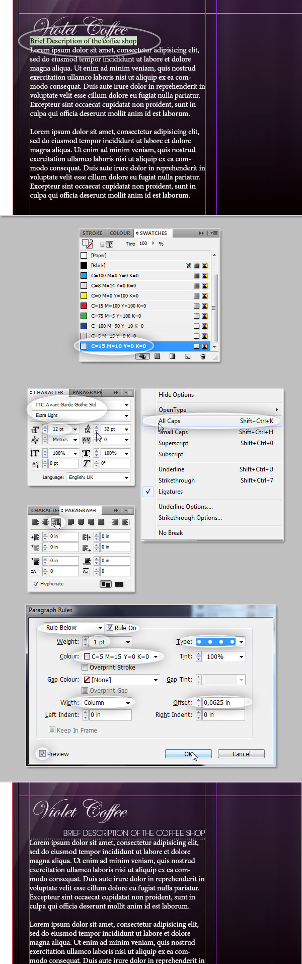
Now, let’s do something a little bit more complicated, we well combine character and paragraph styles to create a custom and reusable Paragraph Style, which is one of the most powerful features of this software. First of all, open the Paragraph Panel (Window > Type and Tables > Paragraph).Select the second row of text, which is actually a subtitle, first in the Swatches panel create a new swatch with this color: C:15, M:10, Y:0, K:0. Now in the Characters Panel, change the typeface (I’m using ITC Avant Garde – Extra Light) and Size: 12, open the Panel’s Option menu (icon on the top right of the panel) and select "All Caps" to uppercase the text.
Then in the Paragraph panel, click on the Align right option. Then in the Panel Options Menu, select Paragraph Rules, a dialog will appear, there, click the Rule On check box. Select the Rule Below option, modify the Width to 1px, Style dotted, search for a Color from the existing Swatches, and set the Offset to 0,0625 inches. You can preview your changes on the fly by checking the Preview check box.
At the end you should have something similar to the bottom of the image below.
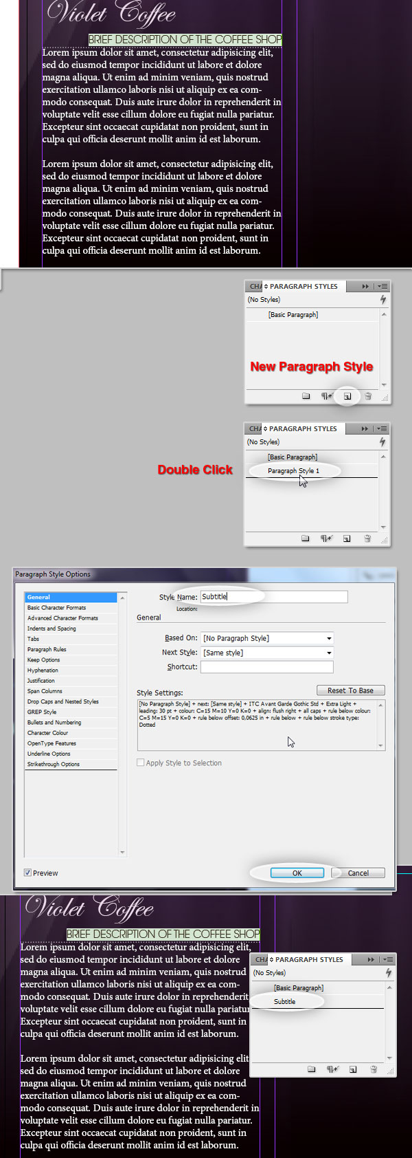
Step 13
Now we will save this Paragraph Style to use it or modify it later, for this, show the Paragraph Styles panel by going to Window > Styles > Paragraph Styles just like on the Character Style, the "[Basic Paragraph]" option overrides all the styles of the paragraph.Use the Type Tool to select the row of text that we just edited. To save the line as a custom Paragraph Style, click on the New button at the bottom of the panel, a new row will be created, double-click on it and a dialog with several options will appear. There you can change almost everything of the style, this time we will change only the Style Name to "Subtitle." And now we are able to reuse this style several times on the design.
Step 14
Now select all the extra text, you can notice I’m dividing it in two paragraphs to make the example more visual. On the Swatches Panel create a new swatch C:5, M:5, Y:0, and K:0, then select it. In the Character Panel set the Typeface to ITC Avant Garde Extra Light Condensed (you can use any other of course) with a Size of 12pt and Leading of 20pt. On the Paragraph Panel select Justify with last line aligned left, First Line Left Indent: 0,0625 and Space Before: 0,1875, besides click on the Hyphenate Check box to divide the words when they exceed the box border.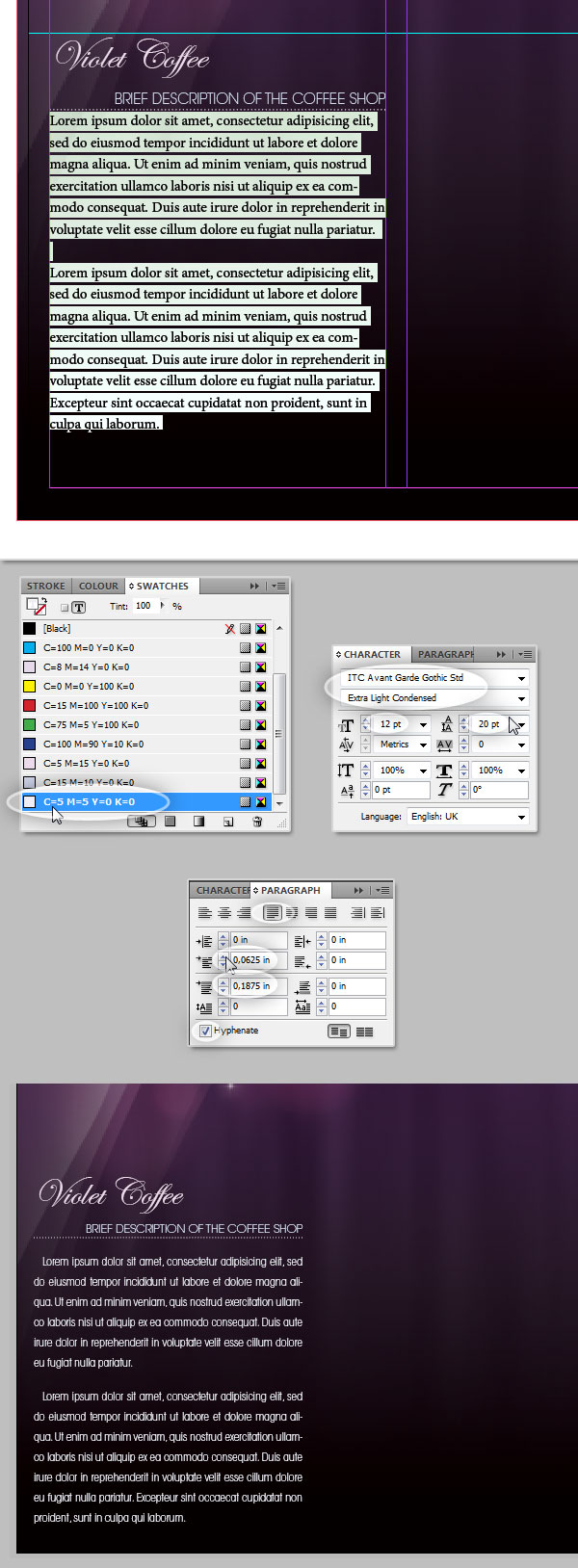
Step 15
Save the previous styling in a new Paragraph Style named "Standard Paragraph."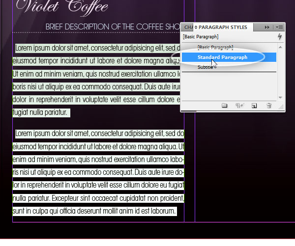
Previewing
Step 16
InDesign allows us to see a quick preview of the design, at the bottom of the Tools Bar you can switch between viewing modes, Normal (W) shows all the additional elements such guides bleed and margins. Selecting the Preview Option you can see only the printable elements. In the bottom of the image below there’s a preview of the Back Cover page, the design is starting to look good.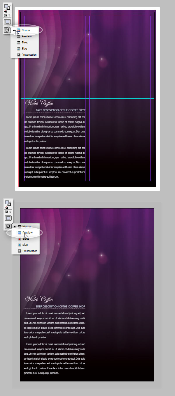
Add the Internal Text
Step 17
Now let’s add the internal pages’ content using the column border as bounds. Use the Type Tool to draw a text box on the first column of Page 2, Option/Right Click over it and select Fill with Placeholder Text to have a visual of the content (you can skip this step of course). Then using the Selection Tool, Click on the box of text and Drag it holding the Alt Key to duplicate it. Do it three times in order to add a text box on each column of pages 2 and 3.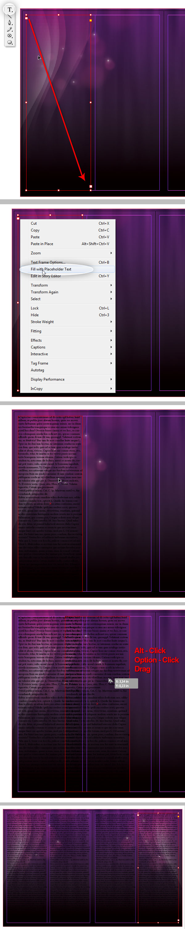
Chain Text Boxes
Step 18
Using the Selection Tool (V) click on the tiny square at the right bottom of the first text box. The cursor will change to an arrow with a tiny chain icon next to it, that means you must select over which text box you will like the text to continue. Click over the second column text box. Then repeat the step, but chaining the second with the third box, and then with third and fourth.Just for testing purposes, using the Type Tool select all the text (Click on any box and press Command + A), on the Paragraph Styles panel Click on our previously created "Standard Paragraph." Then look the design on the Preview mode (see Step 16). Try editing the text, if you remove a word on any box, the content should be adjusted accordingly on all the other boxes.
After testing the columns chaining, select all the text and deleted, and ensure the new text inserted is set with the default "[Basic Paragraph]" style on the Paragraph Styles panel.
Step 19
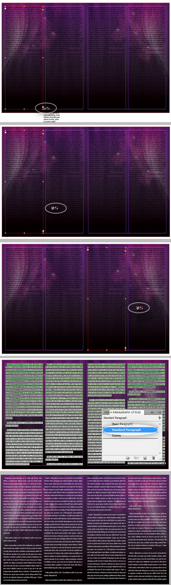
It’s time to add the actual menu text. Often what you get from the client is just plain text like in this example, it’s your work to make it look nice. Copy and Paste the Menu text from the client’s Word document.Before moving forward identify what your client had in mind. You can distinguish "Titles" for something like menu sections: "Coffee," "Hot Beverages," etc. Then the item name, e.g. Expresso, Capuccino, etc. Below a short description of each item and finally the prices for the different sizes or variations.
The categories titles will be the first in line, using the Type Tool start selecting the word "Coffee" and on the Character Styles panel click on our custom "Title" style. Repeat this step with all the titles on the document (just for visual purposes I changed the rest of the words’ color to white, to make it more visible).
Step 20
Now set the styles for the items’ titles. Using the Type Tool select the word "Expresso." Then in the Swatches Panel use the previously created Swatch: C:5, M:5, Y:0, K:0. In the Character Panel set the Font to ITC Avant Garde Book Condensed, with a Size of 12. On the Paragraph Panel, set the Align Left option, set the Left Indent to 0.125 inches, the Space Before to 0.1875 inches, and Space After to 0.0625 inches. Also add a Paragraph Rule using the following options Weight of 0,5pt, Type of Dotted, Color of Paper, Left Indent of 0,125in, and Offset of 0,0625in.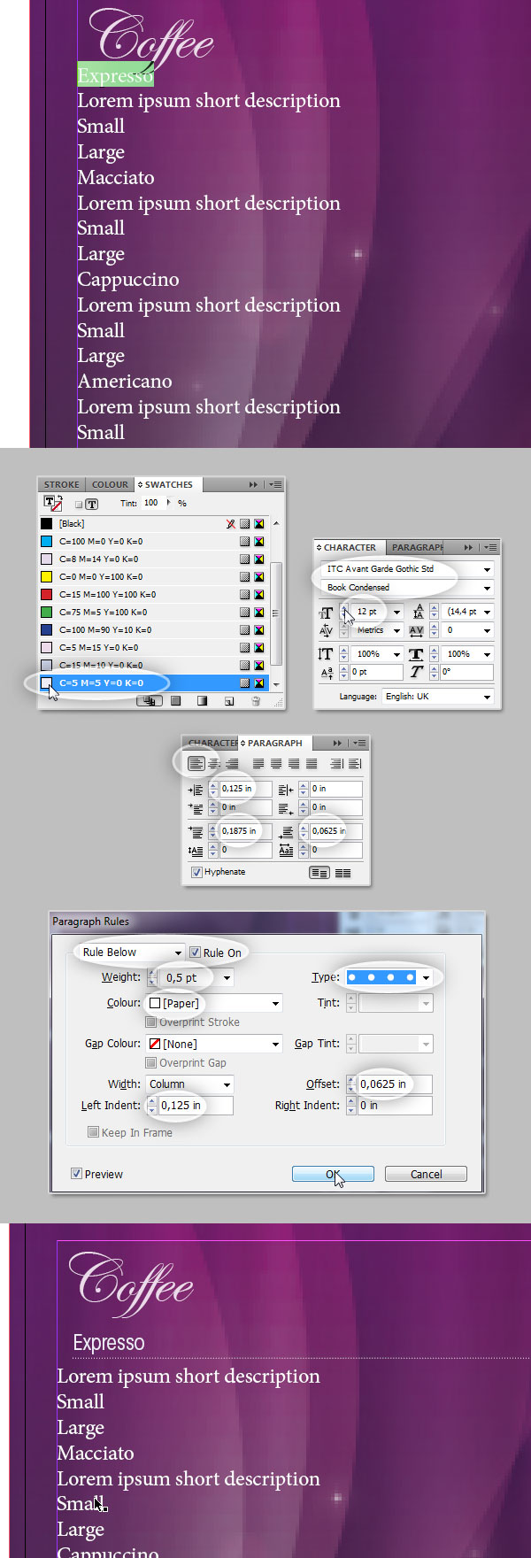
Step 21
Save all the previous styles in a new Paragraph Style named "Item Title," then apply it to all the items in the document.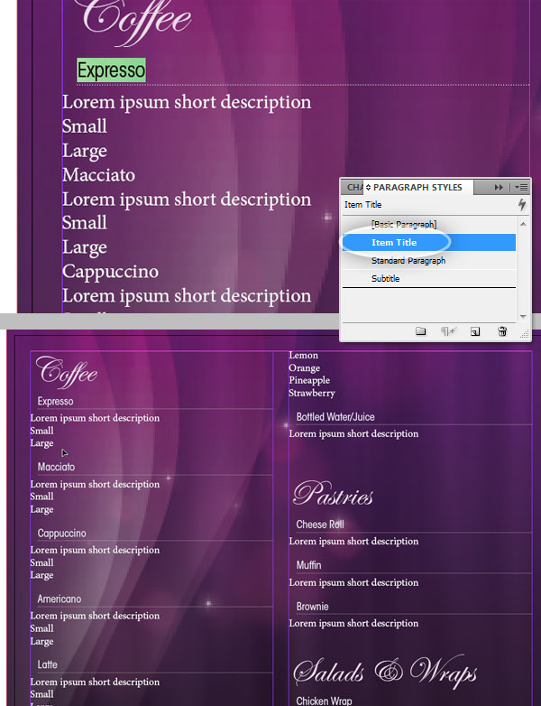
Step 22
Now select the short description text. In the Swatches panel set the Text Color to Paper, in the character Panel set the Font Face to ITC Avant Garde Extra Light Condensed, with a Size of 11pt. And on the Paragraph Panel select the Left Align option and Left Indent 0.125 in.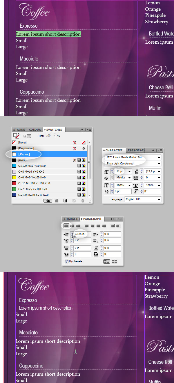
Step 23
Create a new Paragraph Style and name it "Short Description," then apply it on all the descriptions of the document.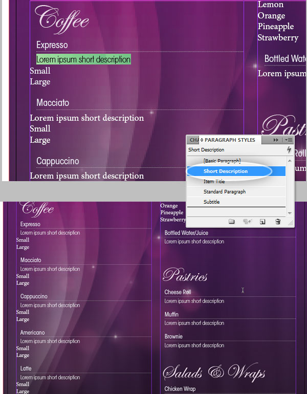
Working with Tabs
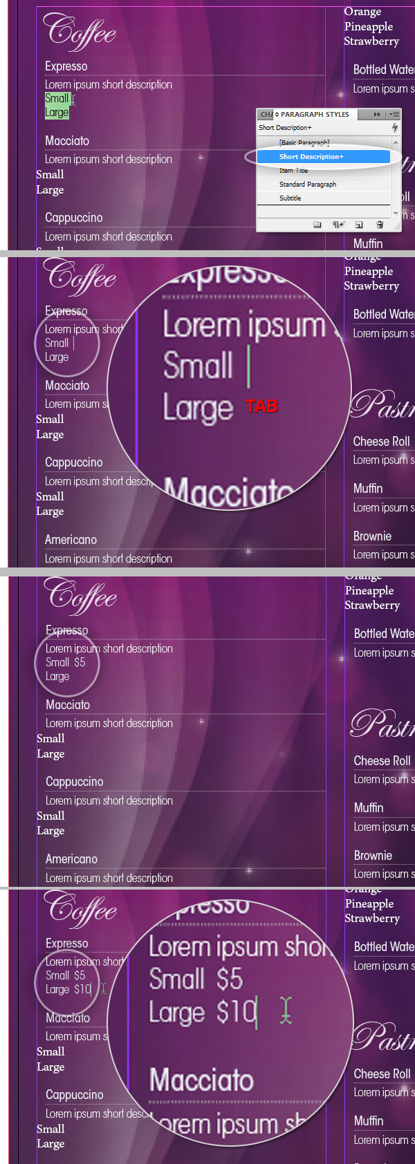
Step 24
Even if it’s not in the document, the coffee shop’s client needs to know the price of each product, so we will add it in a nice way. Apply the "Short Description" Paragraph style to the two price rows under "Expresso" coffee, "Small" and "Large." Then, always using the Type Tool, set the cursor at the end of the word "Small" and click the Tab key once. Next write some random price. Repeat the Tab process on the "Large" coffee’s price.The Tab character is really important in this step in order to save time. Basically we will use an index like style with dotted lines connecting the label with its price. Repeat this step on all the document’s prices.
Step 25
Now it’s time to style the Tab, ensure the two prices’ rows are selected and go to Type > Tabs to show the Tabs Panel. You’ll see a ruler with triangular marks on the left and right sides, those are actually the Left and Right Indent.Click on any portion of the ruler, between the indents to add a Tab Mark, this mark will be a reference for the Tab character that we inserted on the previous step. Drag it left or right until the prices on the position shown on the screens are placed as shown below. Then on the Leader field, set a character to replace the invisible Tab. In this case, I’m using a period "." but feel free to use any other. Finally, in this panel you can modify the indents by dragging its handlers. I’m moving the Left Indent a few points as shown at the bottom of the screenshot below.
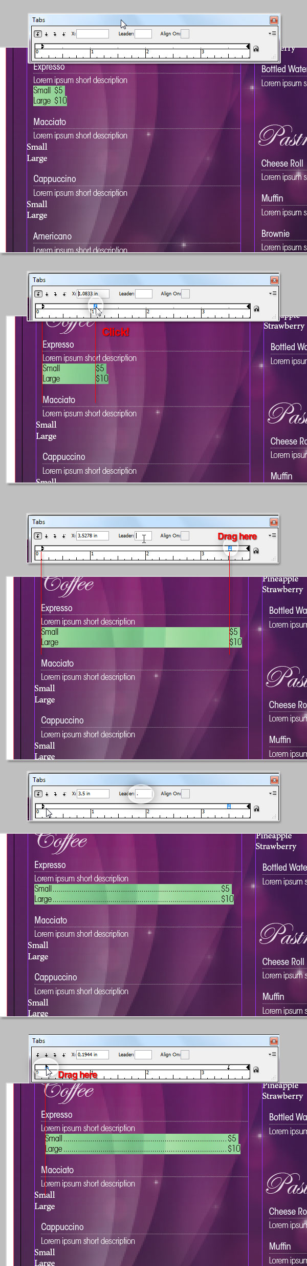
Step 26
Keeping the two rows Text selection, create a new Paragraph Style named "Menu Price." Apply it on all the necessary prices paragraphs. In some cases, there are no sizes, so just apply the price style to the description row, adding a Tab and a price of course.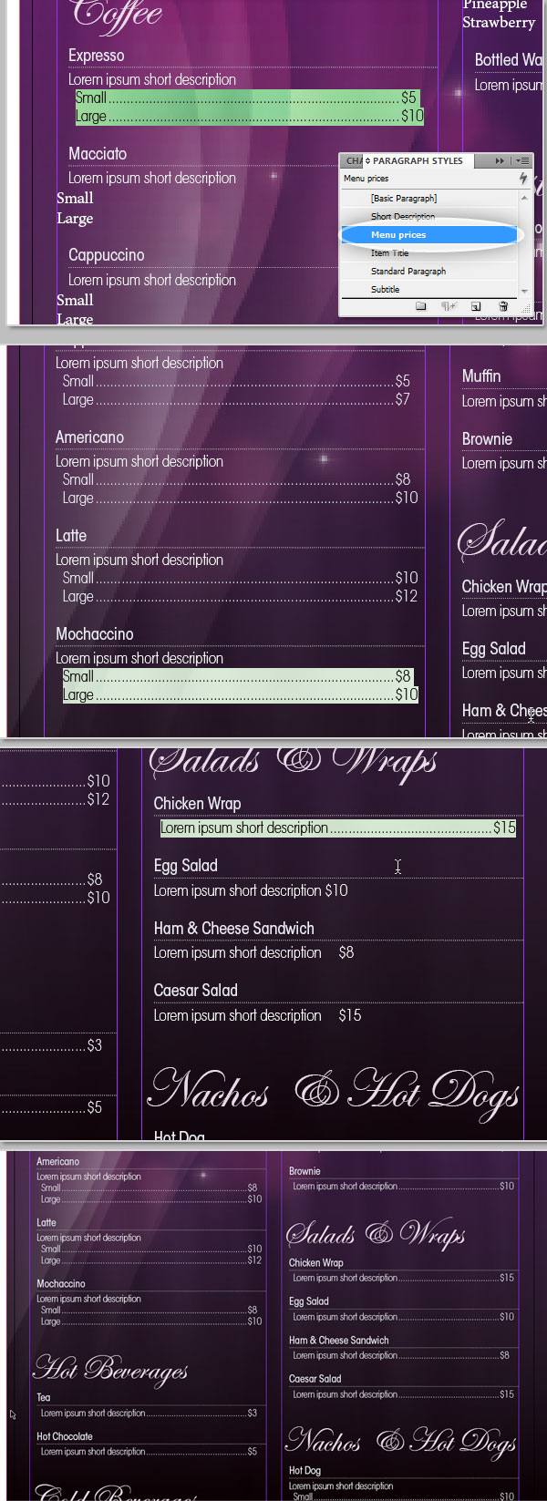
Step 27
Keeping the two rows Text selection create a new Paragraph Style named "Menu Price." Apply it on all the necessary prices paragraphs. In some cases, there are no sizes, so just apply the price style to the description row, adding a Tab and a price of course.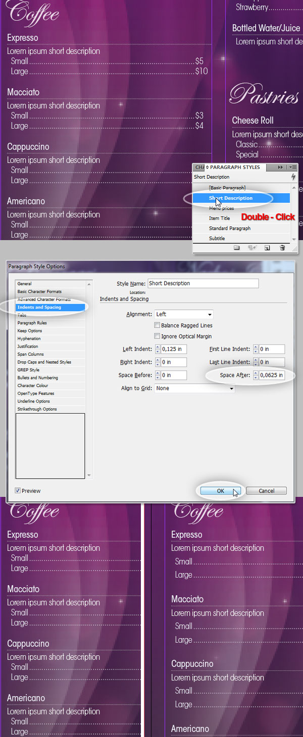
Editing Paragraph Styles
Step 28
We are almost done, a little tip at this point. The advantage of using Paragraph Styles is that you are always able to edit them without modifying everything again. In the following screenshot there’s two examples, we will modify the "Menu Prices" and "Item Title" styles. We just need to double-click on the Style and modify the values accordingly, you can preview the changes and commit them by clicking OK in the Panel. All the paragraphs related to its respective style will be automatically modified. If you want to, set the new values shown below on each style.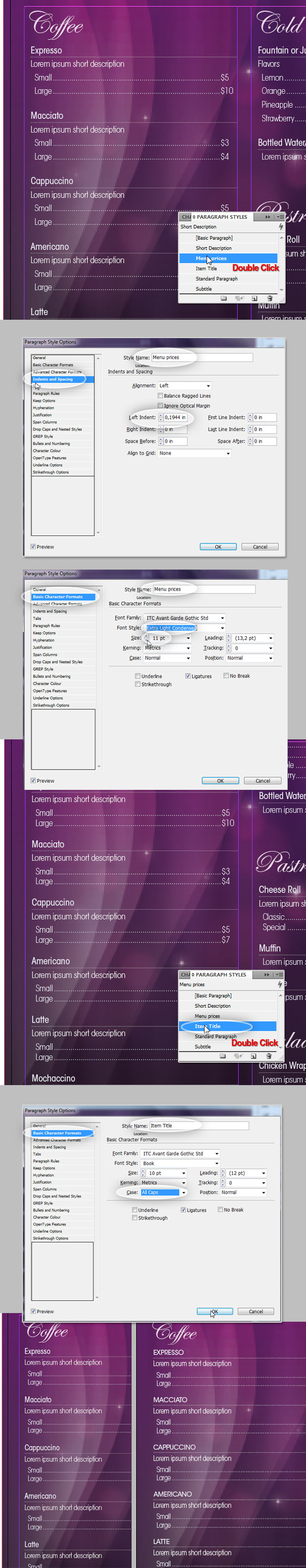
Resizing Boxes
Step 29
Using the Selection Tool and the transform controls you can resize the boxes according to your needs. In this example I’m resizing the first column box to create space to add a copy of the coffee’s logo. You’ll notice that all the content will be adjusted accordingly. All the text work is done by now, let’s add the final details.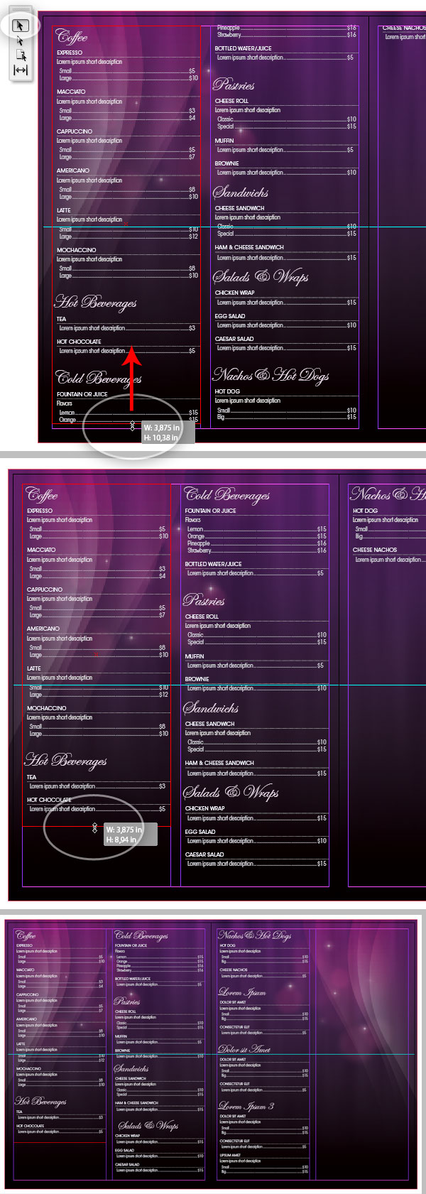
Adding Additional Objects
Step 30
Now we will add our nice Coffee Cup and a small version of the company Name to the internal pages. On the Layers Panel, create a new layer named "Additional Objects," besides you can block the other layers to avoid undesired editions. Then go to File > Place and look for the "coffee.psd" file. Place it on the second column of Page 3.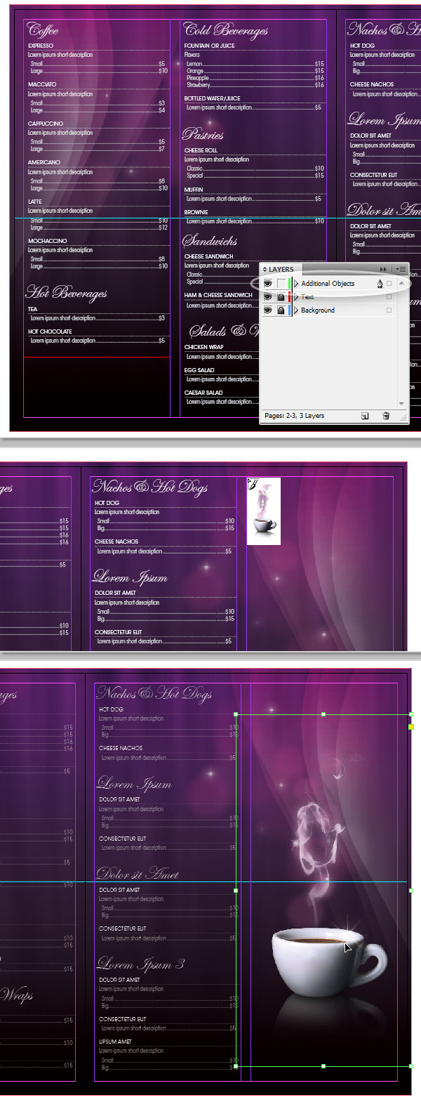
Step 31
Go to File > Place, look for the "logo.psd" file and place it on the first column of Page 2. Then on the Tool Bar select the Free Transform Tool (E) and use the transform handlers to reduce the image size matching the new width with the column’s width. Since the resolution of the PSD file is pretty big, there’s no problem reducing the size of objects, but if you want to increase the size you’ll see distortion.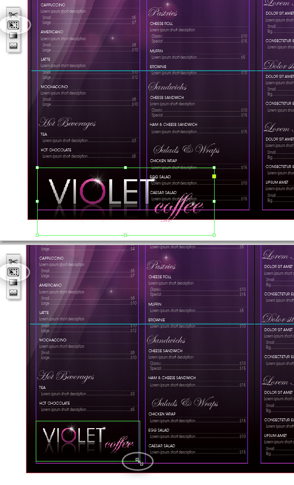
Step 32
And that’s it!. Check if everything looks good by switching to Preview Mode.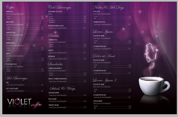
Print it as a Booklet
Step 33
Now your design should look very similar to the screenshot below. A front cover page, two internal pages with the menu text, and a back cover page with the company information. Let’s Print it!The most economic way to print this design is handling it as a booklet, which means the printshop will print it in a single sheet of paper, both sides. The type of paper depends on your needs, but the size of the paper sheet should be no less than "double-letter" sized. In this tutorial we will export the design on a high quality PDF file ready to print. You will need to have Adobe Acrobat Pro to make it work.
Go to File > Print Booklet, on the pop-up dialog Click on Print Settings, a new pop up will show, there Click on Setup. The system will show you a list of the available printers on your computer. Select Adobe PDF and Click on Preferences, then in the Settings Tab select the option: High Quality Print. Now Click on OK to commit the changes and Click on Print to go back to the InDesign print settings dialog.
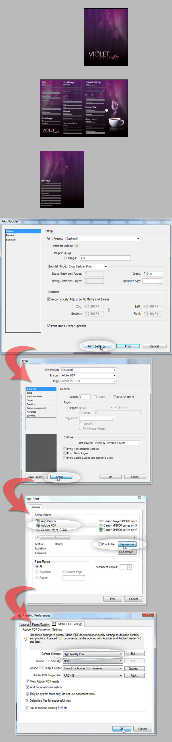
Step 34
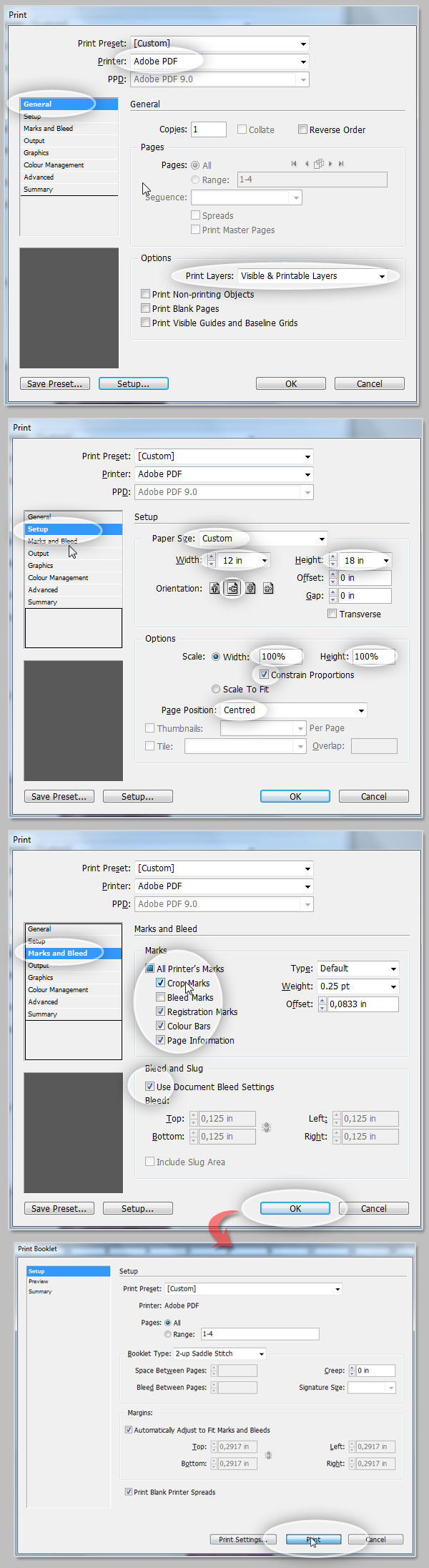
Check that under General options the value for Printer is Adobe PDF. Under Options select Visible & Printable Layers.Under Setup options, select the paper size as Custom and set the following values Width at 12 in, Height at 18 in (Since the printable area of the document is 11 x 17 inches, we need to talk with the printshop and ask them for standards, often you can just leave it as is, but in this example I wanted to show you how to add print marks so I’m adding an extra inch around the design area). Set the page orientation to Landscape and ensure the Scaling values set at 100%.
Under Marks and Bleeds, Check the Following marks: Crop Marks, Registration Marks, Color Bars, and Page Information. Then check the Use Document Bleed Settings. Click on OK and then Click on Print.
Step 35
And voilá we have a ready to print PDF document. You can get rid of the print marks if you want, or show only the ones you need.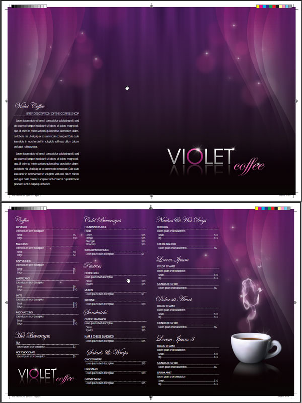

Tidak ada komentar:
Posting Komentar