Apple has always been showing what beautiful design means in all their designs, products, icons, websites. But what really make Apple design stand out from the crowd? Why it receives so big attention, so many awards, what’s so special in it?
I wanted to find it out so that’s why I created this Apple type inspirational post showcasing all the best Apple inspired website designs and in the meantime I also analyzed Apple website as well trying to drop down important points and explain why their design and approach works. It was very interesting study for myself and also I got reason to put all this stuff in easy to read and transparent way.
Let’s start with own Apple designed website sections to see original style:
Throughout whole site they are using white,grey and blue color schemes, keeping designs very light and easy for eye to scan. To emphasize different sections typography, icons and photographs are used very effectively. Sometimes text-size seems to be even too small, but in that way Apple is conveying huge amounts of products, information, links which in other way wouldn’t be possible – interesting solution. In this way we don’t need to make many clicks to find what we need, we can find right section almost in index page – it’s very important from usability point of view.
Also everything is built on grid system, all text, icons, navigation, links are perfectly aligned, making website very easy to read, scan and seem professional.
Right, but now let’s drop it down into list for clear vision:
- Light color scheme, subtle gradients
- Effectively used white space
- Clearly expressed typography
- Beautiful product shots
- Widely used icons to emphasize text meaning
- Very clear grid system
- Clear and user friendly navigation
- Product based features always supplemented with great shots, videos and typography
- Small text size, but comfortable readability
- Contrasts to gain attention to specific spots
- Easy step by step guides and support
- No Flash – wide use of Javascript to decrease page loading time
Can you add some more sections here? Those are just my few dropped down things I found to be very important in Apple design style success.
Ok, now we will just showcase few huge sections of Apple to get their style from a little bit wider point of view:
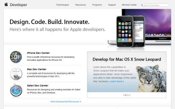
Apple Developer
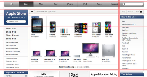
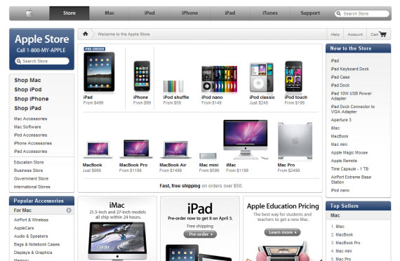
Apple Store
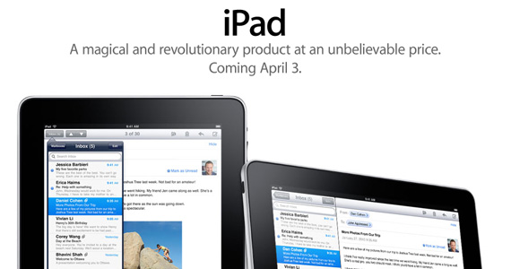
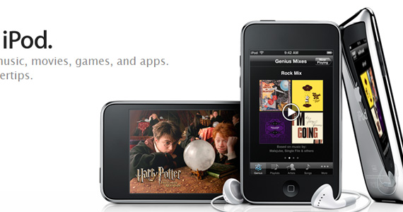
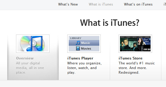
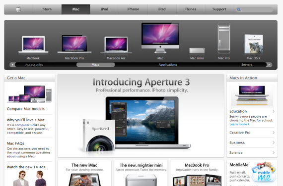
Apple Mac
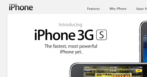
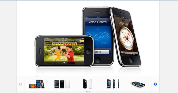
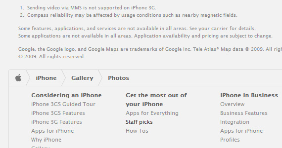
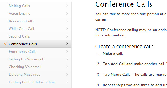
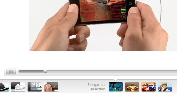
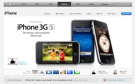
Apple iPhone
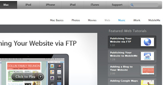
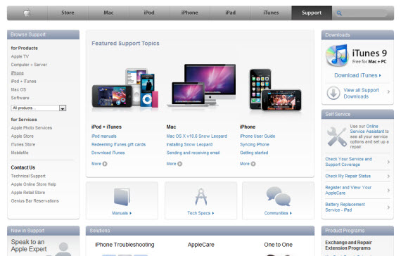
Apple Support
Another sites, definitely Apple style inspired:
Now to the main point, it’s very interesting to watch how other sites are using and taking the best Apple techniques and implement them in their own sites from their point of view and own personalized approach. Often you will find many similarities with Apple design, but sometimes sites even evolve Apple type of style bringing it to the next level and discovering something amazing and something new. For me those sites were excellent learning exercise and hopefully it will bring some good emotions to you as well. Design is indeed beautiful.1. Panic Coda
Very popular coding editor for Mac and website using the best practises – what makes it Apple inspired? From my point of view it’s harmonic grid, making whole website easy to scan just in few seconds. Other than that – small, good-looking icons, effectively used white space just emphasize focus on necessary parts of website – logo, 3 navigation section and after that sleek sliding feature descriptions.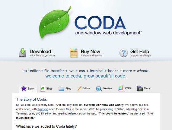
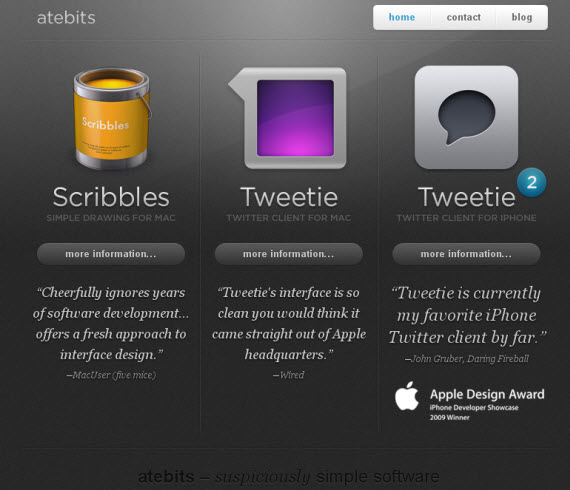
2. AteBits
Keep it simple, stupid! If you analyze just starting page you will notice many small things making it look amazing together – dark lines, background, text shadows, letterpress effects and light mouseovers.
3. Cultured Code
Beautiful icons and typography working together give really good impression throughout whole website – that’s all what’s needed! Analyze site deeper to see also how they display information and text in good way.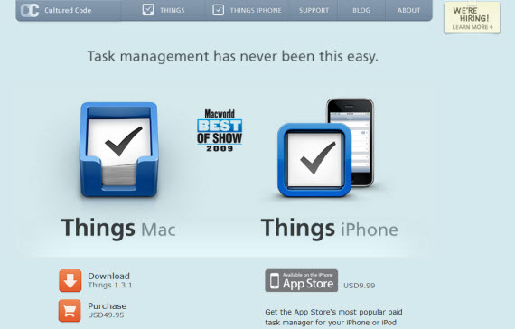
4. Mac Rabbit
Notice how effectively site uses just white and grey colors with light gradients and colored icons to emphasize accents. Beautiful.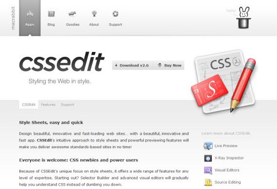
5. Twelve South
Main emphasis here on really great product shots, Mac products are great, why not use beautiful photos and emphasize them with beautiful typography!?!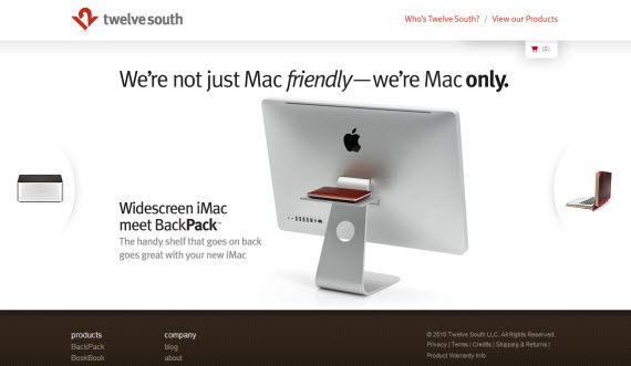
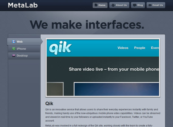
6. Metalabs
Some may disagree, because this website is a little bit away from Apple style? Why?I think it’s because of color and usually Apple type websites use just white/grey colors, big icons and white space on “above the fold” section.
But design is amazing, beautiful featured slideshow and many little emphasis throughout whole website.
7. Version App
Completely dark website in the same time using white space,grid, icons and typography very good, excellent studying case as something different.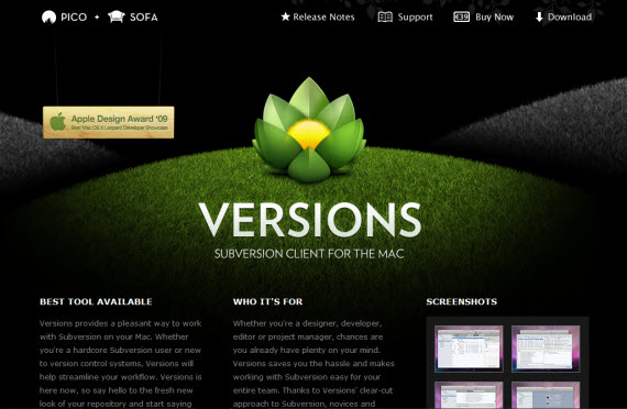
8. IconDock
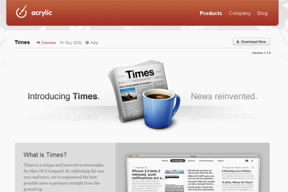
9. Acrylic Apps
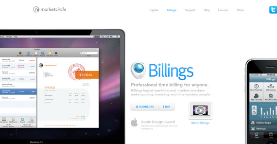
10. Billings App
Huge product shots make this design part someway unique but in the meantime similar in good way with Apple style. Why?Small text size, used background and text colors (white,grey,blue).
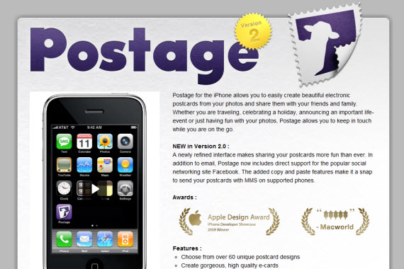
11. Postage
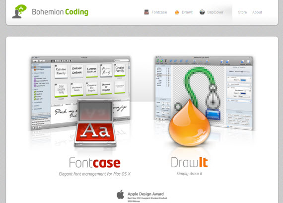
12. Bohemian Coding
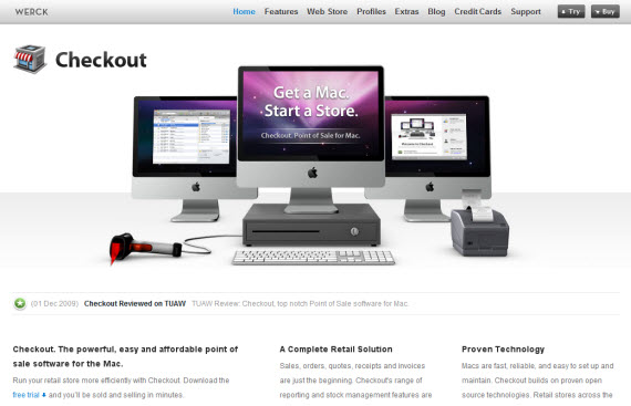
13. Checkout App
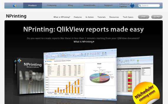
14. Nprinting
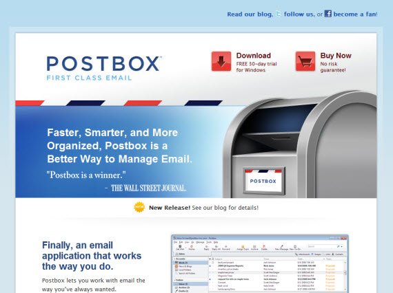
15. PostBox Inc
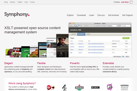
16. Symphony CMS
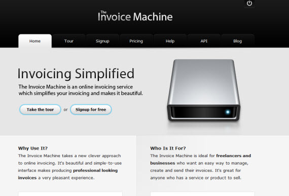
17. Invoice Machine
18. Icon Designer
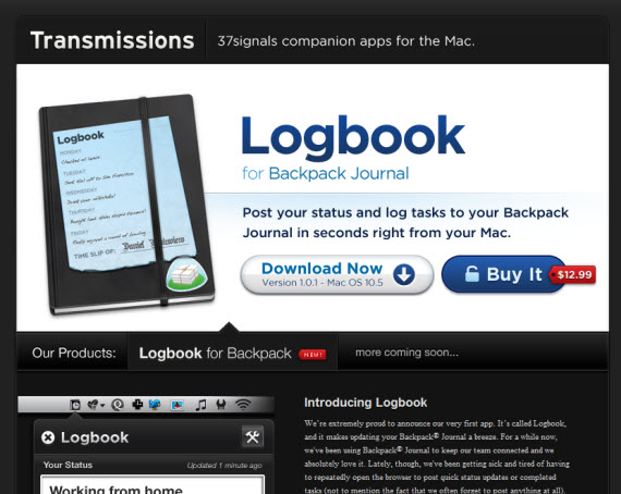
19. Transmission Apps
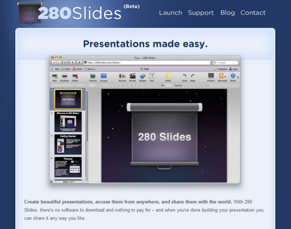
20. 280 Slides
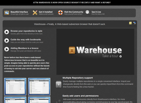
21. Ware House App
22. PixelMator
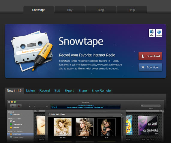
23. SnowTape
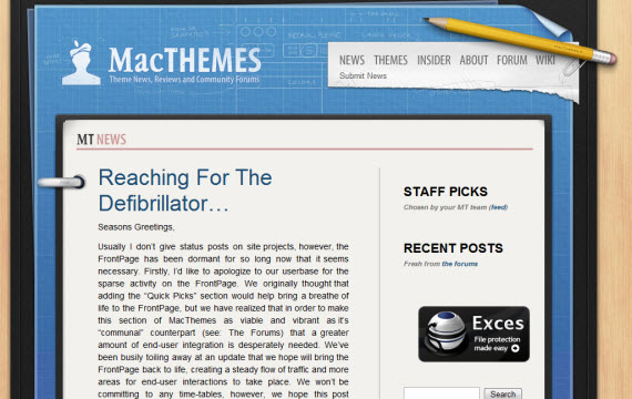
24. Mac Themes
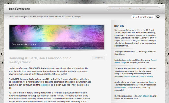
25. Small Transport
26. Tea Round
Iphone app sites are a little bit different since the main aspect is on iPhone product and icon, but still the same quality features – more icons, typography and effective whitespace.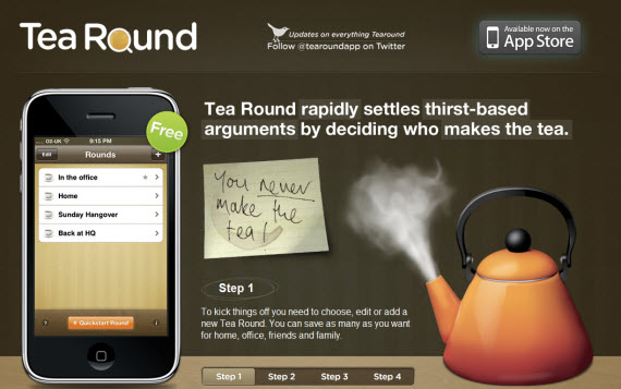
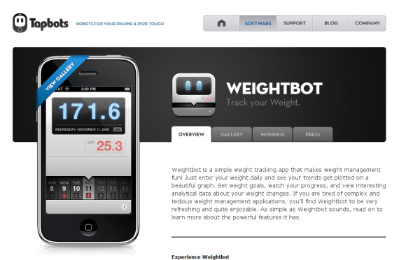
27. Tap Bots
Just beautiful icons showcasing products in landing page usually is enough! If you are certain about your product why not to show that!?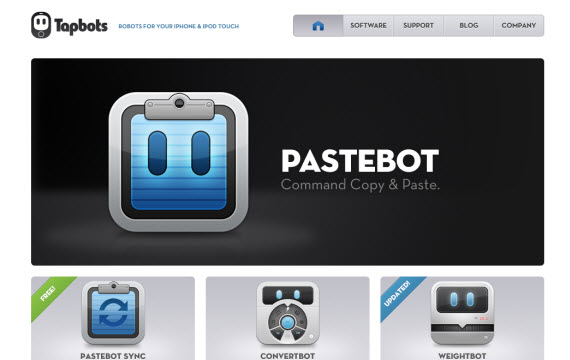
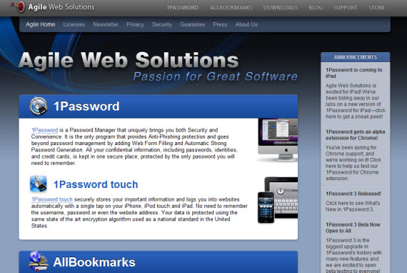
28. Agile Web Solutions
We are going deeper in showcasing a little bit different sites. In my opinion gradients, dark colors are used too much making design look not so professional as it should be, but I found a lot of interesting features and good design uses here as well, that’s why I decided to include this design.Navigate through other pages to understand my point.
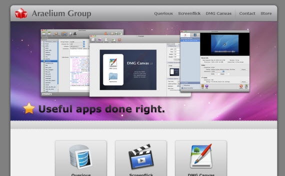
29. Araelium Group
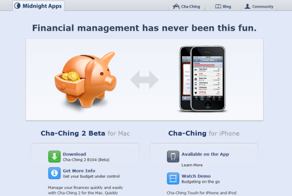
30. Midnight Apps
31. Real Mac Software
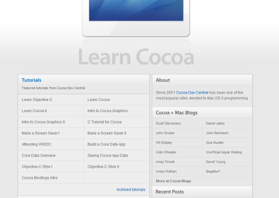
32. Cocoa Dev Central
33. Potion Factory
Stunningly beautiful website with beautiful design and amazing JS animations.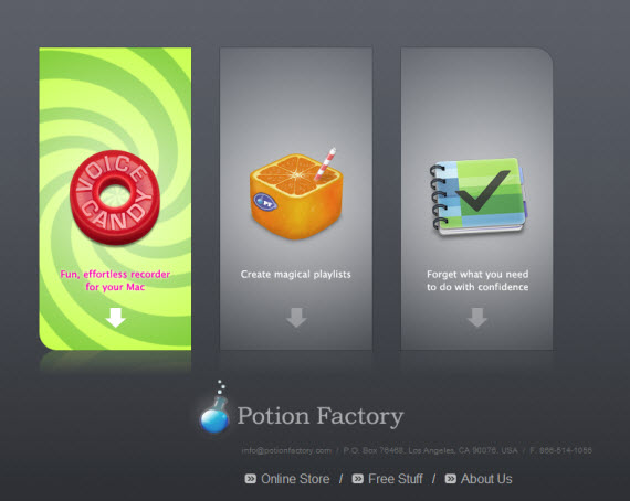
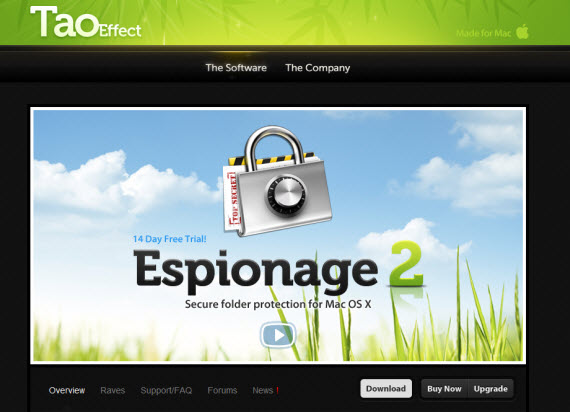
34. Tao Effect
35. Task Mate
Very simple and minimalist website, for me it was even TOO simple, but it’s freeware so maybe that’s the case here.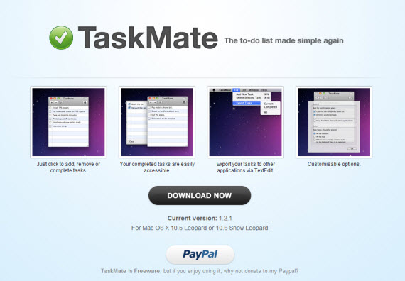
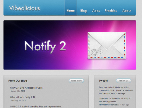
36. Vibealicious Notify 2
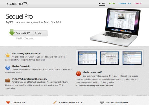
37. Sequel Pro
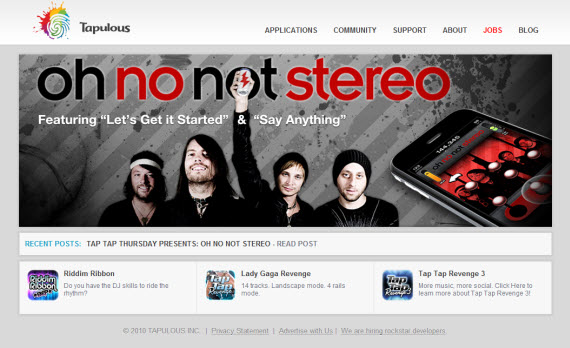
38. Tapulous
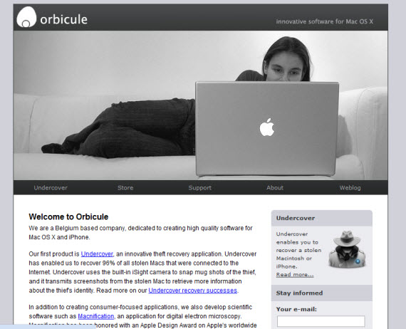
39. OrbiCule
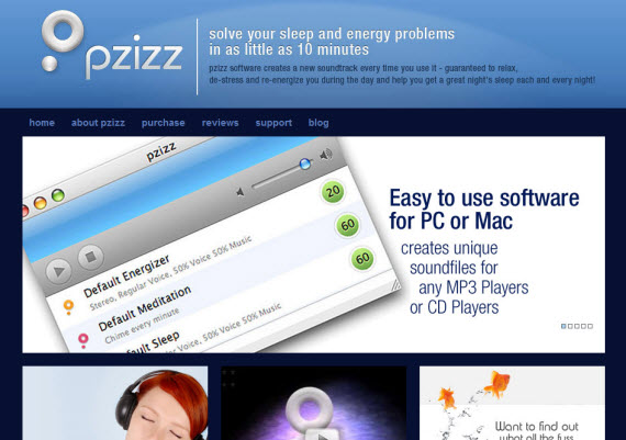
40. Pzizz
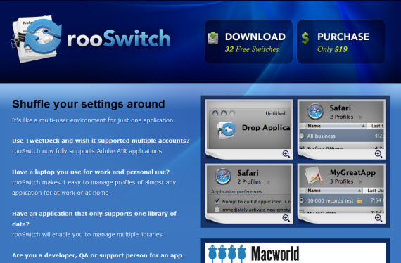
41. Roo Switch
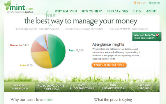
42. Mint
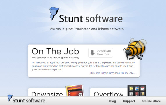
43. Stunt Software
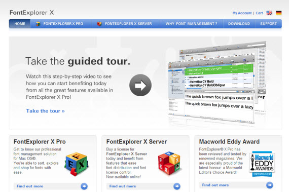
44. Font Explorer X
45. Server Skine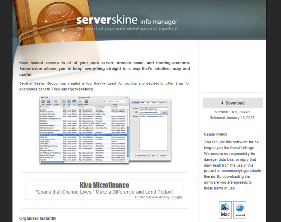
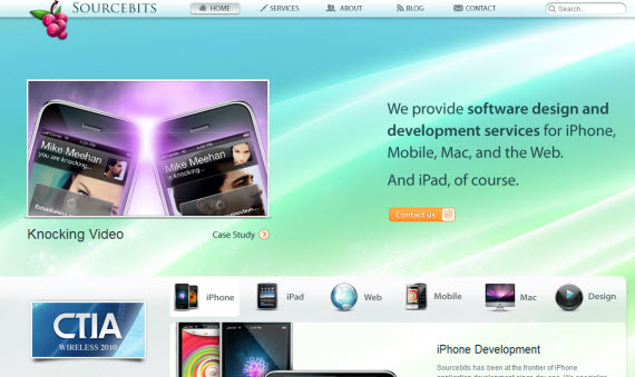
46. Source Bits
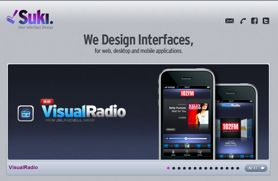
47. Suki
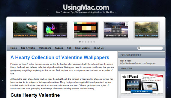
48. Using Mac
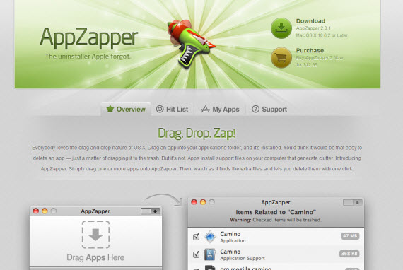
49. App Zapper
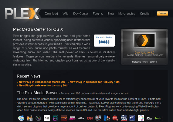
50. Plex App
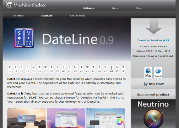
51. Machine Codex
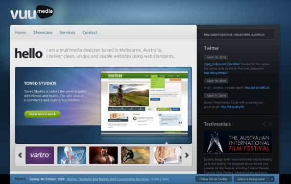
52. Vuu Media
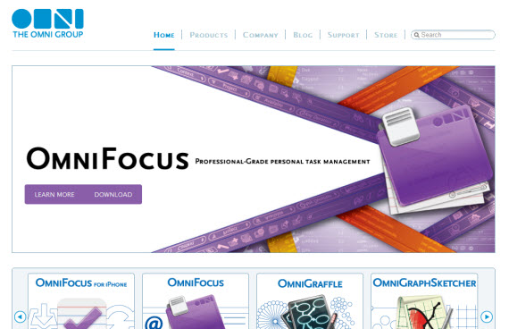
53. OmniGroup
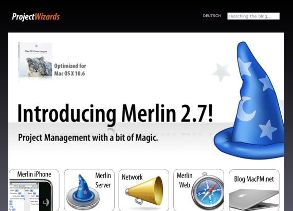
54. Project Wizards
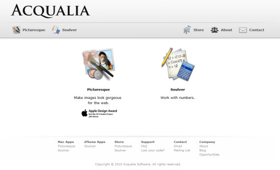
55. Acqualia
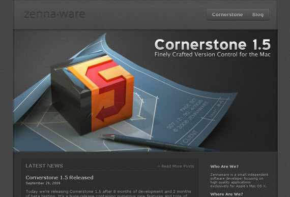
56. Zenna Ware
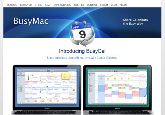
57. Busy Mac
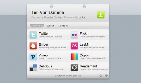
58. Tim Van Damme
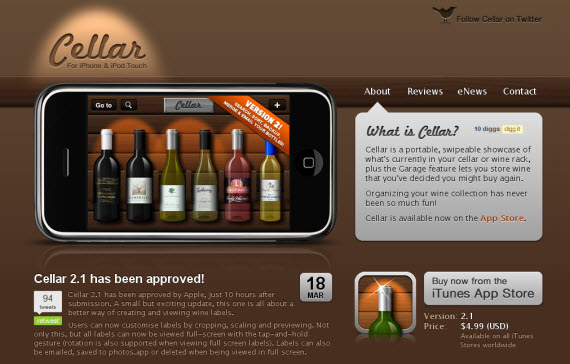
59. Cellar App
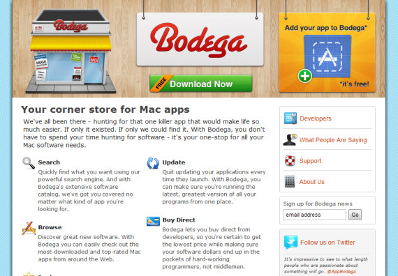
60. AppBodega

Tidak ada komentar:
Posting Komentar