
To sort of wrap up our series on using liquid effects for design, today, we will look at how to use liquid photostocks to create a gorgeous and stunning liquid text effect in Photoshop. By using some clever techniques, we can warp liquids into a variety of shapes to meet our needs.
In this case, you’ll learn how to create letters from liquids, and then add in some extra effects for a dynamic composition.
All you need is Photoshop and some free stock images, so let’s get started!
Also, don’t forget to suggest tutorials in the comments!
 Tools used:
- Adobe Photoshop
- Various stock images
Final Image Preview:
Step 1: Document creation and water stock selection
To start off we will need to create a new document. We will be working with a canvas size of 3000*2000; once the image is finished we can size the image down to 1200*800.
Now we will need a mass selection of stock images to create our text. I have used various stocks that I have collected from shutter stock however if you do not want to get your stocks from shutter stock than you can use stock images from sites such as SXC and Deviantart. Below is a list of stocks that you can use for this.
Stock links:
- http://www.sxc.hu/browse.phtml?f=download&id=1180590
- http://www.sxc.hu/photo/884261
- http://www.sxc.hu/photo/1042507
- http://www.sxc.hu/photo/1042509
- http://www.sxc.hu/photo/1104884
- http://www.sxc.hu/photo/1131843
- http://www.sxc.hu/photo/1104885
- http://www.sxc.hu/photo/706828
- http://www.sxc.hu/photo/660705
Step 2: Water stock manipulation
Once you have obtained your stock images you will need to begin to mold them into your water letters. I will show you how I molded the images in the steps below. Keep in mind thought that my canvas is white during the screenshots; however the canvas size should be black. Also in case you didn’t know, if you set the liquid layer down as a screen layer then the back ground will be removed , anything that still remains after this can be fixed with the level editor and or the eraser tool. For more information you can read the following tutorial that explains how to manipulate water stocks. http://design.creativefan.com/create-a-vibrant-colorful-alcohol-product-ad/My stock images look like the below screen shots:


To start off I used my curved stock image and dropped it into my canvas.

Next I duplicated it and filled it 180 degrees. Once that was done I pushed the two curves together to create my splash S.

Once that was done I merged the two layers down into one layer and cleaned it up a bit with the eraser tool and level editor.

Next I started on the P. To do this I again used my curved stock, I free transformed it so it would sit upright and then erased out a few segments so it appeared like a hook.

Next I grabbed my curved stock and turned it so it would complete the circle at the top of the P.

Next I used the same curve stock to lengthen the tail of the P.

Next I used a single stock image to construct the L.

Now just continue on until you have created your water ‘splash’! Keep in mind that you will want to keep the hard edges away as best as possible and also that you can use filters such as the liquefy filter to help aid in the creation of the letters forms.
Step 3: Incorporating stock elements and designs into your splash text.
Once all of the letters have been created it is time to start contemplating your design. To start off we need some color. To do this create a new layer above the splash layer and draw all over it with a blue brush; any brush will do for this.
Now apply two Gaussian blurs, each with a radius of 250. Once this is done set the layers opacity to 15%.

Next create a new layer underneath the text layer and repeat this process. This time however use a lighter blue and set the opacity higher than the previous layer, depending on how bright you want your colors to appear. I went with an opacity of about 25%.

Now that we have created the basic layout for our scene we need to start building it up and what better way than with a few jelly fishes? So we can now go head over to SXC (you will need an account, but its free so sign up!) to grab the first jelly fish stock http://www.sxc.hu/photo/843107 Now just copy this jellyfish into our document in Photoshop so we can begin editing it into our piece.

We will begin our editing process by performing an auto level adjustment. This will adjust the brightness, darkness and contrast based upon the scene. Once this has been done your jellyfish should look similar to mine (minus the white backdrop).

Now we can press ‘E’ on the keyboard to grab the eraser tool; we will then right click and grab the standard 300px soft brush, we want to change the hardness to 100% rather than 0. Once we have our brush set up we will just quickly erase all the debris that are floating around in there with him. Try and get the strange over saturated red patches as well as all the little floating things. Once you have erased all you can see your image should look like mine below.

Now to further enhance the jellyfish we will be doing a manual edit of the levels. To do this we will need to pres ‘CTRL L’ on the keyboard, we will be moving the far left triangle over to the right a little bit and then pressing ok or ‘ENTER’ on the keyboard. Doing the manual adjustment will darken all the blacks in the scene and cause the grays to become pitch black which is a very good thing.

Now just place it in your scene and set the layer as a screen layer.

Now we can repeat this process with the following stock image and then place it as we have done with the previous stock. http://www.sxc.hu/pic/l/z/ze/zenpixel/234636_6457.jpg

Next we will start adding in some fish! The first of which can be found here
http://www.sxc.hu/browse.phtml?f=download&id=895395
So head over to Sxc again and grab and drop this into your document as I have done.

Now we can use the magic wand tool just like we did with the phone. So to start off we will press ‘W’ on the keyboard to grab the wand tool, we will leave its tolerance at 25%. With the magic wand tool enabled we can start clicking around our fish, if we hold the ‘SHIFT’ key down after the initial click we should be able to keep the current selection and only add to it. Once you have clicked all around the fish your selection should look similar to mine in the below screenshot.

Now enable a layer mask and invert it to make only the fish visible.

Now just clean up around your fish and tada! He is all isolated out!

Now we can place him around our splash text.

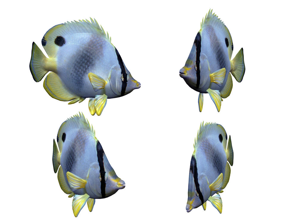
The next stock fish we will use is located on deviantart which can be found here http://fc07.deviantart.net/fs11/i/2006/248/7/9/Fish_Stock_1_by_Shoofly_Stock.jpg

Once you have copied and pasted the fish’s into your document we will start by pressing ‘M’ on our keyboard to bring the marquee tool back up. With the marquee tool back up we can make a selection around the middle fish. Once you have made a selection around him you can press ‘CTRL C’ and followed by ‘CTRL V’ this will copy what we had selected and then paste it. Once we have pasted the duplicate of our fish we can hide the original layer by selecting the eye icon on the layer toolbar. With the original layer hidden we can begin isolating our fish with the magic wand tool. So press ‘W’ on the keyboard to bring the magic wand tool back up and select the white around the fish, once you have selected the white you can press ‘DEL’ on your keyboard to remove it and now our fish is isolated!


Now we can continue on using various fish stocks until we have the canvas filled to our liking. Below I have compiled a list of fish stocks that you can use to finish this step in your design, the main thing here is to keep it varied, you don’t want any conformity in your scene.
Fish stocks
- http://www.sxc.hu/photo/226752
- http://www.sxc.hu/photo/226751
- http://upload.wikimedia.org/wikipedia/commons/2/29/Clown_Fish_Swimming.jpg
- http://media.bigoo.ws/content/layout/animal/animal_118.jpg
- http://www.sxc.hu/photo/226751
- http://fc00.deviantart.net/fs11/i/2006/248/7/d/Fish_Stock_2_by_Shoofly_Stock.jpg
- http://www.sxc.hu/pic/l/t/tu/tuareq/792375_27502743.jpg
- http://www.sxc.hu/browse.phtml?f=download&id=857013
- http://www.sxc.hu/browse.phtml?f=download&id=226753


My image now looks something like the below screen shot.

Once I had dropped all of my fish in I went ahead and isolated a turtle and placed it inside of my A.

When doing this the most important factor was that I erased all of the water that covered the turtle.

If you would like to add the turtle into your scene you can find a similar one located on SXC at http://www.sxc.hu/photo/833619
Step 4: Adding in extra splashes and closing.
As of now the piece could be considered done. However I wanted to add something a tad bit extra, to do this I used an blurred water stock located on SXC. This stock image is located here http://www.sxc.hu/photo/884261
We will set this layer up as a screen as we did with our first water stocks and then erase everything but the top splashes.
Now just duplicate it and transform it around a few times and your done!


My final image looks like the below screen shot.
I hope you enjoyed my tutorial and have picked up a few tricks or two along the way. If you have any questions regarding a step or need any assistance don’t hesitate to ask!

Tidak ada komentar:
Posting Komentar